Measured entry
neu-slider
sliderneumorphismfirst party
A controlled React range input wrapped in a semantic label, with an optional computed value badge and neumorphic styling. It ships as one default-exported JSX component, has no package dependencies, and relies on Tailwind utility classes, including arbitrary shadow and color values.
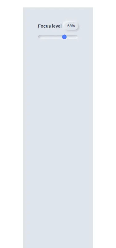
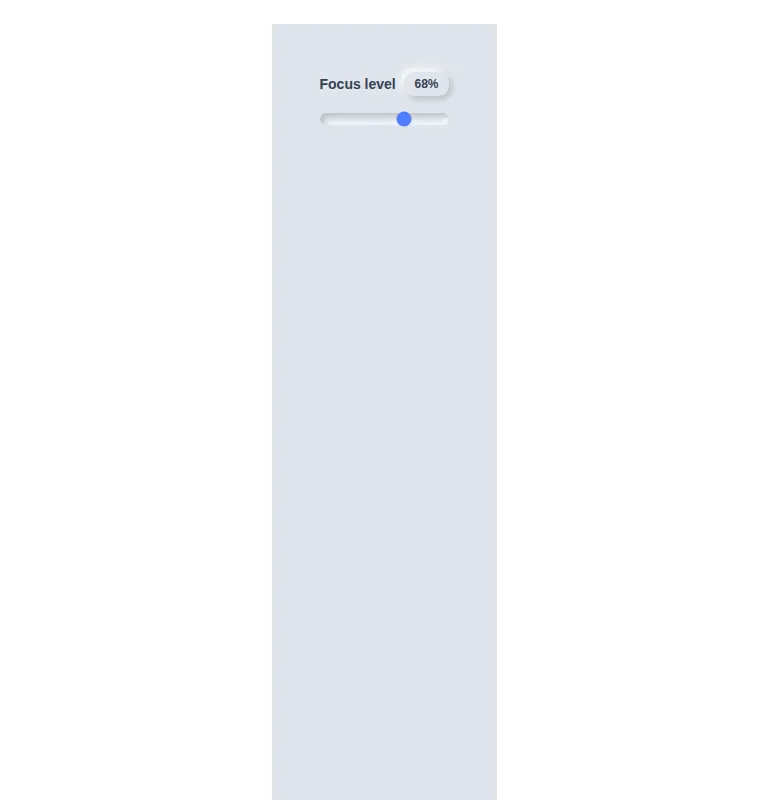

Measured
Every value below was written by the harness on the run that produced the frames above. None of it is derived from the prose.
| Build | OK |
|---|---|
| Mount | OK |
| Console errors | 0 |
| Uncaught page errors | 0 |
| Horizontal overflow | clean at 375, 768, 1440 |
| Axe critical | 0 |
| Axe serious | 0 |
| Axe moderate | 0 |
| Axe minor | 0 |
| Gzip marginal | 17.7 KB (83.1 KB build, 65.4 KB baseline) |
| Bare mode | OK |
| Provider required | NO |
| Demo used | written from the component source API |
Verdict
A tidy, dependency-free slider that builds and mounts on its own, keeps native range semantics, and fits restrained neumorphic interfaces. Adopt it when the fixed visual treatment and controlled-input API match your form; otherwise expect a small styling or value-formatting pass.
Use it if
- You want a compact labeled slider whose current position can be shown beside the label.
- Your React interface already uses Tailwind and its muted neumorphic palette fits the surrounding surface.
- You are prepared to own the value in parent state and pass an onChange handler.
Skip it if
- Your product does not use Tailwind and you do not want to translate the utility classes into CSS.
- You need a filled track that visibly communicates progress before the thumb.
- You need defensive handling for equal bounds, out-of-range values, or a display format other than a computed percentage.
Install
| Declared dependencies | none declared |
|---|---|
| Missing on install | none |
| Bare install | builds and mounts without the shadcn-style helpers |
| Provider | no provider required in the harness |
First-party component from the sir-originals set. In a non-shadcn project, add React and configure Tailwind to scan this JSX file so its utility and arbitrary-value classes are emitted. If Tailwind is not part of the stack, recreate those classes in ordinary CSS. Manage the value in parent state and wire onChange yourself.
Source and credit
This page is a review, not a copy. The component source lives with its author and this site does not republish it. Read the license before you use anything.
Author repository
mrkeyoor/sir-originalsAlternatives
Other published entries for the slider pattern, ordered by what they measured: mounts first, then clean axe scans, then bare-mode passes, then the smaller bundle.
- clay-sliderclaymorphism
- Renders
- YES
- A11y
- 0
- Gzip
- 18.1KB
- Bare
- pass
- Prov
- NO
- ruixen-fine-tune-sliderunclassified
- Renders
- YES
- A11y
- 0
- Gzip
- 61.5KB
- Bare
- pass
- Prov
- NO
- tripled-volume-component-shadcnuiminimal-flat
- Renders
- YES
- A11y
- 0
- Gzip
- 72.7KB
- Bare
- fail
- Prov
- NO
- tripled-cards-slider-shadcnuiliquid-glass
- Renders
- YES
- A11y
- 0
- Gzip
- 76.4KB
- Bare
- fail
- Prov
- NO
- shadcn-sliderunclassified
- Renders
- YES
- A11y
- 1
- Gzip
- 39.2KB
- Bare
- pass
- Prov
- NO
- neobrutalism-sliderbrutalism
- Renders
- YES
- A11y
- 1
- Gzip
- 39.3KB
- Bare
- pass
- Prov
- NO