Measured entry
ruixen-fine-tune-slider
sliderunclassifiedmotion on file
A dark, animated React slider that lets pointer users pull away from the track for finer value changes. It ships as a single client component through a shadcn registry, uses Tailwind utility classes for all styling, and imports Motion for its springs, reveals, glow, and tether effects.
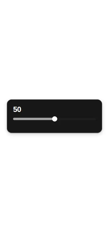
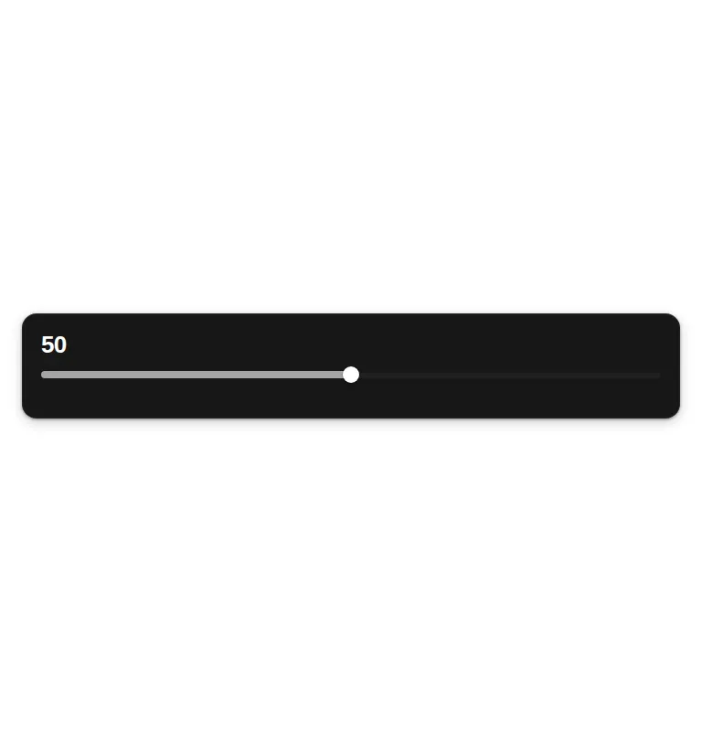
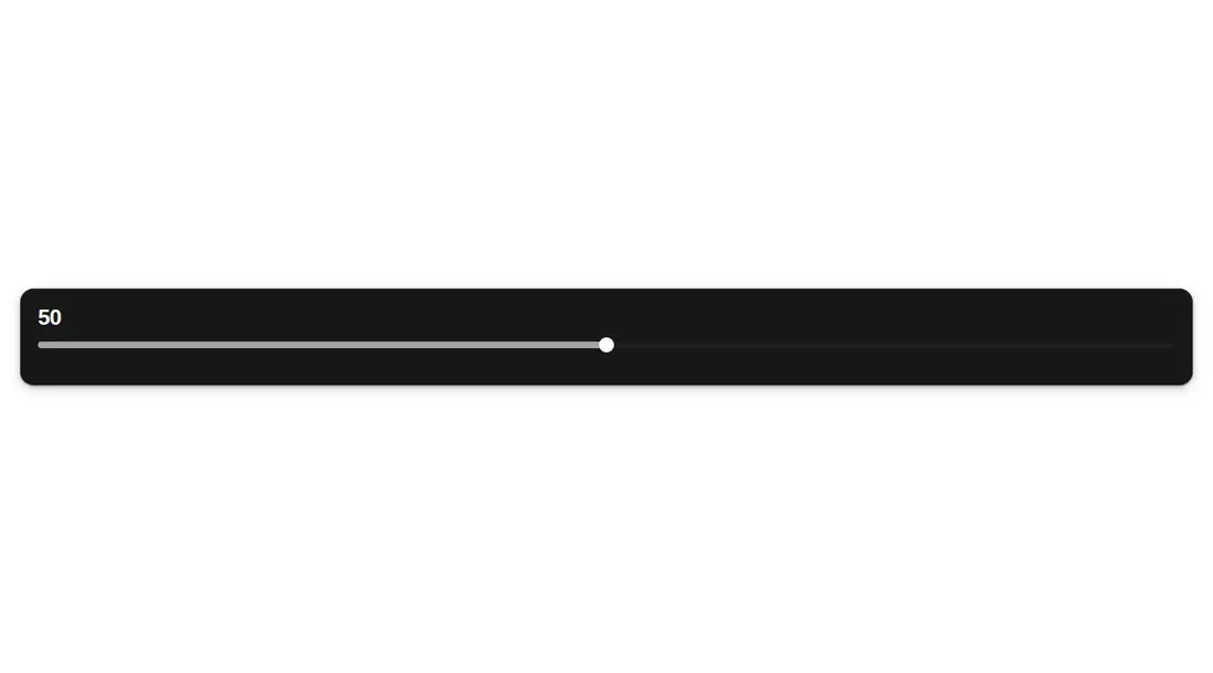
Measured
Every value below was written by the harness on the run that produced the frames above. None of it is derived from the prose.
| Build | OK |
|---|---|
| Mount | OK |
| Console errors | 0 |
| Uncaught page errors | 0 |
| Horizontal overflow | clean at 375, 768, 1440 |
| Axe critical | 0 |
| Axe serious | 0 |
| Axe moderate | 0 |
| Axe minor | 0 |
| Gzip marginal | 61.5 KB (126.9 KB build, 65.4 KB baseline) |
| Bare mode | OK |
| Provider required | NO |
| Demo used | written from the component source API |
Verdict
A polished specialist control for pointer-heavy tuning interfaces, and it builds and mounts outside a shadcn project. Adopt it only if you can add keyboard behavior and slider semantics; as supplied, the interaction design is stronger than its input accessibility.
Use it if
- You need a pointer-focused scrubber where users can slow value changes without opening a separate precision control.
- Your interface already uses Tailwind and can accept Motion for interaction feedback.
- You want an uncontrolled slider with configurable bounds, step size, initial value, and a change callback.
Skip it if
- You need keyboard operation or native slider semantics without modifying the component.
- You need a controlled value prop that stays synchronized with external state.
- You want a lightweight static range input without an animation dependency.
- Your design system cannot accommodate its fixed dark surface and embedded visual styling.
Install
| Declared dependencies | motion |
|---|---|
| Missing on install | none |
| Bare install | builds and mounts without the shadcn-style helpers |
| Provider | no provider required in the harness |
In a non-shadcn React project, copy the client component, install Motion, and provide Tailwind with support for the utility and arbitrary-value classes used by the file. No provider is required. Add slider semantics, focus styling, and keyboard handlers before treating it as an accessible form control.
Source and credit
This page is a review, not a copy. The component source lives with its author and this site does not republish it. Read the license before you use anything.
Author repository
github.com/ruixenui/ruixen.comAlternatives
Other published entries for the slider pattern, ordered by what they measured: mounts first, then clean axe scans, then bare-mode passes, then the smaller bundle.
- neu-sliderneumorphism
- Renders
- YES
- A11y
- 0
- Gzip
- 17.7KB
- Bare
- pass
- Prov
- NO
- clay-sliderclaymorphism
- Renders
- YES
- A11y
- 0
- Gzip
- 18.1KB
- Bare
- pass
- Prov
- NO
- tripled-volume-component-shadcnuiminimal-flat
- Renders
- YES
- A11y
- 0
- Gzip
- 72.7KB
- Bare
- fail
- Prov
- NO
- tripled-cards-slider-shadcnuiliquid-glass
- Renders
- YES
- A11y
- 0
- Gzip
- 76.4KB
- Bare
- fail
- Prov
- NO
- shadcn-sliderunclassified
- Renders
- YES
- A11y
- 1
- Gzip
- 39.2KB
- Bare
- pass
- Prov
- NO
- neobrutalism-sliderbrutalism
- Renders
- YES
- A11y
- 1
- Gzip
- 39.3KB
- Bare
- pass
- Prov
- NO