Measured entry
cultui-expandable-screen
cardliquid-glassmotion on file
A client-side React compound component that morphs a trigger into a full-screen content panel through shared-layout animation. It ships as a shadcn registry source file with its own context and optional background helper, and depends on Motion, Lucide React, React hooks, and Tailwind-style utility and theme classes.
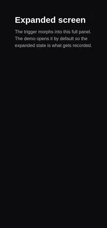
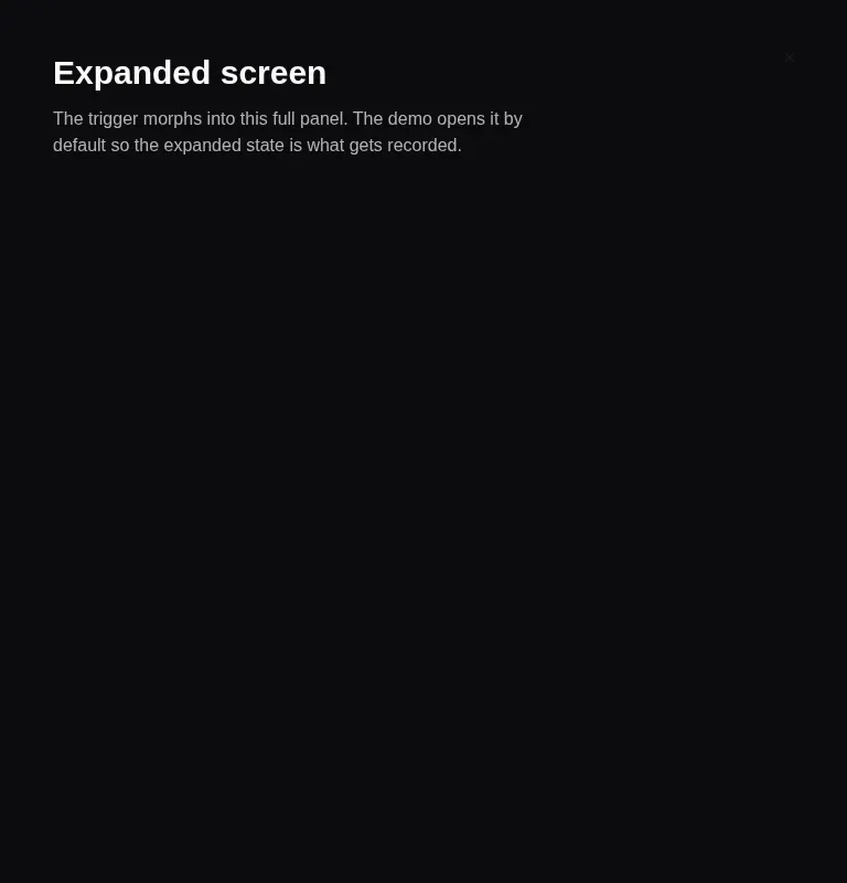
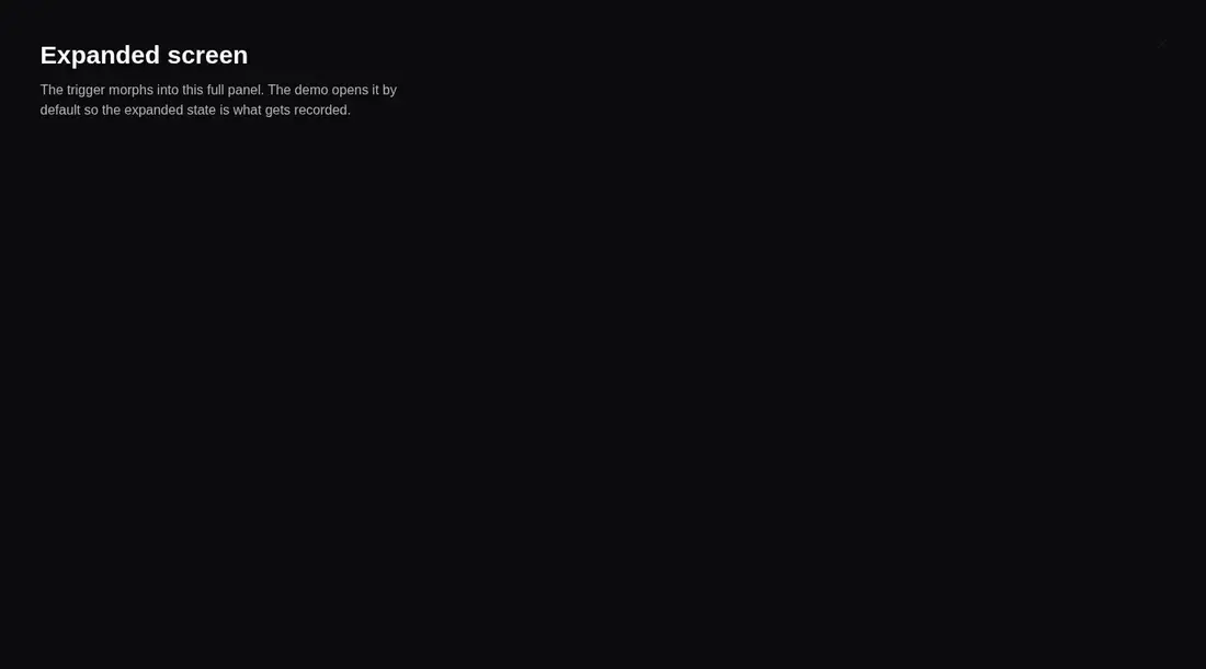
Measured
Every value below was written by the harness on the run that produced the frames above. None of it is derived from the prose.
| Build | OK |
|---|---|
| Mount | OK |
| Console errors | 0 |
| Uncaught page errors | 0 |
| Horizontal overflow | clean at 375, 768, 1440 |
| Axe critical | 0 |
| Axe serious | 0 |
| Axe moderate | 0 |
| Axe minor | 0 |
| Gzip marginal | 64.2 KB (129.7 KB build, 65.5 KB baseline) |
| Bare mode | OK |
| Provider required | NO |
| Demo used | written from the component source API |
Verdict
The morphing interaction builds and mounts cleanly, renders without overflow, and needs no provider. It is a solid visual primitive, but not a complete accessible dialog. Adopt it when you can replace the clickable div with keyboard-safe behavior and add the modal semantics your product requires.
Use it if
- You want a button or card to expand into an immersive full-screen panel while preserving a visual connection to its trigger.
- Your app already uses Motion and utility-class styling, and you are comfortable supplying the panel content and surface treatment.
- You need an uncontrolled open state with an expansion callback and a context hook for nested custom content.
Skip it if
- You need a keyboard-native trigger without modifying the component, because expansion is attached to a clickable div.
- You need complete modal behavior such as focus trapping, Escape dismissal, dialog semantics, or backdrop dismissal out of the box.
- You are minimizing client bundle impact and do not otherwise use Motion.
- You cannot audit its body scroll locking, which overwrites inline overflow and lacks unmount cleanup while expanded.
Install
| Declared dependencies | motion, lucide-react |
|---|---|
| Missing on install | none |
| Bare install | builds and mounts without the shadcn-style helpers |
| Provider | no provider required in the harness |
In a non-shadcn project, copy the client component, install Motion and Lucide React, and ensure your utility CSS scans the file. Provide the theme color classes it references or replace them with local styles. No external provider is required.
Source and credit
This page is a review, not a copy. The component source lives with its author and this site does not republish it. Read the license before you use anything.
Author repository
github.com/nolly-studio/cult-uiAlternatives
Other published entries for the card pattern, ordered by what they measured: mounts first, then clean axe scans, then bare-mode passes, then the smaller bundle.
- tailark-veil-content-1minimal-flat
- Renders
- YES
- A11y
- 0
- Gzip
- 17.6KB
- Bare
- pass
- Prov
- NO
- tailark-veil-content-2minimal-flat
- Renders
- YES
- A11y
- 0
- Gzip
- 17.6KB
- Bare
- pass
- Prov
- NO
- tailark-mist-content-3minimal-flat
- Renders
- YES
- A11y
- 0
- Gzip
- 24.1KB
- Bare
- pass
- Prov
- NO
- neobrutalism-cardbrutalism
- Renders
- YES
- A11y
- 0
- Gzip
- 29.6KB
- Bare
- pass
- Prov
- NO
- neobrutalism-ncardbrutalism
- Renders
- YES
- A11y
- 0
- Gzip
- 29.6KB
- Bare
- pass
- Prov
- NO
- reui-icon-stackminimal-flat
- Renders
- YES
- A11y
- 0
- Gzip
- 30.1KB
- Bare
- pass
- Prov
- NO