Measured entry
cultui-family-drawer
sheetglassmorphismmotion on file
A composable React bottom drawer with animated height changes, swappable views, a portal and overlay, plus trigger, close, header, and button primitives. It ships as a client-side shadcn registry component and relies on Motion, react-use-measure, Vaul, Radix Slot, clsx, and utility CSS theme tokens.
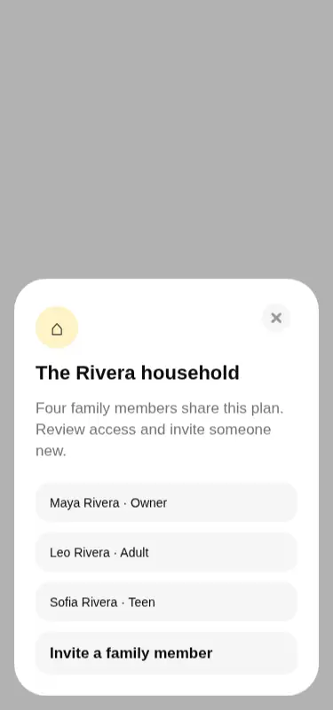
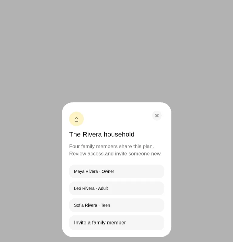
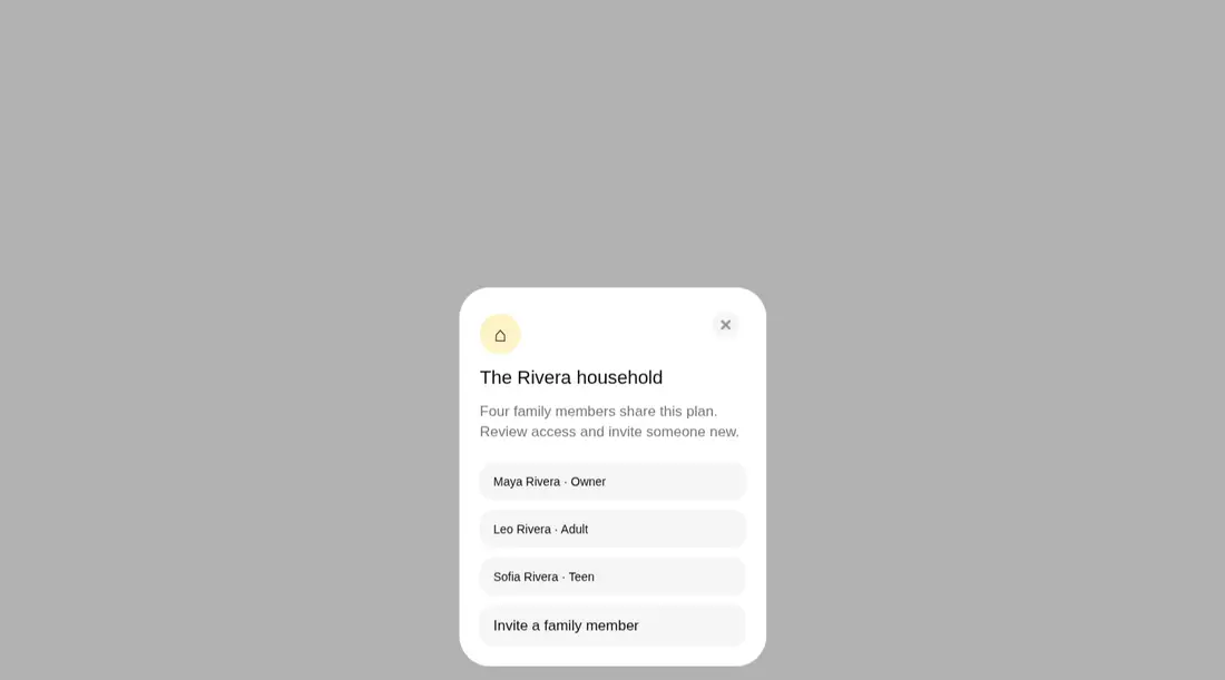
Measured
Every value below was written by the harness on the run that produced the frames above. None of it is derived from the prose.
| Build | OK |
|---|---|
| Mount | OK |
| Console errors | 0 |
| Uncaught page errors | 0 |
| Horizontal overflow | clean at 375, 768, 1440 |
| Axe critical | 0 |
| Axe serious | 0 |
| Axe moderate | 0 |
| Axe minor | 0 |
| Gzip marginal | 83.4 KB (148.8 KB build, 65.4 KB baseline) |
| Bare mode | FAIL |
| Provider required | NO |
| Demo used | written from the component source API |
What the harness recorded
BARE BUILD
✗ Build failed in 1.75s
error during build:
[vite]: Rollup failed to resolve import "clsx" from "<sandbox>re-eee9236a9840/src/cut/components/ui/family-drawer.tsx".
Verdict
A credible choice for polished, multi-view drawer flows: it built and mounted cleanly, stayed contained across the tested layouts, and produced no automated accessibility findings. The tradeoff is a substantial dependency footprint for teams that only need a simple sheet.
Use it if
- You need a compact account, household, or settings flow that moves between drawer views without replacing the surrounding page.
- Your product already uses Vaul and utility CSS, so the component can share existing interaction and theme conventions.
- You want controlled open state and view-change callbacks while retaining ready-made animated transitions.
Skip it if
- You only need a basic single-panel drawer and cannot justify several animation and measurement dependencies.
- Your design calls for a wide sheet, side panel, or full-screen mobile flow rather than this compact bottom card.
- Your styling system cannot supply the utility classes, color tokens, and custom focus-ring token used by the source.
Install
| Declared dependencies | motion, react-use-measure, vaul, @radix-ui/react-slot |
|---|---|
| Missing on install | none |
| Bare install | fails once the shadcn-style helpers are removed, so it needs that setup |
| Provider | no provider required in the harness |
In a non-shadcn project, add Motion, react-use-measure, Vaul, Radix Slot, and clsx, then provide a compatible utility CSS pipeline with the background, foreground, muted, accent, border, radius, and focus-ring classes used by the component. Keep it on the client side.
Source and credit
This page is a review, not a copy. The component source lives with its author and this site does not republish it. Read the license before you use anything.
Author repository
github.com/nolly-studio/cult-uiAlternatives
Other published entries for the sheet pattern, ordered by what they measured: mounts first, then clean axe scans, then bare-mode passes, then the smaller bundle.
- hextaui-popoverminimal-flat
- Renders
- YES
- A11y
- 0
- Gzip
- 52.9KB
- Bare
- pass
- Prov
- NO
- shadcn-sheetunclassified
- Renders
- YES
- A11y
- 0
- Gzip
- 26.3KB
- Bare
- fail
- Prov
- NO
- neobrutalism-nsheetbrutalism
- Renders
- YES
- A11y
- 0
- Gzip
- 40.5KB
- Bare
- fail
- Prov
- NO
- neobrutalism-sheetbrutalism
- Renders
- YES
- A11y
- 0
- Gzip
- 40.5KB
- Bare
- fail
- Prov
- NO
- 8bitcn-resizableskeuomorphism
- Renders
- YES
- A11y
- 0
- Gzip
- 40.8KB
- Bare
- fail
- Prov
- NO
- 8bitcn-sheetskeuomorphism
- Renders
- YES
- A11y
- 0
- Gzip
- 43.8KB
- Bare
- fail
- Prov
- NO