Measured entry
cultui-feature-carousel
carouselliquid-glassmotion on file
An animated product-feature carousel shipped as a shadcn registry client component for Next.js. It combines Motion transitions, Next Image, react-wrap-balancer, clsx, Tailwind utility classes, a local cn helper, and a global CSS rule for its cursor-following card effect. Its step labels and descriptions are embedded in the source.
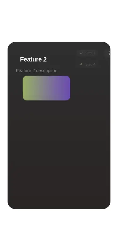
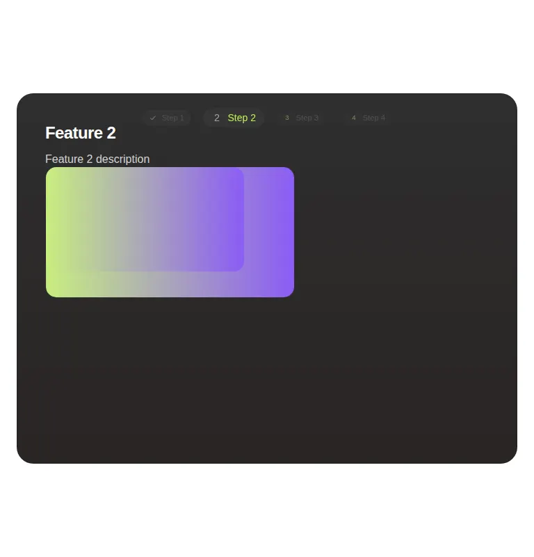
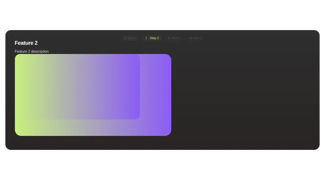
Measured
Every value below was written by the harness on the run that produced the frames above. None of it is derived from the prose.
| Build | OK |
|---|---|
| Mount | OK |
| Console errors | 0 |
| Uncaught page errors | 0 |
| Horizontal overflow | clean at 375, 768, 1440 |
| Axe critical | 0 |
| Axe serious | 0 |
| Axe moderate | 0 |
| Axe minor | 0 |
| Gzip marginal | 78.7 KB (144.1 KB build, 65.4 KB baseline) |
| Bare mode | FAIL |
| Provider required | NO |
| Demo used | written from the component source API |
What the harness recorded
BARE BUILD
✗ Build failed in 50.43s
error during build:
[vite:load-fallback] Could not load <sandbox>/src/lib/utils (imported by src/cut/components/ui/feature-carousel.tsx): ENOENT: no such file or directory, open '<sandbox>/src/lib/utils'
Verdict
A polished, specialized starting point for a product tour, but not a drop-in general carousel. It needs a shadcn-style setup, and teams should plan to fix the hardcoded copy, final asset, click behavior, and noisy debug logging before production use.
Use it if
- You want an auto-advancing product walkthrough built around layered screenshots.
- Your app already uses Next.js, Tailwind, and shadcn-style path aliases and utilities.
- You are comfortable editing the source to replace the bundled step copy and final asset.
Skip it if
- You need slide content to come from props, a CMS, or an arbitrary data array.
- You need conventional carousel controls, since the step labels do not select slides and the card advances through a full-cover click target.
- You cannot host the fixed final-step asset or revise the source to use the provided image data.
- You want a lightweight carousel without a substantial animation dependency cost.
Install
| Declared dependencies | motion, react-wrap-balancer |
|---|---|
| Missing on install | none |
| Bare install | fails once the shadcn-style helpers are removed, so it needs that setup |
| Provider | no provider required in the harness |
In a non-shadcn project, add Motion, react-wrap-balancer, clsx, Next Image support or an equivalent image adapter, Tailwind with the referenced theme utilities, an alias-backed cn helper, the animated-cards global CSS rule, and the final-step image asset.
Source and credit
This page is a review, not a copy. The component source lives with its author and this site does not republish it. Read the license before you use anything.
Author repository
github.com/nolly-studio/cult-uiAlternatives
Other published entries for the carousel pattern, ordered by what they measured: mounts first, then clean axe scans, then bare-mode passes, then the smaller bundle.
- neobrutalism-marqueebrutalism
- Renders
- YES
- A11y
- 0
- Gzip
- 17.3KB
- Bare
- pass
- Prov
- NO
- kibo-deckminimal-flat
- Renders
- YES
- A11y
- 0
- Gzip
- 71.9KB
- Bare
- pass
- Prov
- NO
- ruixen-card-stack3d
- Renders
- YES
- A11y
- 0
- Gzip
- 84.0KB
- Bare
- pass
- Prov
- NO
- magicui-marqueeunclassified
- Renders
- YES
- A11y
- 0
- Gzip
- 11.9KB
- Bare
- fail
- Prov
- NO
- ruixen-auto-scrolling-client-carouselunclassified
- Renders
- YES
- A11y
- 0
- Gzip
- 27.2KB
- Bare
- fail
- Prov
- NO
- ruixen-coverflow-carousel3d
- Renders
- YES
- A11y
- 0
- Gzip
- 33.2KB
- Bare
- fail
- Prov
- NO