Measured entry
ruixen-coverflow-carousel
A client-side React coverflow for image-led collections, shipped as a shadcn registry component. It implements drag, flick, snapping, looping, keyboard navigation, optional controls, and captions without a carousel library. It uses Tailwind classes, lucide-react icons, ResizeObserver, animation frames, and the shadcn-style cn utility backed by clsx and tailwind-merge.
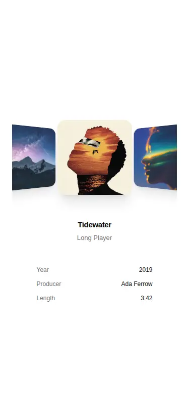
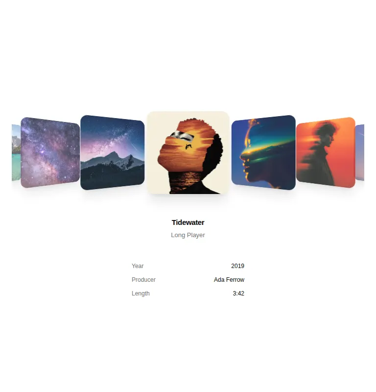
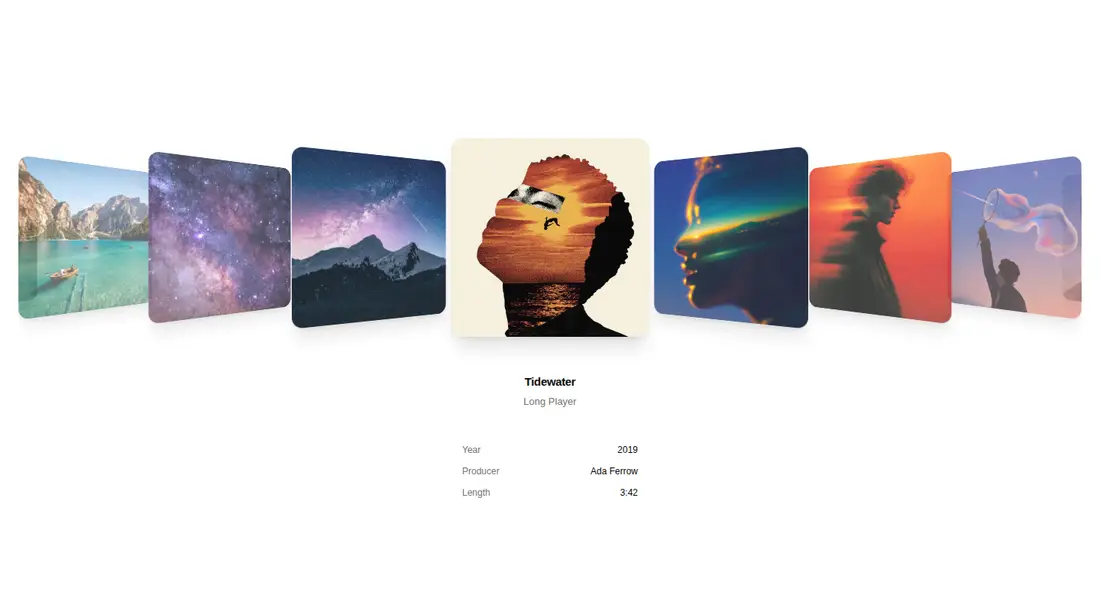
Measured
Every value below was written by the harness on the run that produced the frames above. None of it is derived from the prose.
| Build | OK |
|---|---|
| Mount | OK |
| Console errors | 0 |
| Uncaught page errors | 0 |
| Horizontal overflow | clean at 375, 768, 1440 |
| Axe critical | 0 |
| Axe serious | 0 |
| Axe moderate | 0 |
| Axe minor | 0 |
| Gzip marginal | 33.2 KB (98.9 KB build, 65.7 KB baseline) |
| Bare mode | FAIL |
| Provider required | NO |
| Demo used | written from the component source API |
What the harness recorded
BARE BUILD
✗ Build failed in 2m 17s
error during build:
[vite:load-fallback] Could not load <sandbox>/src/lib/utils (imported by src/cut/components/ruixen/coverflow-carousel.tsx): ENOENT: no such file or directory, open '<sandbox>/src/lib/utils'
Verdict
A solid choice for an image-first showcase when the coverflow treatment fits the content. It builds, mounts, stays within its viewport, and exposes useful controls, but it needs a shadcn-style setup before it works unchanged because the source imports the shared cn helper through an app alias.
Use it if
- You need a tactile, perspective-based carousel for albums, portfolios, products, or editorial covers.
- Your React app already uses Tailwind and can supply image URLs, alt text, and optional caption metadata.
- You want built-in pointer dragging and keyboard navigation without adopting a full carousel package.
Skip it if
- Your interface needs a conventional flat slider whose adjacent items remain easy to scan and compare.
- You need a server-only component or must avoid browser APIs such as ResizeObserver and animation frames.
- Your motion policy requires reduced-motion behavior out of the box; this component does not implement that preference.
- You cannot accommodate Tailwind utilities, the lucide icon package, or a local class-name merge helper.
Install
| Declared dependencies | clsx, tailwind-merge |
|---|---|
| Missing on install | none |
| Bare install | fails once the shadcn-style helpers are removed, so it needs that setup |
| Provider | no provider required in the harness |
In a non-shadcn project, add Tailwind, lucide-react, clsx, and tailwind-merge; create a cn class-merging helper; then either configure the @ alias to resolve your source root or replace the utility import with a valid relative path. Keep the component on the client side. No context provider is required.
Source and credit
This page is a review, not a copy. The component source lives with its author and this site does not republish it. Read the license before you use anything.
Author repository
github.com/ruixenui/ruixen.comAlternatives
Other published entries for the carousel pattern, ordered by what they measured: mounts first, then clean axe scans, then bare-mode passes, then the smaller bundle.
- neobrutalism-marqueebrutalism
- Renders
- YES
- A11y
- 0
- Gzip
- 17.3KB
- Bare
- pass
- Prov
- NO
- kibo-deckminimal-flat
- Renders
- YES
- A11y
- 0
- Gzip
- 71.9KB
- Bare
- pass
- Prov
- NO
- ruixen-card-stack3d
- Renders
- YES
- A11y
- 0
- Gzip
- 84.0KB
- Bare
- pass
- Prov
- NO
- magicui-marqueeunclassified
- Renders
- YES
- A11y
- 0
- Gzip
- 11.9KB
- Bare
- fail
- Prov
- NO
- ruixen-auto-scrolling-client-carouselunclassified
- Renders
- YES
- A11y
- 0
- Gzip
- 27.2KB
- Bare
- fail
- Prov
- NO
- shadcn-carouselunclassified
- Renders
- YES
- A11y
- 0
- Gzip
- 40.7KB
- Bare
- fail
- Prov
- NO