Measured entry
ruixen-card-stack
A client-side React carousel that fans image cards into a layered depth effect. It ships as a shadcn registry component and supports drag gestures, arrow keys, autoplay, hover pause, dots, reduced motion, and custom card rendering. It uses Tailwind classes, Next.js Link, Motion, and Lucide React.
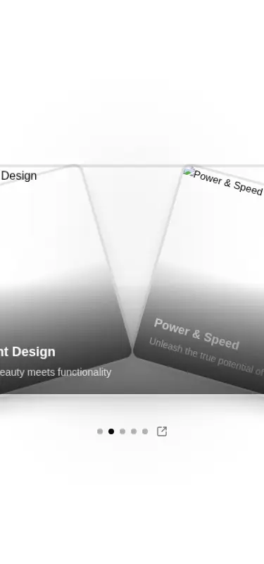
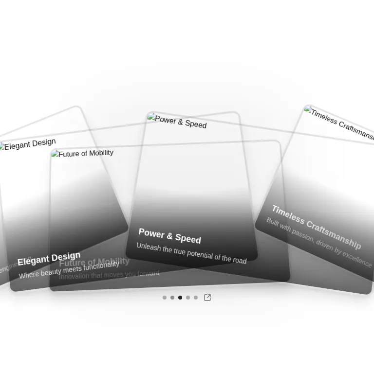
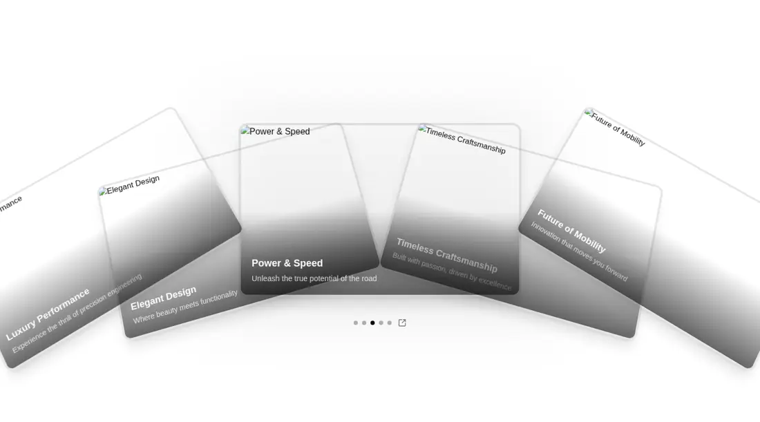
Measured
Every value below was written by the harness on the run that produced the frames above. None of it is derived from the prose.
| Build | OK |
|---|---|
| Mount | OK |
| Console errors | 5 |
| Uncaught page errors | 0 |
| Horizontal overflow | flagged at 375, 768, 1440 |
| Axe critical | 0 |
| Axe serious | 0 |
| Axe moderate | 0 |
| Axe minor | 0 |
| Gzip marginal | 84.0 KB (149.5 KB build, 65.5 KB baseline) |
| Bare mode | OK |
| Provider required | NO |
| Demo used | written from the component source API |
What the harness recorded
CONSOLE
Failed to load resource: the server responded with a status of 404 (Not Found)
CONSOLE
Failed to load resource: the server responded with a status of 404 (Not Found)
CONSOLE
Failed to load resource: the server responded with a status of 404 (Not Found)
Verdict
A polished concept with useful controls and sensible reduced-motion behavior, but not a safe drop-in. Its fixed card sizing and fan offsets overflowed every tested viewport. Use it when the depth effect justifies responsive tuning and the added dependency weight.
Use it if
- You want a cinematic card selector where the surrounding items provide visual context.
- Your project already uses Next.js and Tailwind, and adding Motion is acceptable.
- You can tune the exposed card geometry for the exact container where it will appear.
Skip it if
- You need a drop-in responsive carousel that stays within its container without geometry changes.
- You cannot accept the added animation-library weight for a single carousel.
- Your interaction standard requires every clickable card to be a native keyboard control.
- You need framework-neutral routing without replacing the built-in Next.js Link.
Install
| Declared dependencies | motion, lucide-react |
|---|---|
| Missing on install | none |
| Bare install | builds and mounts without the shadcn-style helpers |
| Provider | no provider required in the harness |
In a non-shadcn project, add Motion and Lucide React, provide Tailwind with the referenced theme utilities, and place the file behind a client boundary. Use Next.js for the bundled Link component or replace it with your router or an anchor. Supply valid image assets and tune the card geometry to prevent horizontal overflow.
Source and credit
This page is a review, not a copy. The component source lives with its author and this site does not republish it. Read the license before you use anything.
Author repository
github.com/ruixenui/ruixen.comAlternatives
Other published entries for the carousel pattern, ordered by what they measured: mounts first, then clean axe scans, then bare-mode passes, then the smaller bundle.
- neobrutalism-marqueebrutalism
- Renders
- YES
- A11y
- 0
- Gzip
- 17.3KB
- Bare
- pass
- Prov
- NO
- kibo-deckminimal-flat
- Renders
- YES
- A11y
- 0
- Gzip
- 71.9KB
- Bare
- pass
- Prov
- NO
- magicui-marqueeunclassified
- Renders
- YES
- A11y
- 0
- Gzip
- 11.9KB
- Bare
- fail
- Prov
- NO
- ruixen-auto-scrolling-client-carouselunclassified
- Renders
- YES
- A11y
- 0
- Gzip
- 27.2KB
- Bare
- fail
- Prov
- NO
- ruixen-coverflow-carousel3d
- Renders
- YES
- A11y
- 0
- Gzip
- 33.2KB
- Bare
- fail
- Prov
- NO
- shadcn-carouselunclassified
- Renders
- YES
- A11y
- 0
- Gzip
- 40.7KB
- Bare
- fail
- Prov
- NO