Measured entry
cultui-floating-panel
cardglassmorphismmotion on file
A copy-in, client-side React floating note panel that expands from its trigger with spring animation and a blurred backdrop. It ships as a shadcn registry component built from context and composable form parts, and relies on Motion, Lucide icons, Tailwind utility classes, and the usual cn helper alias.
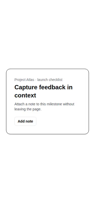
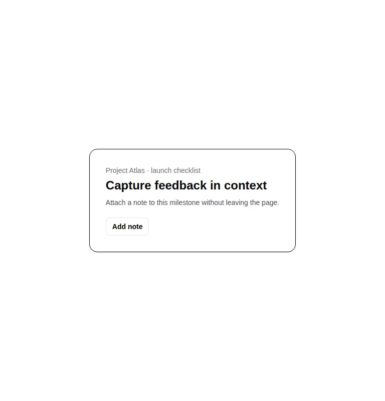
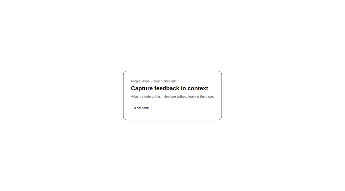
Measured
Every value below was written by the harness on the run that produced the frames above. None of it is derived from the prose.
| Build | OK |
|---|---|
| Mount | OK |
| Console errors | 0 |
| Uncaught page errors | 0 |
| Horizontal overflow | clean at 375, 768, 1440 |
| Axe critical | 0 |
| Axe serious | 0 |
| Axe moderate | 0 |
| Axe minor | 0 |
| Gzip marginal | 70.7 KB (136.1 KB build, 65.4 KB baseline) |
| Bare mode | FAIL |
| Provider required | NO |
| Demo used | written from the component source API |
What the harness recorded
BARE BUILD
✗ Build failed in 26.41s
error during build:
[vite:load-fallback] Could not load <sandbox>/src/lib/utils (imported by src/cut/components/ui/floating-panel.tsx): ENOENT: no such file or directory, open '<sandbox>/src/lib/utils'
Verdict
A polished copy-in option for contextual note capture, with clean composition and a verified working demo. It needs a shadcn-style setup to build and mount as supplied. Budget time for stronger dialog focus behavior and collision-aware placement before treating it as a general-purpose popover.
Use it if
- You need a compact, animated note or feedback form that opens beside its trigger.
- Your app already uses shadcn conventions, Tailwind utilities, and Motion.
- You want composable trigger, header, body, footer, textarea, and action primitives that remain easy to restyle.
Skip it if
- You need production-grade dialog focus trapping, focus restoration, or fully accurate expanded-state signaling without extending the component.
- The panel must avoid viewport edges or reposition itself around nearby boundaries.
- You want to avoid the added client weight of Motion for a small form interaction.
- Your design system does not use Tailwind utilities or shadcn path aliases and you do not want to adapt the source.
Install
| Declared dependencies | motion |
|---|---|
| Missing on install | none |
| Bare install | fails once the shadcn-style helpers are removed, so it needs that setup |
| Provider | no provider required in the harness |
In a non-shadcn project, add Motion and Lucide React, provide React client-component support, configure Tailwind for the included utility classes, and create or replace the cn class-merging helper and its path alias. If your stack lacks aliases, change that import to a local relative path.
Source and credit
This page is a review, not a copy. The component source lives with its author and this site does not republish it. Read the license before you use anything.
Author repository
github.com/nolly-studio/cult-uiAlternatives
Other published entries for the card pattern, ordered by what they measured: mounts first, then clean axe scans, then bare-mode passes, then the smaller bundle.
- tailark-veil-content-1minimal-flat
- Renders
- YES
- A11y
- 0
- Gzip
- 17.6KB
- Bare
- pass
- Prov
- NO
- tailark-veil-content-2minimal-flat
- Renders
- YES
- A11y
- 0
- Gzip
- 17.6KB
- Bare
- pass
- Prov
- NO
- tailark-mist-content-3minimal-flat
- Renders
- YES
- A11y
- 0
- Gzip
- 24.1KB
- Bare
- pass
- Prov
- NO
- neobrutalism-cardbrutalism
- Renders
- YES
- A11y
- 0
- Gzip
- 29.6KB
- Bare
- pass
- Prov
- NO
- neobrutalism-ncardbrutalism
- Renders
- YES
- A11y
- 0
- Gzip
- 29.6KB
- Bare
- pass
- Prov
- NO
- reui-icon-stackminimal-flat
- Renders
- YES
- A11y
- 0
- Gzip
- 30.1KB
- Bare
- pass
- Prov
- NO