Measured entry
eldora-holographic-card
hover-effect3dmotion on file
A client-side React card that tilts toward the pointer and moves a holographic glare over a required image, with optional hover art, vertical labels, and drag behavior. It ships as shadcn registry source rather than a packaged widget, imports Motion for animation, and relies on Tailwind utility classes plus injected and inline styles.
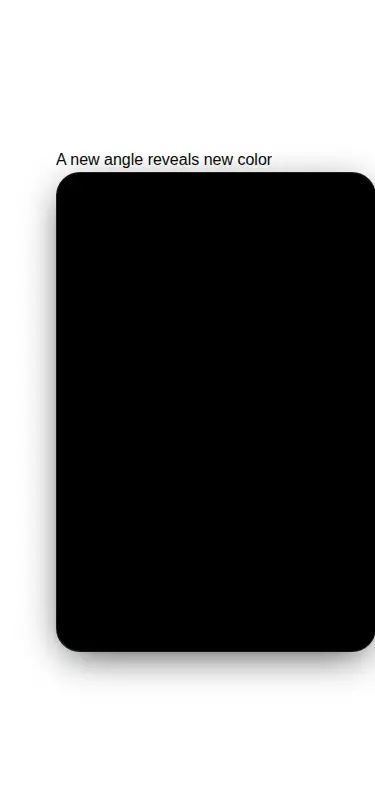
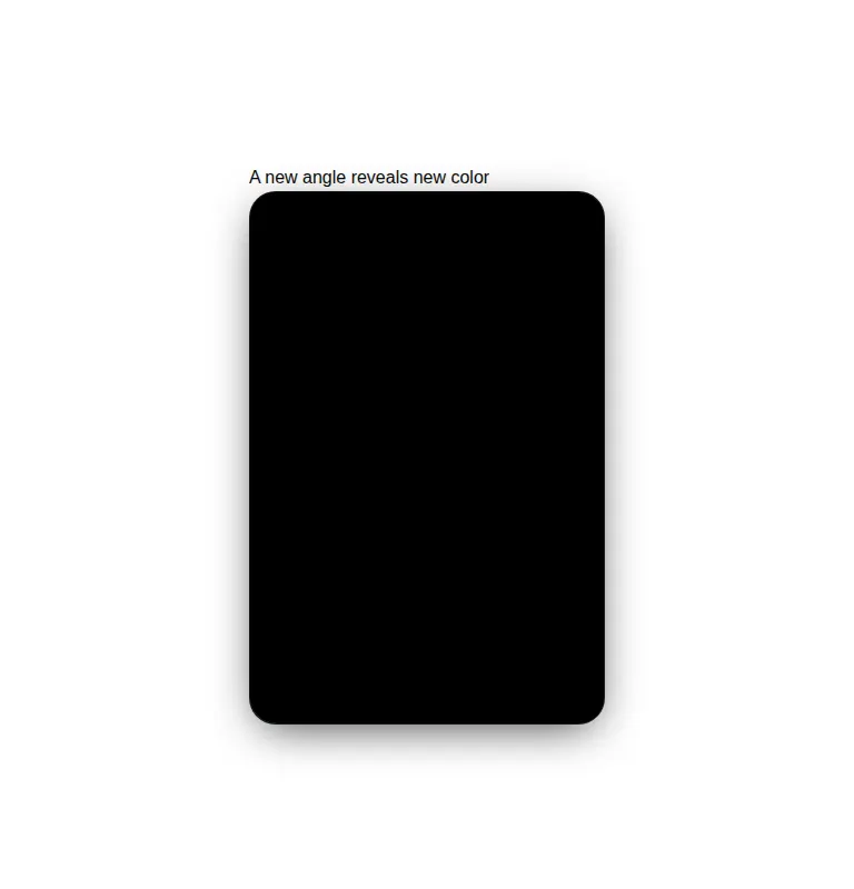
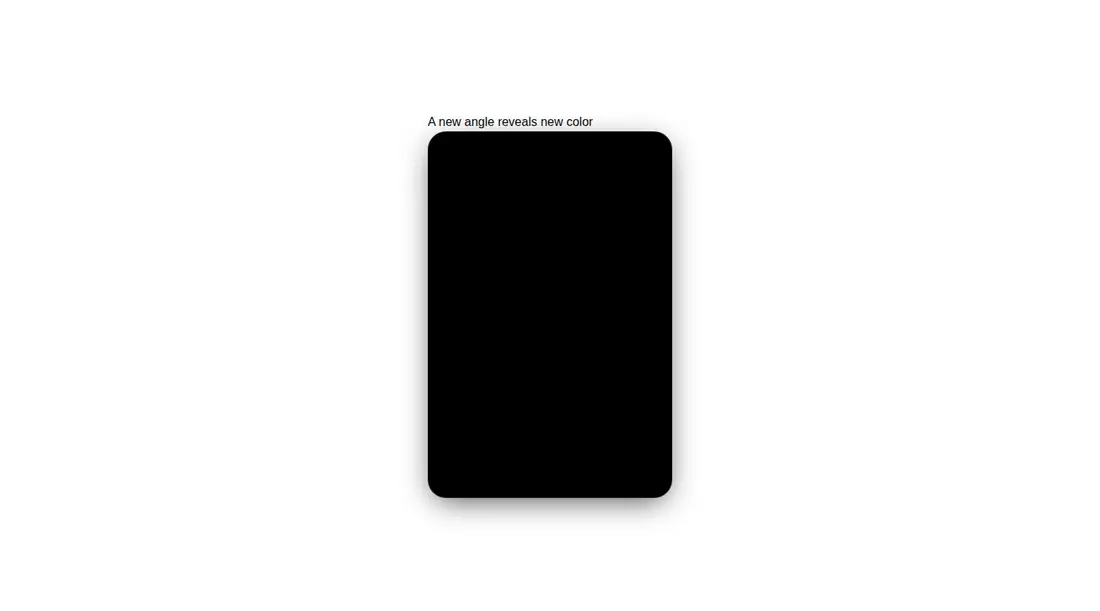
Measured
Every value below was written by the harness on the run that produced the frames above. None of it is derived from the prose.
| Build | OK |
|---|---|
| Mount | OK |
| Console errors | 0 |
| Uncaught page errors | 0 |
| Horizontal overflow | flagged at 375 |
| Axe critical | 0 |
| Axe serious | 0 |
| Axe moderate | 0 |
| Axe minor | 0 |
| Gzip marginal | 60.4 KB (125.8 KB build, 65.4 KB baseline) |
| Bare mode | OK |
| Provider required | NO |
| Demo used | written from the component source API |
Verdict
Use it as a specialized image effect, not a general card primitive. It builds and mounts cleanly in configured and bare React setups, but the supplied demo renders an empty black panel because it omits the required image prop, and the default sizing needs attention in narrow layouts.
Use it if
- You need an image-led collectible, membership, or product card with configurable tilt and hologram effects.
- Your React project already uses Tailwind and can accept Motion as a runtime dependency.
- You can supply the artwork and deliberately tune the card dimensions for each layout.
Skip it if
- You need a fluid card that fits narrow containers without sizing adjustments, since the tested default overflows the mobile layout.
- You need a content-first card with arbitrary children rather than a required image and two constrained text regions.
- The effect must work equally through keyboard, touch, and pointer input, since its main feedback follows mouse movement and hover.
- You are minimizing client-side animation dependencies and do not already ship Motion.
Install
| Declared dependencies | react, motion |
|---|---|
| Missing on install | none |
| Bare install | builds and mounts without the shadcn-style helpers |
| Provider | no provider required in the harness |
In a non-shadcn project, add React and Motion, preserve the client-component boundary, and provide Tailwind utilities or equivalent CSS for positioning, sizing, stacking, blending, and image fit. Copy the source, pass imageSrc, and set responsive dimensions where the fixed default does not fit.
Source and credit
This page is a review, not a copy. The component source lives with its author and this site does not republish it. Read the license before you use anything.
Author repository
github.com/karthikmudunuri/eldorauiAlternatives
Other published entries for the hover-effect pattern, ordered by what they measured: mounts first, then clean axe scans, then bare-mode passes, then the smaller bundle.
- eldora-card-flip-hover3d
- Renders
- YES
- A11y
- 0
- Gzip
- 17.5KB
- Bare
- pass
- Prov
- NO
- uilayouts-btn-hover-left-flip3d
- Renders
- YES
- A11y
- 0
- Gzip
- 17.5KB
- Bare
- pass
- Prov
- NO
- uilayouts-btn-hover-down3d
- Renders
- YES
- A11y
- 0
- Gzip
- 17.6KB
- Bare
- pass
- Prov
- NO
- uilayouts-btn-hover-multiplegradient-glow
- Renders
- YES
- A11y
- 0
- Gzip
- 17.9KB
- Bare
- pass
- Prov
- NO
- magicui-cool-modespatial
- Renders
- YES
- A11y
- 0
- Gzip
- 21.8KB
- Bare
- pass
- Prov
- NO
- uilayouts-hovercard2gradient-glow
- Renders
- YES
- A11y
- 0
- Gzip
- 24.0KB
- Bare
- pass
- Prov
- NO