Measured entry
hextaui-ai-prompt-templates
A client-side React browser for prompt templates, with search, category and favorite filters, selectable cards, variable entry, and prompt preview. It ships as a shadcn registry block and depends on React, Lucide icons, a local cn helper, and local badge, button, card, dialog, field, input-group, and separator primitives backed by Radix.
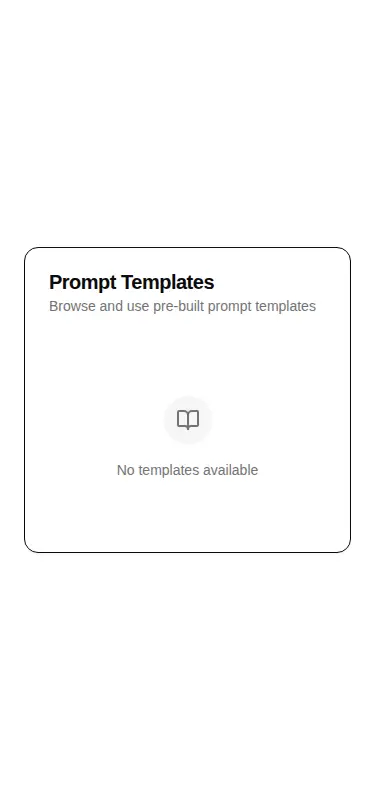
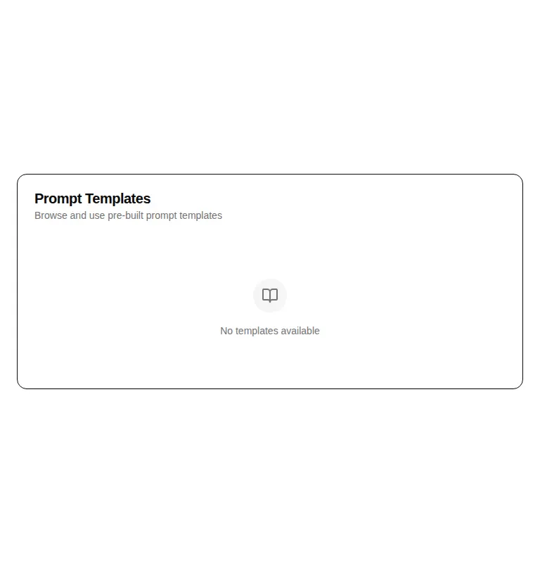
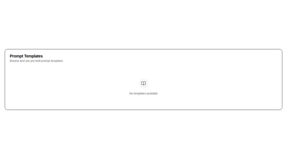
Measured
Every value below was written by the harness on the run that produced the frames above. None of it is derived from the prose.
| Build | OK |
|---|---|
| Mount | OK |
| Console errors | 0 |
| Uncaught page errors | 0 |
| Horizontal overflow | clean at 375, 768, 1440 |
| Axe critical | 0 |
| Axe serious | 0 |
| Axe moderate | 0 |
| Axe minor | 0 |
| Gzip marginal | 50.8 KB (116.2 KB build, 65.4 KB baseline) |
| Bare mode | FAIL |
| Provider required | NO |
| Demo used | written from the component source API |
What the harness recorded
BARE BUILD
✗ Build failed in 1m 36s
error during build:
[vite:load-fallback] Could not load <sandbox>/src/lib/utils (imported by src/cut/blocks/ai/ai-prompt-templates.tsx): ENOENT: no such file or directory, open '<sandbox>/src/lib/utils'
Verdict
A capable front-end shell when your product already owns the prompt data and actions. The configured build and mount are dependable, but it needs a shadcn-style setup before it will build or mount. Also review the global keyboard handlers before placing it in a shortcut-heavy screen.
Use it if
- You need a ready-made catalogue with filtering, favorites, empty states, and keyboard navigation.
- Your prompt objects include variables and you want a configuration dialog with required-field gating and preview.
- You can supply selection, favorite persistence, and creation callbacks from your own application.
Skip it if
- You need a self-contained package that renders without shadcn aliases, theme tokens, or copied UI primitives.
- You want template storage, creation forms, or prompt execution included; this component only presents data and emits callbacks.
- Your page already owns global arrow-key navigation and cannot accommodate this component's window-level shortcuts.
Install
| Declared dependencies | @radix-ui/react-slot, @radix-ui/react-dialog, @radix-ui/react-label, @radix-ui/react-separator |
|---|---|
| Missing on install | none |
| Bare install | fails once the shadcn-style helpers are removed, so it needs that setup |
| Provider | no provider required in the harness |
In a non-shadcn project, add Tailwind theme tokens and path aliases, a cn class-merging helper, Lucide React, the required Radix packages, and compatible local implementations of the imported UI primitives. Map the registry aliases to those files or rewrite the imports.
Source and credit
This page is a review, not a copy. The component source lives with its author and this site does not republish it. Read the license before you use anything.
Author repository
github.com/preetsuthar17/HextaUIAlternatives
Other published entries for the card pattern, ordered by what they measured: mounts first, then clean axe scans, then bare-mode passes, then the smaller bundle.
- tailark-veil-content-1minimal-flat
- Renders
- YES
- A11y
- 0
- Gzip
- 17.6KB
- Bare
- pass
- Prov
- NO
- tailark-veil-content-2minimal-flat
- Renders
- YES
- A11y
- 0
- Gzip
- 17.6KB
- Bare
- pass
- Prov
- NO
- tailark-mist-content-3minimal-flat
- Renders
- YES
- A11y
- 0
- Gzip
- 24.1KB
- Bare
- pass
- Prov
- NO
- neobrutalism-cardbrutalism
- Renders
- YES
- A11y
- 0
- Gzip
- 29.6KB
- Bare
- pass
- Prov
- NO
- neobrutalism-ncardbrutalism
- Renders
- YES
- A11y
- 0
- Gzip
- 29.6KB
- Bare
- pass
- Prov
- NO
- reui-icon-stackminimal-flat
- Renders
- YES
- A11y
- 0
- Gzip
- 30.1KB
- Bare
- pass
- Prov
- NO