Measured entry
hextaui-billing-payment-method
A client-side React card for listing payment methods, choosing a default, and routing add, edit, and delete actions through callbacks. It ships as a shadcn registry item and uses local shadcn card, button, badge, menu, and alert-dialog primitives, plus React state, Lucide icons, Radix, Tailwind classes, and class-name helpers.
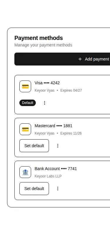
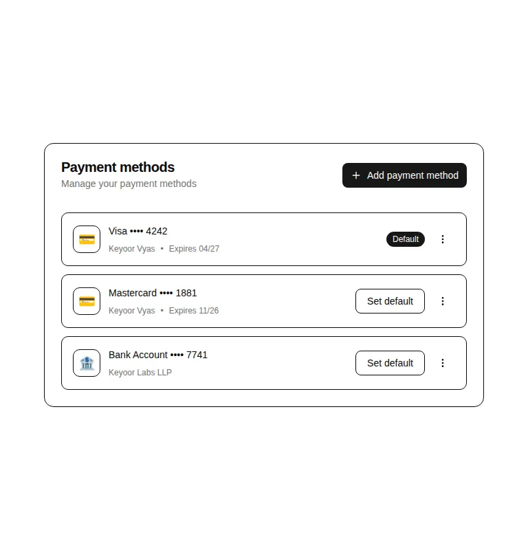
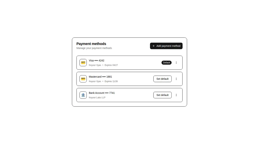
Measured
Every value below was written by the harness on the run that produced the frames above. None of it is derived from the prose.
| Build | OK |
|---|---|
| Mount | OK |
| Console errors | 0 |
| Uncaught page errors | 0 |
| Horizontal overflow | flagged at 375 |
| Axe critical | 0 |
| Axe serious | 0 |
| Axe moderate | 0 |
| Axe minor | 0 |
| Gzip marginal | 66.0 KB (131.5 KB build, 65.5 KB baseline) |
| Bare mode | FAIL |
| Provider required | NO |
| Demo used | written from the component source API |
What the harness recorded
BARE BUILD
✗ Build failed in 966ms
error during build:
[vite]: Rollup failed to resolve import "lucide-react" from "<sandbox>re-d3c6087a5938/src/cut/blocks/billing/billing-payment-method.tsx".
Verdict
A solid settings-page shell when the host app already handles payment logic, with clear actions and a sensible delete safeguard. It needs a shadcn-style setup to build and mount, and narrow mobile use needs layout repair before release.
Use it if
- You need a ready-made billing settings panel for cards and bank accounts.
- Your application already owns the payment APIs and only needs callback hooks for each action.
- Your design system already follows shadcn conventions and Tailwind theme tokens.
- You want deletion guarded by a confirmation dialog and support for an empty state.
Skip it if
- The panel must fit narrow mobile layouts without additional responsive work.
- You need real card-network logos rather than the same generic symbol for every card brand.
- You need billing addresses displayed or edited because the component accepts that data but does not render it.
- You want payment mutations, validation, or forms included instead of supplying all behavior through callbacks.
Install
| Declared dependencies | @radix-ui/react-alert-dialog, @radix-ui/react-slot, @radix-ui/react-dropdown-menu, clsx, tailwind-merge |
|---|---|
| Missing on install | none |
| Bare install | fails once the shadcn-style helpers are removed, so it needs that setup |
| Provider | no provider required in the harness |
In a non-shadcn project, add the copied card, button, badge, dropdown-menu, and alert-dialog primitives; configure the expected import aliases, Tailwind theme tokens, and class-name utility; and install React, lucide-react, the required Radix packages, clsx, and tailwind-merge. Preserve client-component support in frameworks that distinguish server and client modules.
Source and credit
This page is a review, not a copy. The component source lives with its author and this site does not republish it. Read the license before you use anything.
Author repository
github.com/preetsuthar17/HextaUIAlternatives
Other published entries for the card pattern, ordered by what they measured: mounts first, then clean axe scans, then bare-mode passes, then the smaller bundle.
- tailark-veil-content-1minimal-flat
- Renders
- YES
- A11y
- 0
- Gzip
- 17.6KB
- Bare
- pass
- Prov
- NO
- tailark-veil-content-2minimal-flat
- Renders
- YES
- A11y
- 0
- Gzip
- 17.6KB
- Bare
- pass
- Prov
- NO
- tailark-mist-content-3minimal-flat
- Renders
- YES
- A11y
- 0
- Gzip
- 24.1KB
- Bare
- pass
- Prov
- NO
- neobrutalism-cardbrutalism
- Renders
- YES
- A11y
- 0
- Gzip
- 29.6KB
- Bare
- pass
- Prov
- NO
- neobrutalism-ncardbrutalism
- Renders
- YES
- A11y
- 0
- Gzip
- 29.6KB
- Bare
- pass
- Prov
- NO
- reui-icon-stackminimal-flat
- Renders
- YES
- A11y
- 0
- Gzip
- 30.1KB
- Bare
- pass
- Prov
- NO