Measured entry
hextaui-command-menu
A client-side React command-menu dialog shipped as a shadcn registry component. It composes Radix Dialog and Visually Hidden with HextaUI's keyboard-key and scroll-area components, Lucide icons, a Tailwind class merger, and theme-token utility classes. It includes menu state and keyboard navigation, but not command filtering.
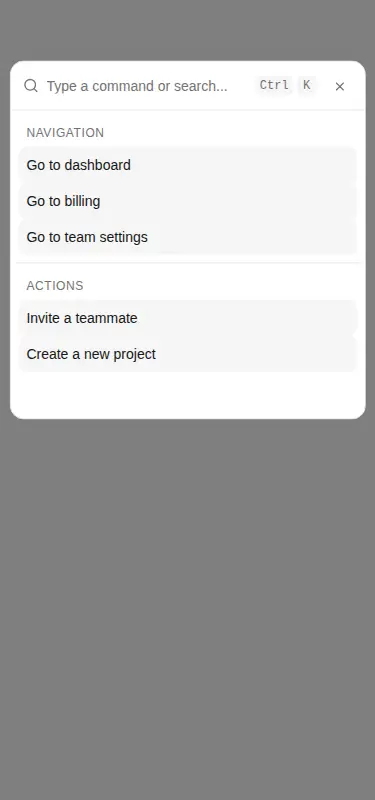
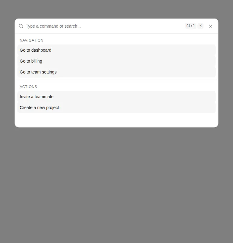
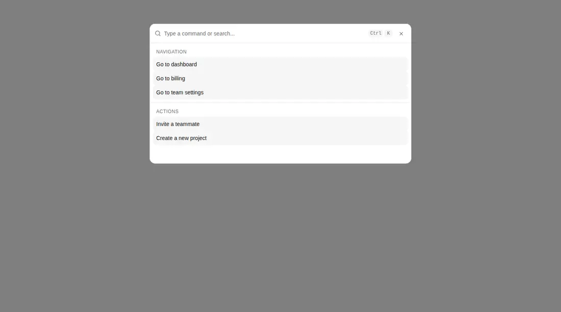
Measured
Every value below was written by the harness on the run that produced the frames above. None of it is derived from the prose.
| Build | OK |
|---|---|
| Mount | OK |
| Console errors | 0 |
| Uncaught page errors | 0 |
| Horizontal overflow | clean at 375, 768, 1440 |
| Axe critical | 0 |
| Axe serious | 0 |
| Axe moderate | 0 |
| Axe minor | 0 |
| Gzip marginal | 49.6 KB (115.1 KB build, 65.5 KB baseline) |
| Bare mode | FAIL |
| Provider required | NO |
| Demo used | written from the component source API |
What the harness recorded
BARE BUILD
✗ Build failed in 697ms
error during build:
[vite]: Rollup failed to resolve import "lucide-react" from "<sandbox>re-dbcb0e1b58c7/src/cut/components/ui/command-menu.tsx".
Verdict
A workable visual shell for a React command palette, with clean mounting and a useful composition API. Treat it as a starting point, not a finished command system: filtering is absent, item indices require careful assignment, and the document-wide keyboard handling needs hardening for complex pages.
Use it if
- You need a modal launcher with grouped actions, shortcuts, and a scrollable list.
- Your React app already uses Tailwind theme tokens and can adopt local registry components.
- You plan to supply item callbacks and implement filtering around the exposed input state.
Skip it if
- You need search to filter commands out of the box; typing only updates internal state.
- You need robust menu semantics and active-item announcements without adding them yourself.
- Your page may host multiple command menus, since keyboard navigation queries command items across the whole document.
- You want a small dependency footprint or a framework-neutral component.
Install
| Declared dependencies | @radix-ui/react-visually-hidden, @radix-ui/react-dialog, @radix-ui/react-scroll-area, clsx, tailwind-merge |
|---|---|
| Missing on install | none |
| Bare install | fails once the shadcn-style helpers are removed, so it needs that setup |
| Provider | no provider required in the harness |
In a non-shadcn project, add React, Tailwind CSS with the referenced color and focus theme tokens, Radix Dialog, Visually Hidden, and Scroll Area, Lucide React, clsx, and tailwind-merge. Provide local cn, keyboard-key, and scroll-area components, then replace the registry import aliases with paths your build resolves.
Source and credit
This page is a review, not a copy. The component source lives with its author and this site does not republish it. Read the license before you use anything.
Author repository
github.com/preetsuthar17/HextaUIAlternatives
Other published entries for the card pattern, ordered by what they measured: mounts first, then clean axe scans, then bare-mode passes, then the smaller bundle.
- tailark-veil-content-1minimal-flat
- Renders
- YES
- A11y
- 0
- Gzip
- 17.6KB
- Bare
- pass
- Prov
- NO
- tailark-veil-content-2minimal-flat
- Renders
- YES
- A11y
- 0
- Gzip
- 17.6KB
- Bare
- pass
- Prov
- NO
- tailark-mist-content-3minimal-flat
- Renders
- YES
- A11y
- 0
- Gzip
- 24.1KB
- Bare
- pass
- Prov
- NO
- neobrutalism-cardbrutalism
- Renders
- YES
- A11y
- 0
- Gzip
- 29.6KB
- Bare
- pass
- Prov
- NO
- neobrutalism-ncardbrutalism
- Renders
- YES
- A11y
- 0
- Gzip
- 29.6KB
- Bare
- pass
- Prov
- NO
- reui-icon-stackminimal-flat
- Renders
- YES
- A11y
- 0
- Gzip
- 30.1KB
- Bare
- pass
- Prov
- NO