Measured entry
hextaui-drawer
sheetminimal-flatmotion on file
A client-side React drawer assembled as a shadcn registry component, with composable trigger, portal, overlay, content, header, footer, title, description, and close exports. It wraps Vaul primitives, uses Tailwind utility classes and a local cn helper, and declares Vaul, Radix Dialog, clsx, and tailwind-merge as dependencies.
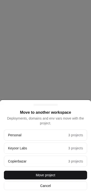
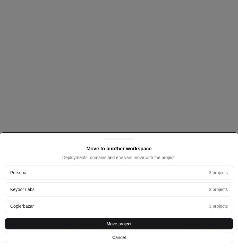
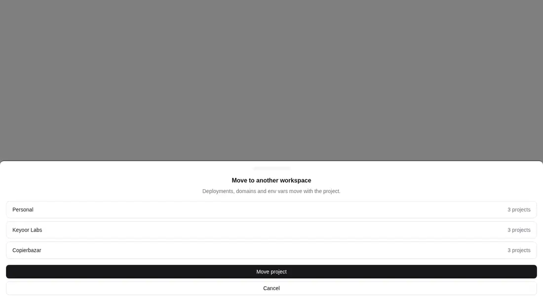
Measured
Every value below was written by the harness on the run that produced the frames above. None of it is derived from the prose.
| Build | OK |
|---|---|
| Mount | OK |
| Console errors | 0 |
| Uncaught page errors | 0 |
| Horizontal overflow | clean at 375, 768, 1440 |
| Axe critical | 0 |
| Axe serious | 0 |
| Axe moderate | 0 |
| Axe minor | 0 |
| Gzip marginal | 51.9 KB (117.4 KB build, 65.5 KB baseline) |
| Bare mode | FAIL |
| Provider required | NO |
| Demo used | written from the component source API |
What the harness recorded
BARE BUILD
spawnSync npx ETIMEDOUT
Verdict
A solid choice for a shadcn-based React interface: the source offers a complete primitive set, responsive edge layouts, and sensible accessibility structure. It built and mounted cleanly in the prepared harness, but the bare check did not mount, so it needs a shadcn-style setup rather than being a drop-in component.
Use it if
- You need a touch-friendly drawer that can enter from any screen edge.
- Your React app already follows shadcn conventions for Tailwind tokens, path aliases, and the cn utility.
- You want separate primitives for accessible titles, descriptions, overlays, portals, and close controls.
- You need motion-reduction styling and constrained scrolling built into the drawer shell.
Skip it if
- You want a dependency-free panel or already use another dialog and drawer primitive library.
- Your project does not use Tailwind and you do not want to translate its utility classes and theme tokens.
- You need a drop-in package that works without shadcn-style aliases, utilities, and global styling.
- A persistent sidebar or non-modal inspector fits the interaction better than an overlay drawer.
Install
| Declared dependencies | vaul, @radix-ui/react-dialog, clsx, tailwind-merge |
|---|---|
| Missing on install | none |
| Bare install | fails once the shadcn-style helpers are removed, so it needs that setup |
| Provider | no provider required in the harness |
In a non-shadcn project, add Vaul, Radix Dialog, clsx, and tailwind-merge; provide a cn helper; replace or configure the path alias; enable Tailwind utilities and animation variants; and define the background, foreground, muted, and border theme tokens used by the component. Keep the file as a client component where that distinction applies.
Source and credit
This page is a review, not a copy. The component source lives with its author and this site does not republish it. Read the license before you use anything.
Author repository
github.com/preetsuthar17/HextaUIAlternatives
Other published entries for the sheet pattern, ordered by what they measured: mounts first, then clean axe scans, then bare-mode passes, then the smaller bundle.
- hextaui-popoverminimal-flat
- Renders
- YES
- A11y
- 0
- Gzip
- 52.9KB
- Bare
- pass
- Prov
- NO
- shadcn-sheetunclassified
- Renders
- YES
- A11y
- 0
- Gzip
- 26.3KB
- Bare
- fail
- Prov
- NO
- neobrutalism-nsheetbrutalism
- Renders
- YES
- A11y
- 0
- Gzip
- 40.5KB
- Bare
- fail
- Prov
- NO
- neobrutalism-sheetbrutalism
- Renders
- YES
- A11y
- 0
- Gzip
- 40.5KB
- Bare
- fail
- Prov
- NO
- 8bitcn-resizableskeuomorphism
- Renders
- YES
- A11y
- 0
- Gzip
- 40.8KB
- Bare
- fail
- Prov
- NO
- 8bitcn-sheetskeuomorphism
- Renders
- YES
- A11y
- 0
- Gzip
- 43.8KB
- Bare
- fail
- Prov
- NO