Measured entry
hextaui-field
A composable React and TypeScript field-layout set for legends, labels, descriptions, separators, grouped controls, and validation messages. It ships as a shadcn registry item and assumes Tailwind classes, a local cn helper, class-variance-authority, plus shadcn Label and Separator components backed by Radix.
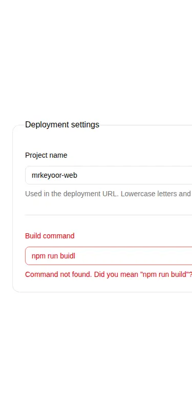
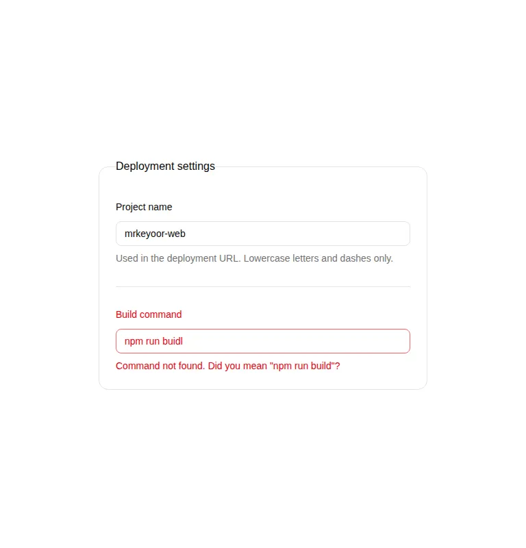
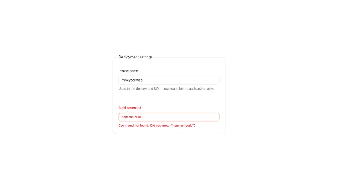
Measured
Every value below was written by the harness on the run that produced the frames above. None of it is derived from the prose.
| Build | OK |
|---|---|
| Mount | OK |
| Console errors | 0 |
| Uncaught page errors | 0 |
| Horizontal overflow | flagged at 375 |
| Axe critical | 1 |
| Axe serious | 0 |
| Axe moderate | 0 |
| Axe minor | 0 |
| Gzip marginal | 33.7 KB (99.2 KB build, 65.5 KB baseline) |
| Bare mode | FAIL |
| Provider required | NO |
| Demo used | written from the component source API |
What the harness recorded
BARE BUILD
spawnSync npx ETIMEDOUT
Verdict
A useful field-composition layer for an existing shadcn codebase, with flexible layouts and practical error rendering. It needs a shadcn-style setup, and teams should fix the ARIA issue and narrow-screen demo wrapper before shipping it unchanged.
Use it if
- You already use shadcn conventions and want a consistent structure around mixed form controls.
- You need vertical, horizontal, or container-responsive field arrangements without adopting a full form library.
- You want validation text that can accept either custom content or a deduplicated list of form errors.
Skip it if
- Your project does not use Tailwind or shadcn-style aliases and you do not want to recreate that infrastructure.
- You need a component that passes an accessibility audit unchanged, since the current implementation triggers an unsupported ARIA attribute finding.
- You need the supplied card example to fit narrow screens without adjusting its fixed-width wrapper.
Install
| Declared dependencies | @radix-ui/react-label, @radix-ui/react-separator, clsx, tailwind-merge |
|---|---|
| Missing on install | none |
| Bare install | fails once the shadcn-style helpers are removed, so it needs that setup |
| Provider | no provider required in the harness |
In a non-shadcn project, add React, Tailwind CSS, class-variance-authority, clsx, tailwind-merge, the Radix label and separator packages, a compatible cn utility, path-alias support, and local Label and Separator wrappers. Ensure your Tailwind setup recognizes the container-query, data-attribute, and relational selector classes used here.
Source and credit
This page is a review, not a copy. The component source lives with its author and this site does not republish it. Read the license before you use anything.
Author repository
github.com/preetsuthar17/HextaUIAlternatives
Other published entries for the card pattern, ordered by what they measured: mounts first, then clean axe scans, then bare-mode passes, then the smaller bundle.
- tailark-veil-content-1minimal-flat
- Renders
- YES
- A11y
- 0
- Gzip
- 17.6KB
- Bare
- pass
- Prov
- NO
- tailark-veil-content-2minimal-flat
- Renders
- YES
- A11y
- 0
- Gzip
- 17.6KB
- Bare
- pass
- Prov
- NO
- tailark-mist-content-3minimal-flat
- Renders
- YES
- A11y
- 0
- Gzip
- 24.1KB
- Bare
- pass
- Prov
- NO
- neobrutalism-cardbrutalism
- Renders
- YES
- A11y
- 0
- Gzip
- 29.6KB
- Bare
- pass
- Prov
- NO
- neobrutalism-ncardbrutalism
- Renders
- YES
- A11y
- 0
- Gzip
- 29.6KB
- Bare
- pass
- Prov
- NO
- reui-icon-stackminimal-flat
- Renders
- YES
- A11y
- 0
- Gzip
- 30.1KB
- Bare
- pass
- Prov
- NO