Measured entry
hextaui-sheet
sheetminimal-flatmotion on file
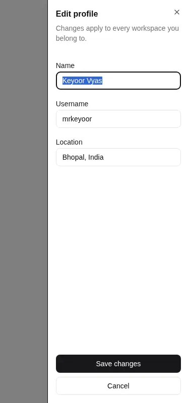
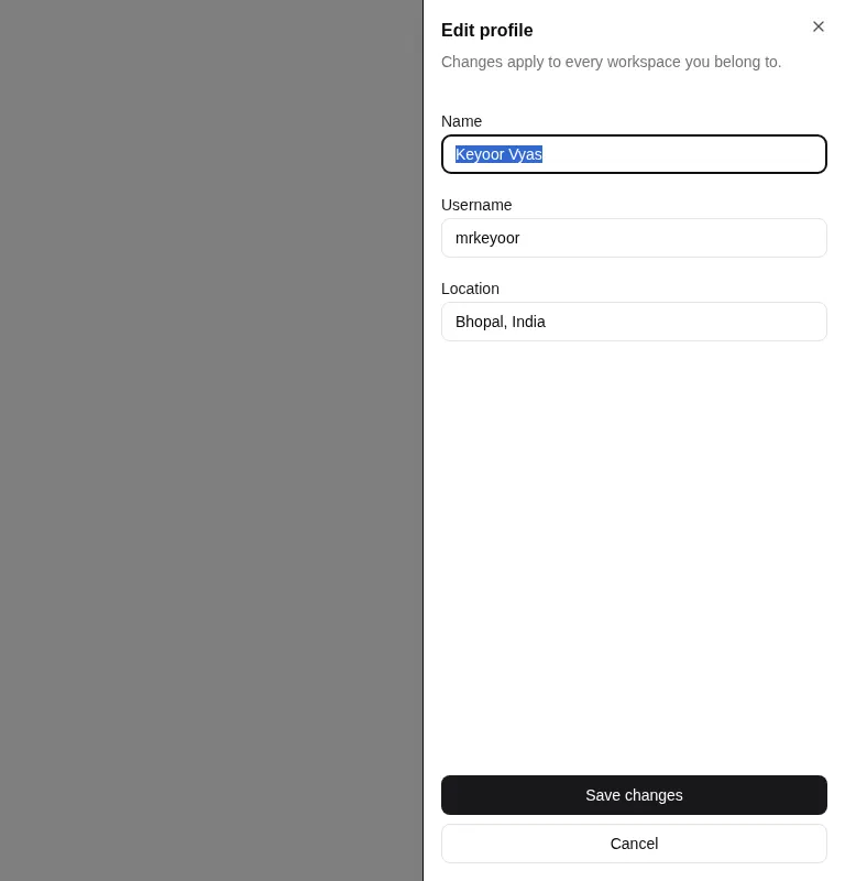
A client-side edge sheet built on Radix Dialog, with an overlay, close control, structured header and footer, and placement from any edge. It ships as copy-in registry source rather than a packaged widget, and relies on Tailwind utility classes, Lucide React, and a shadcn-style cn helper backed by clsx and tailwind-merge.

Measured
Every value below was written by the harness on the run that produced the frames above. None of it is derived from the prose.
| Build | OK |
|---|---|
| Mount | OK |
| Console errors | 0 |
| Uncaught page errors | 0 |
| Horizontal overflow | clean at 375, 768, 1440 |
| Axe critical | 0 |
| Axe serious | 0 |
| Axe moderate | 0 |
| Axe minor | 0 |
| Gzip marginal | 43.8 KB (109.3 KB build, 65.5 KB baseline) |
| Bare mode | FAIL |
| Provider required | NO |
| Demo used | written from the component source API |
What the harness recorded
BARE BUILD
✗ Build failed in 914ms
error during build:
[vite]: Rollup failed to resolve import "lucide-react" from "<sandbox>re-daf56515b036/src/cut/components/ui/sheet.tsx".
Verdict
A dependable, conventional sheet for Tailwind and Radix stacks. It built and mounted cleanly, stayed within the tested viewports, and produced no reported accessibility violations. The tradeoff is meaningful dependency and styling machinery for a familiar interaction.
Use it if
- You need a modal edit form, settings panel, or compact task flow that enters from a screen edge.
- Your React app already uses Tailwind theme tokens and Radix primitives.
- You want accessible dialog behavior while retaining direct control over the copied component source.
Skip it if
- You need a persistent sidebar rather than a modal surface with an overlay.
- Your design system does not use Tailwind utilities or shadcn-style theme tokens.
- You need swipe, drag, or snap-point interactions, which this component does not provide.
- You want to avoid adding Radix Dialog and Lucide React to a lightweight interface.
Install
| Declared dependencies | @radix-ui/react-dialog, clsx, tailwind-merge |
|---|---|
| Missing on install | none |
| Bare install | fails once the shadcn-style helpers are removed, so it needs that setup |
| Provider | no provider required in the harness |
In a non-shadcn project, add Radix Dialog, Lucide React, clsx, and tailwind-merge; provide a compatible cn helper; map the background, foreground, border, ring, and secondary theme tokens; and include the Tailwind animation utilities used by the open and close states.
Source and credit
This page is a review, not a copy. The component source lives with its author and this site does not republish it. Read the license before you use anything.
Author repository
github.com/preetsuthar17/HextaUIAlternatives
Other published entries for the sheet pattern, ordered by what they measured: mounts first, then clean axe scans, then bare-mode passes, then the smaller bundle.
- hextaui-popoverminimal-flat
- Renders
- YES
- A11y
- 0
- Gzip
- 52.9KB
- Bare
- pass
- Prov
- NO
- shadcn-sheetunclassified
- Renders
- YES
- A11y
- 0
- Gzip
- 26.3KB
- Bare
- fail
- Prov
- NO
- neobrutalism-nsheetbrutalism
- Renders
- YES
- A11y
- 0
- Gzip
- 40.5KB
- Bare
- fail
- Prov
- NO
- neobrutalism-sheetbrutalism
- Renders
- YES
- A11y
- 0
- Gzip
- 40.5KB
- Bare
- fail
- Prov
- NO
- 8bitcn-resizableskeuomorphism
- Renders
- YES
- A11y
- 0
- Gzip
- 40.8KB
- Bare
- fail
- Prov
- NO
- 8bitcn-sheetskeuomorphism
- Renders
- YES
- A11y
- 0
- Gzip
- 43.8KB
- Bare
- fail
- Prov
- NO