Measured entry
kibo-stories
carouselminimal-flatmotion on file
A client-side React stories carousel shipped as a shadcn registry component. It composes image or hover-playing video cards with author, title, and gradient overlay primitives, and relies on the shadcn avatar and carousel components, Tailwind utility classes, Embla, Radix UI, the shared class-name helper, and Lucide icons pulled in by the carousel.
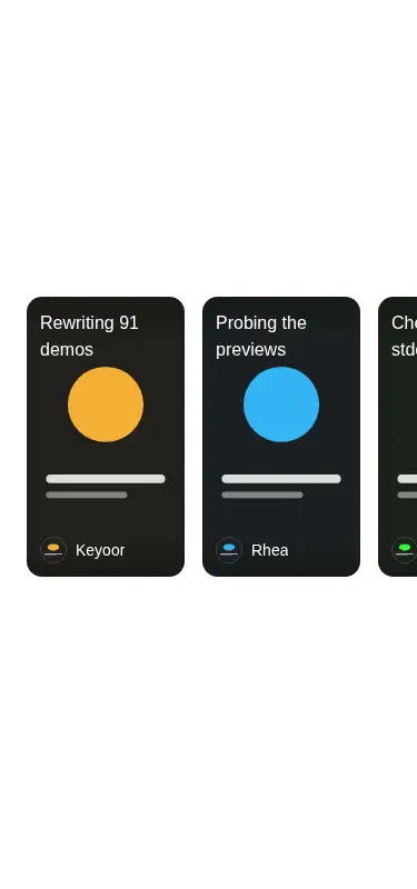
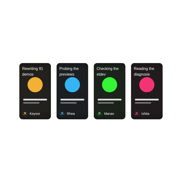
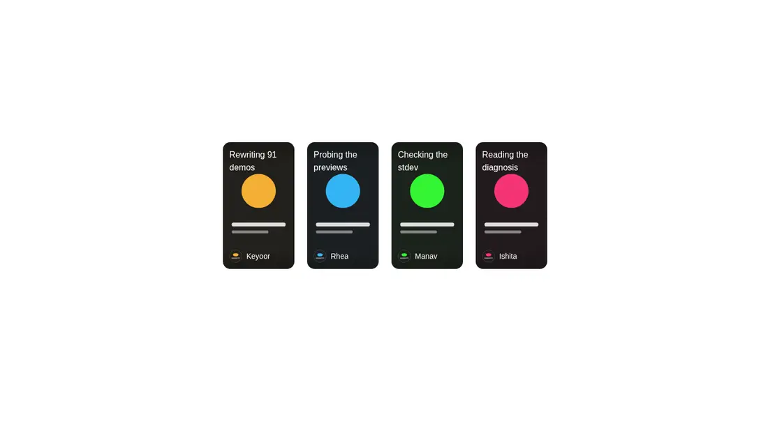
Measured
Every value below was written by the harness on the run that produced the frames above. None of it is derived from the prose.
| Build | OK |
|---|---|
| Mount | OK |
| Console errors | 0 |
| Uncaught page errors | 0 |
| Horizontal overflow | flagged at 375 |
| Axe critical | 0 |
| Axe serious | 0 |
| Axe moderate | 0 |
| Axe minor | 0 |
| Gzip marginal | 42.6 KB (108.1 KB build, 65.5 KB baseline) |
| Bare mode | FAIL |
| Provider required | NO |
| Demo used | written from the component source API |
What the harness recorded
BARE BUILD
✗ Build failed in 863ms
error during build:
[vite]: Rollup failed to resolve import "lucide-react" from "<sandbox>re-9b352472786c/src/components/ui/carousel.tsx".
Verdict
A solid fit for an existing shadcn application that wants a composable story-card rail, but it is only the browsing surface, not a complete stories experience. The bare mount fails, so it needs a shadcn-style setup, and its narrow-screen overflow needs deliberate sizing or containment.
Use it if
- You need a horizontally draggable strip of portrait story cards with optional images or hover-playing videos.
- Your app already uses shadcn conventions and can reuse its avatar, carousel, theme tokens, and utility helper.
- You want composable primitives so each card can arrange its own title, author, media, and overlays.
Skip it if
- Your layout must never overflow a narrow mobile viewport without additional responsive sizing work.
- You need a ready-made story viewer with progress indicators, modal playback, navigation, or viewed-state management.
- You want a dependency-light carousel and do not already carry the shadcn, Embla, Radix UI, and Lucide stack.
Install
| Declared dependencies | radix-ui, embla-carousel-react, clsx, tailwind-merge |
|---|---|
| Missing on install | none |
| Bare install | fails once the shadcn-style helpers are removed, so it needs that setup |
| Provider | no provider required in the harness |
In a non-shadcn project, add Tailwind with the expected theme tokens, the shared class-name utility, path aliases, the shadcn avatar and carousel components, and their Radix UI, Embla, Lucide, clsx, and tailwind-merge dependencies. Also provide client-component support and responsive container rules for narrow screens.
Source and credit
This page is a review, not a copy. The component source lives with its author and this site does not republish it. Read the license before you use anything.
Author repository
github.com/shadcnblocks/kiboAlternatives
Other published entries for the carousel pattern, ordered by what they measured: mounts first, then clean axe scans, then bare-mode passes, then the smaller bundle.
- neobrutalism-marqueebrutalism
- Renders
- YES
- A11y
- 0
- Gzip
- 17.3KB
- Bare
- pass
- Prov
- NO
- kibo-deckminimal-flat
- Renders
- YES
- A11y
- 0
- Gzip
- 71.9KB
- Bare
- pass
- Prov
- NO
- ruixen-card-stack3d
- Renders
- YES
- A11y
- 0
- Gzip
- 84.0KB
- Bare
- pass
- Prov
- NO
- magicui-marqueeunclassified
- Renders
- YES
- A11y
- 0
- Gzip
- 11.9KB
- Bare
- fail
- Prov
- NO
- ruixen-auto-scrolling-client-carouselunclassified
- Renders
- YES
- A11y
- 0
- Gzip
- 27.2KB
- Bare
- fail
- Prov
- NO
- ruixen-coverflow-carousel3d
- Renders
- YES
- A11y
- 0
- Gzip
- 33.2KB
- Bare
- fail
- Prov
- NO