Measured entry
kokonut-apple-activity-card
carddark-futuristicmotion on file
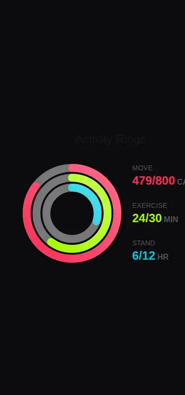
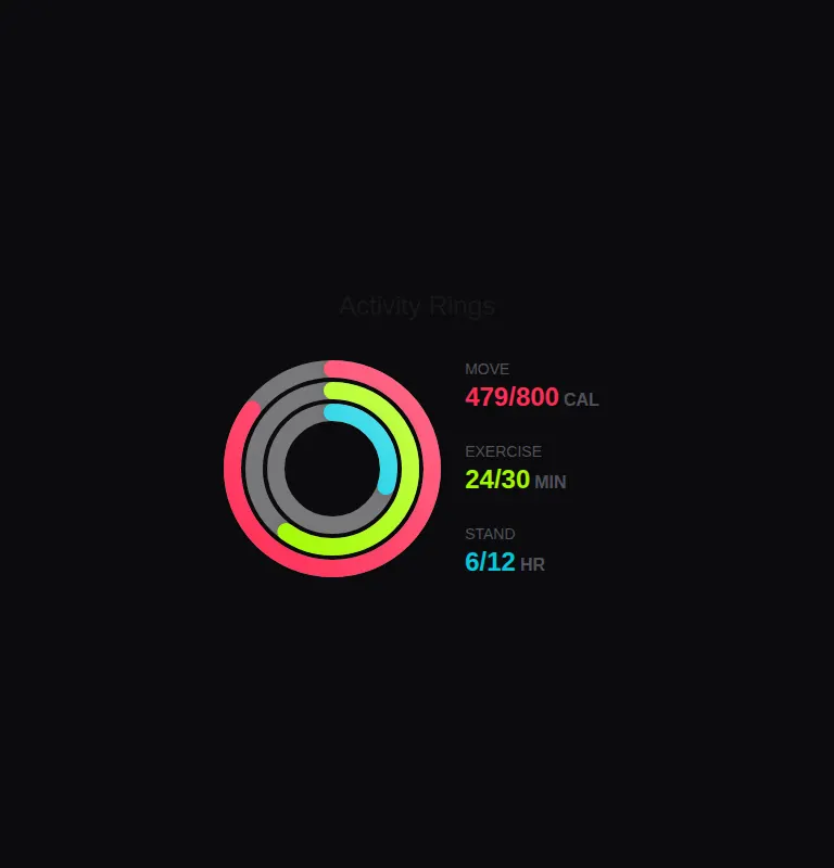
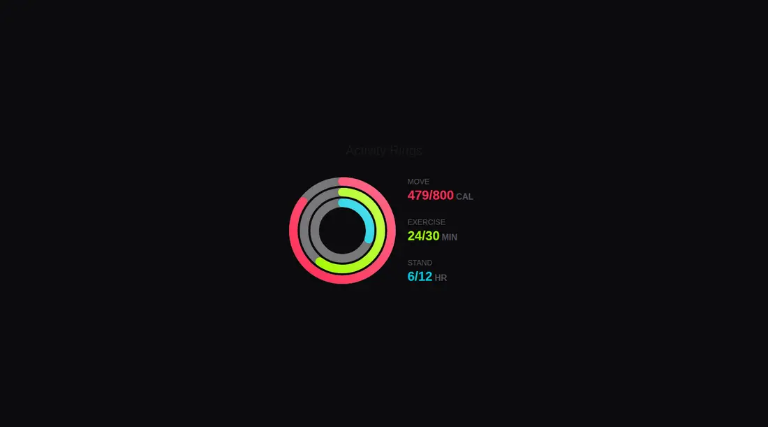
A client-side React activity summary with animated concentric progress rings and a matching metric list. It ships through a shadcn registry and uses Motion, Tailwind utility classes, dark-mode styles, and the conventional aliased cn helper. Its labels, targets, colors, and progress values are fixed in the component source.
Measured
Every value below was written by the harness on the run that produced the frames above. None of it is derived from the prose.
| Build | OK |
|---|---|
| Mount | OK |
| Console errors | 0 |
| Uncaught page errors | 0 |
| Horizontal overflow | flagged at 375 |
| Axe critical | 0 |
| Axe serious | 1 |
| Axe moderate | 0 |
| Axe minor | 0 |
| Gzip marginal | 67.4 KB (132.8 KB build, 65.4 KB baseline) |
| Bare mode | FAIL |
| Provider required | NO |
| Demo used | written from the component source API |
What the harness recorded
BARE BUILD
✗ Build failed in 1m 51s
error during build:
[vite:load-fallback] Could not load <sandbox>/src/lib/utils (imported by src/cut/components/kokonutui/apple-activity-card.tsx): ENOENT: no such file or directory, open '<sandbox>/src/lib/utils'
Verdict
A polished starting point for fitness dashboards, but not drop-in production UI. It needs a shadcn-style setup, responsive changes for narrow screens, contrast corrections, and a real data interface before broad use.
Use it if
- You need an Apple-inspired fitness summary for a dashboard with enough horizontal room for rings and metrics.
- Your React app already uses Tailwind, Motion, and shadcn-style import conventions.
- You are comfortable replacing the bundled activity data with props or application state.
Skip it if
- The card must fit narrow phone layouts without responsive rework, since the metric row clips there.
- You need accessible dark-mode text out of the box, since the muted labels and units fail contrast checks.
- You want a data-driven component ready for reuse without first extracting the hard-coded activity records.
- You do not want to add Motion for a single dashboard card.
Install
| Declared dependencies | motion |
|---|---|
| Missing on install | none |
| Bare install | fails once the shadcn-style helpers are removed, so it needs that setup |
| Provider | no provider required in the harness |
In a non-shadcn project, add Motion and Tailwind, configure the source alias used by the import, provide a cn class-merging helper, and preserve client-side rendering. Then adapt the fixed data to props and add a stacked narrow-screen layout.
Source and credit
This page is a review, not a copy. The component source lives with its author and this site does not republish it. Read the license before you use anything.
Author repository
github.com/kokonut-labs/kokonutuiAlternatives
Other published entries for the card pattern, ordered by what they measured: mounts first, then clean axe scans, then bare-mode passes, then the smaller bundle.
- tailark-veil-content-1minimal-flat
- Renders
- YES
- A11y
- 0
- Gzip
- 17.6KB
- Bare
- pass
- Prov
- NO
- tailark-veil-content-2minimal-flat
- Renders
- YES
- A11y
- 0
- Gzip
- 17.6KB
- Bare
- pass
- Prov
- NO
- tailark-mist-content-3minimal-flat
- Renders
- YES
- A11y
- 0
- Gzip
- 24.1KB
- Bare
- pass
- Prov
- NO
- neobrutalism-cardbrutalism
- Renders
- YES
- A11y
- 0
- Gzip
- 29.6KB
- Bare
- pass
- Prov
- NO
- neobrutalism-ncardbrutalism
- Renders
- YES
- A11y
- 0
- Gzip
- 29.6KB
- Bare
- pass
- Prov
- NO
- reui-icon-stackminimal-flat
- Renders
- YES
- A11y
- 0
- Gzip
- 30.1KB
- Bare
- pass
- Prov
- NO