Measured entry
kokonut-card-stack
carddark-futuristicmotion on file
An interactive product-card stack that expands and collapses on click, with spring motion and reduced-motion support. It ships as a client-side shadcn registry component for Next.js and relies on React, Motion, Next Image, Tailwind utility classes, and a shared cn helper.
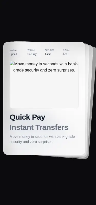
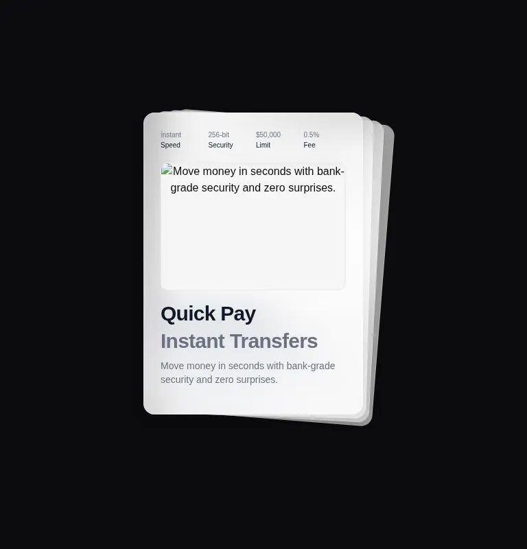
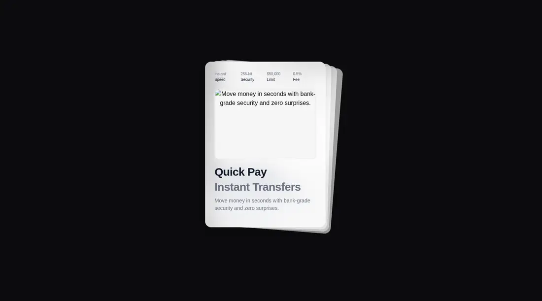
Measured
Every value below was written by the harness on the run that produced the frames above. None of it is derived from the prose.
| Build | OK |
|---|---|
| Mount | OK |
| Console errors | 4 |
| Uncaught page errors | 0 |
| Horizontal overflow | flagged at 375 |
| Axe critical | 0 |
| Axe serious | 0 |
| Axe moderate | 0 |
| Axe minor | 0 |
| Gzip marginal | 78.3 KB (143.7 KB build, 65.4 KB baseline) |
| Bare mode | FAIL |
| Provider required | NO |
| Demo used | written from the component source API |
What the harness recorded
CONSOLE
Failed to load resource: the server responded with a status of 404 (Not Found)
CONSOLE
Failed to load resource: the server responded with a status of 404 (Not Found)
CONSOLE
Failed to load resource: the server responded with a status of 404 (Not Found)
Verdict
A polished interaction concept with sensible reduced-motion handling and a clean accessibility scan, but it is not drop-in. It needs a shadcn-style setup, its mobile spread needs correction, and the supplied image wiring needs attention before production use.
Use it if
- You need a compact, tactile way to preview several product or plan cards in one focal area.
- Your app already uses Next.js, Tailwind, and shadcn-style aliases and utilities.
- You can replace the sample products and image sources with controlled application data and assets.
Skip it if
- Your layout must remain overflow-free on narrow phone screens without responsive rework.
- You need every card's details visible or directly reachable without toggling a layered stack.
- You want a lightweight static card treatment and cannot justify the added animation dependency.
- You cannot replace or correctly configure the demo image sources, which produced failed resource requests in the harness.
Install
| Declared dependencies | motion |
|---|---|
| Missing on install | none |
| Bare install | fails once the shadcn-style helpers are removed, so it needs that setup |
| Provider | no provider required in the harness |
In a non-shadcn project, add Motion and provide React client-component support, Tailwind utilities and dark-mode styles, the cn class-merging helper, and Next Image support or a standard image replacement. Supply the missing local artwork, allow any remote image hosts, and adapt the fixed card geometry for narrow screens.
Source and credit
This page is a review, not a copy. The component source lives with its author and this site does not republish it. Read the license before you use anything.
Author repository
github.com/kokonut-labs/kokonutuiAlternatives
Other published entries for the card pattern, ordered by what they measured: mounts first, then clean axe scans, then bare-mode passes, then the smaller bundle.
- tailark-veil-content-1minimal-flat
- Renders
- YES
- A11y
- 0
- Gzip
- 17.6KB
- Bare
- pass
- Prov
- NO
- tailark-veil-content-2minimal-flat
- Renders
- YES
- A11y
- 0
- Gzip
- 17.6KB
- Bare
- pass
- Prov
- NO
- tailark-mist-content-3minimal-flat
- Renders
- YES
- A11y
- 0
- Gzip
- 24.1KB
- Bare
- pass
- Prov
- NO
- neobrutalism-cardbrutalism
- Renders
- YES
- A11y
- 0
- Gzip
- 29.6KB
- Bare
- pass
- Prov
- NO
- neobrutalism-ncardbrutalism
- Renders
- YES
- A11y
- 0
- Gzip
- 29.6KB
- Bare
- pass
- Prov
- NO
- reui-icon-stackminimal-flat
- Renders
- YES
- A11y
- 0
- Gzip
- 30.1KB
- Bare
- pass
- Prov
- NO