Measured entry
magicui-file-tree
A client-side React file tree that supports nested folders, selection, expansion, sorting, custom icons, and right-to-left layouts. It ships as shadcn registry source and relies on Radix Accordion, Lucide icons, Tailwind styling, a class-name helper, plus local Button and ScrollArea components.
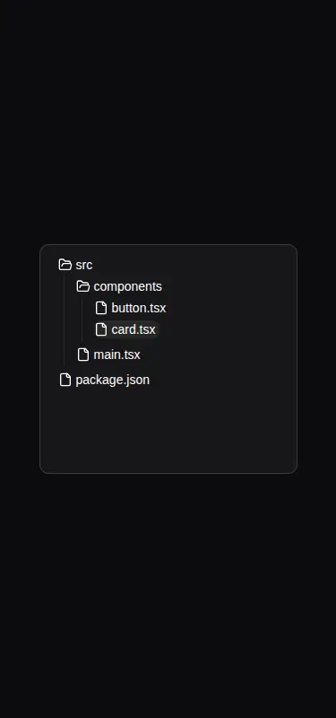
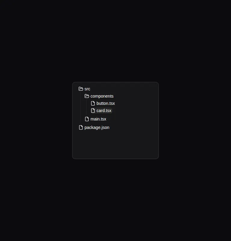

Measured
Every value below was written by the harness on the run that produced the frames above. None of it is derived from the prose.
| Build | OK |
|---|---|
| Mount | OK |
| Console errors | 0 |
| Uncaught page errors | 0 |
| Horizontal overflow | clean at 375, 768, 1440 |
| Axe critical | 0 |
| Axe serious | 0 |
| Axe moderate | 0 |
| Axe minor | 0 |
| Gzip marginal | 45.4 KB (110.9 KB build, 65.5 KB baseline) |
| Bare mode | FAIL |
| Provider required | NO |
| Demo used | written from the component source API |
What the harness recorded
BARE BUILD
✗ Build failed in 845ms
error during build:
[vite]: Rollup failed to resolve import "lucide-react" from "<sandbox>re-5d0db27854ff/src/cut/file-tree.tsx".
Verdict
A capable display and navigation tree for apps already following shadcn conventions. It builds and mounts cleanly in that environment, but it needs a shadcn-style setup; the bare project fails because the source assumes Lucide icons and local UI modules.
Use it if
- You need an expandable directory outline for documentation, project previews, or a compact navigation panel.
- Your app already uses shadcn conventions and can supply the expected utility, button, and scroll-area modules.
- You want either declarative file data or manually composed folder and file nodes, with built-in sorting and selection styling.
Skip it if
- You need a virtualized tree for very large or frequently changing directory data.
- You need file operations such as renaming, dragging, context menus, or multi-selection without substantial extension work.
- You require externally controlled selection and expansion state for routing or application-wide synchronization.
- You want a dependency-light component that can be copied into a plain React project unchanged.
Install
| Declared dependencies | clsx, tailwind-merge, radix-ui |
|---|---|
| Missing on install | none |
| Bare install | fails once the shadcn-style helpers are removed, so it needs that setup |
| Provider | no provider required in the harness |
In a non-shadcn project, add React, Radix Accordion, Lucide React, Tailwind CSS, clsx, and tailwind-merge. Provide the expected class-name helper plus compatible Button and ScrollArea components, and include the accordion animation styles used by the source.
Source and credit
This page is a review, not a copy. The component source lives with its author and this site does not republish it. Read the license before you use anything.
Author repository
github.com/magicuidesign/magicuiAlternatives
Other published entries for the sidebar pattern, ordered by what they measured: mounts first, then clean axe scans, then bare-mode passes, then the smaller bundle.
- shadcn-block-sidebar-13minimal-flat
- Renders
- YES
- A11y
- 0
- Gzip
- 59.4KB
- Bare
- fail
- Prov
- NO
- tripled-animated-sidebar-shadcnuiminimal-flat
- Renders
- YES
- A11y
- 1
- Gzip
- 64.4KB
- Bare
- pass
- Prov
- NO
- shadcn-block-sidebar-14minimal-flat
- Renders
- YES
- A11y
- 2
- Gzip
- 58.4KB
- Bare
- fail
- Prov
- NO
- shadcn-block-sidebar-04minimal-flat
- Renders
- YES
- A11y
- 2
- Gzip
- 58.6KB
- Bare
- fail
- Prov
- NO
- shadcn-block-sidebar-03minimal-flat
- Renders
- YES
- A11y
- 2
- Gzip
- 58.7KB
- Bare
- fail
- Prov
- NO
- shadcn-block-sidebar-06minimal-flat
- Renders
- YES
- A11y
- 2
- Gzip
- 66.7KB
- Bare
- fail
- Prov
- NO