Measured entry
shadcn-block-sidebar-06
A documentation-style application shell with a collapsible sidebar, dropdown submenus, breadcrumb header, content placeholders, and a newsletter card. It ships as a shadcn registry block and composes sidebar, dropdown, breadcrumb, separator, card, button, and input primitives, with Radix UI, class-variance-authority, Lucide React, shared utilities, and theme tokens underneath.

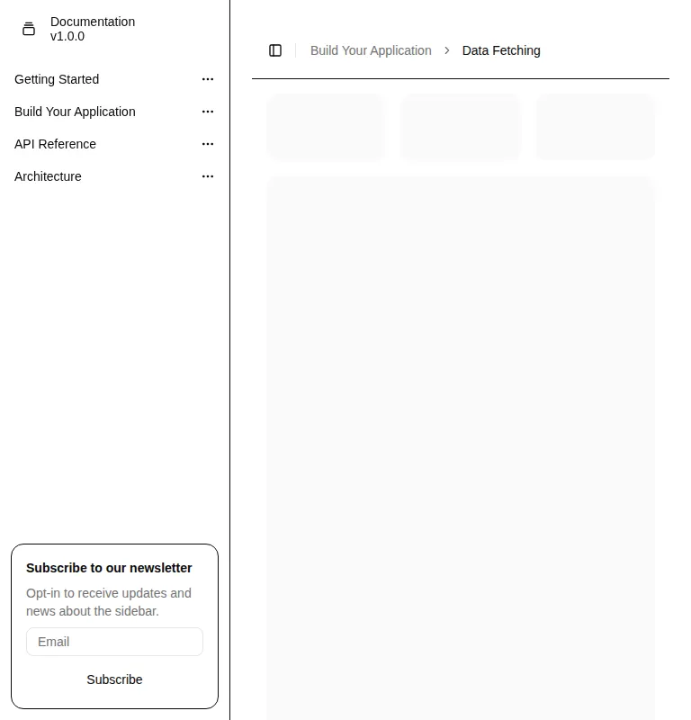
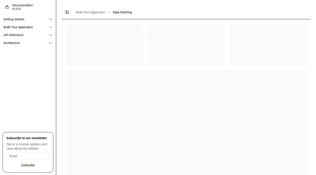
Measured
Every value below was written by the harness on the run that produced the frames above. None of it is derived from the prose.
| Build | OK |
|---|---|
| Mount | OK |
| Console errors | 0 |
| Uncaught page errors | 0 |
| Horizontal overflow | clean at 375, 768, 1440 |
| Axe critical | 0 |
| Axe serious | 0 |
| Axe moderate | 2 |
| Axe minor | 0 |
| Gzip marginal | 66.7 KB (132.1 KB build, 65.4 KB baseline) |
| Bare mode | FAIL |
| Provider required | NO |
| Demo used | none |
What the harness recorded
BARE BUILD
✗ Build failed in 27.33s
error during build:
[vite:load-fallback] Could not load <sandbox>/src/lib/utils (imported by src/components/ui/separator.tsx): ENOENT: no such file or directory, open '<sandbox>/src/lib/utils'
Verdict
A solid starting shell for documentation-heavy products, with responsive behavior and clean runtime results in the configured harness. It needs a shadcn-style setup and does not mount bare. Fix the nested duplicate main landmark and replace the placeholder links and form behavior before shipping.
Use it if
- You need a documentation or dashboard shell whose top-level sections open into dropdown navigation.
- Your app already uses shadcn conventions, path aliases, theme tokens, and the shared sidebar primitives.
- You want a responsive sidebar that becomes mobile-aware without adding a separate navigation implementation.
Skip it if
- You need inline expandable navigation instead of menus that open beside or below the sidebar.
- You want a small standalone menu without importing the broader shadcn sidebar and primitive stack.
- Your page already owns its main landmark and you cannot revise the block's landmark nesting before release.
- You do not want a promotional form embedded in the navigation footer.
Install
| Declared dependencies | radix-ui, class-variance-authority, lucide-react |
|---|---|
| Missing on install | none |
| Bare install | fails once the shadcn-style helpers are removed, so it needs that setup |
| Provider | no provider required in the harness |
In a non-shadcn project, add Radix UI, class-variance-authority, and Lucide React; copy the sidebar, dropdown menu, breadcrumb, separator, card, button, and input primitives; provide the shared class-name utility, import aliases, Tailwind setup, sidebar theme tokens, and any responsive sidebar hooks those primitives use. Wire real routes and the newsletter submission handler.
Source and credit
This page is a review, not a copy. The component source lives with its author and this site does not republish it. Read the license before you use anything.
Author repository
github.com/shadcn-ui/uiAlternatives
Other published entries for the sidebar pattern, ordered by what they measured: mounts first, then clean axe scans, then bare-mode passes, then the smaller bundle.
- magicui-file-treebento
- Renders
- YES
- A11y
- 0
- Gzip
- 45.4KB
- Bare
- fail
- Prov
- NO
- shadcn-block-sidebar-13minimal-flat
- Renders
- YES
- A11y
- 0
- Gzip
- 59.4KB
- Bare
- fail
- Prov
- NO
- tripled-animated-sidebar-shadcnuiminimal-flat
- Renders
- YES
- A11y
- 1
- Gzip
- 64.4KB
- Bare
- pass
- Prov
- NO
- shadcn-block-sidebar-14minimal-flat
- Renders
- YES
- A11y
- 2
- Gzip
- 58.4KB
- Bare
- fail
- Prov
- NO
- shadcn-block-sidebar-04minimal-flat
- Renders
- YES
- A11y
- 2
- Gzip
- 58.6KB
- Bare
- fail
- Prov
- NO
- shadcn-block-sidebar-03minimal-flat
- Renders
- YES
- A11y
- 2
- Gzip
- 58.7KB
- Bare
- fail
- Prov
- NO