Measured entry
shadcn-block-sidebar-13
A React client block that places a settings sidebar inside a controlled dialog, with breadcrumb context and a scrollable content pane. It ships through the shadcn registry and composes the shadcn sidebar, dialog, breadcrumb, and button primitives, backed by Radix UI, class-variance-authority, Lucide icons, Tailwind utilities, and the project utility helper.
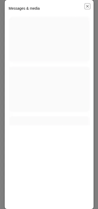
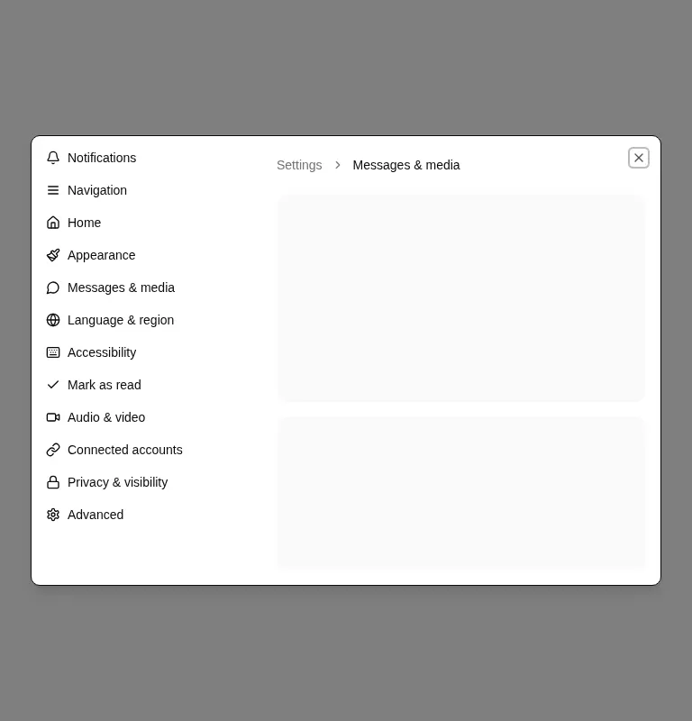
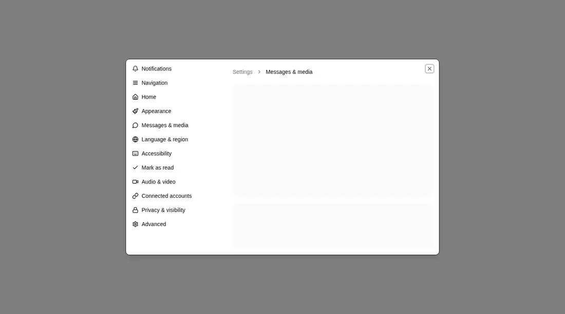
Measured
Every value below was written by the harness on the run that produced the frames above. None of it is derived from the prose.
| Build | OK |
|---|---|
| Mount | OK |
| Console errors | 0 |
| Uncaught page errors | 0 |
| Horizontal overflow | clean at 375, 768, 1440 |
| Axe critical | 0 |
| Axe serious | 0 |
| Axe moderate | 0 |
| Axe minor | 0 |
| Gzip marginal | 59.4 KB (124.8 KB build, 65.4 KB baseline) |
| Bare mode | FAIL |
| Provider required | NO |
| Demo used | none |
What the harness recorded
BARE BUILD
✗ Build failed in 28.70s
error during build:
[vite:load-fallback] Could not load <sandbox>/src/lib/utils (imported by src/components/ui/button.tsx): ENOENT: no such file or directory, open '<sandbox>/src/lib/utils'
Verdict
A credible starting point for desktop-oriented settings in a modal, with clean harness behavior and sensible primitive composition. It needs a shadcn-style setup and does not mount in a bare project; teams must also design mobile category navigation and replace the static demo state.
Use it if
- You need a settings or preferences experience that stays inside a modal rather than taking over a full route.
- Your app already uses the shadcn component conventions and can reuse its sidebar, dialog, breadcrumb, and button primitives.
- A desktop navigation rail that hides on narrower screens matches the intended information architecture.
Skip it if
- Mobile users must retain direct access to every settings category, since this block hides the category sidebar without supplying a replacement picker.
- You need working category navigation out of the box, because the supplied links are placeholders and the active item is static.
- Bundle restraint is a priority and your project does not already carry the underlying shadcn and icon dependencies.
- Your settings flow needs a permanent route, deep links, or browser history rather than dialog-local state.
Install
| Declared dependencies | radix-ui, class-variance-authority, lucide-react |
|---|---|
| Missing on install | none |
| Bare install | fails once the shadcn-style helpers are removed, so it needs that setup |
| Provider | no provider required in the harness |
In a non-shadcn project, add Tailwind with the expected theme tokens, the shadcn utility helper that provides the class-name merge function, the registry sidebar, dialog, breadcrumb, and button components, and their Radix UI, class-variance-authority, and Lucide React dependencies. Configure the source alias used by the imports, then replace registry paths with local component paths.
Source and credit
This page is a review, not a copy. The component source lives with its author and this site does not republish it. Read the license before you use anything.
Author repository
github.com/shadcn-ui/uiAlternatives
Other published entries for the sidebar pattern, ordered by what they measured: mounts first, then clean axe scans, then bare-mode passes, then the smaller bundle.
- magicui-file-treebento
- Renders
- YES
- A11y
- 0
- Gzip
- 45.4KB
- Bare
- fail
- Prov
- NO
- tripled-animated-sidebar-shadcnuiminimal-flat
- Renders
- YES
- A11y
- 1
- Gzip
- 64.4KB
- Bare
- pass
- Prov
- NO
- shadcn-block-sidebar-14minimal-flat
- Renders
- YES
- A11y
- 2
- Gzip
- 58.4KB
- Bare
- fail
- Prov
- NO
- shadcn-block-sidebar-04minimal-flat
- Renders
- YES
- A11y
- 2
- Gzip
- 58.6KB
- Bare
- fail
- Prov
- NO
- shadcn-block-sidebar-03minimal-flat
- Renders
- YES
- A11y
- 2
- Gzip
- 58.7KB
- Bare
- fail
- Prov
- NO
- shadcn-block-sidebar-06minimal-flat
- Renders
- YES
- A11y
- 2
- Gzip
- 66.7KB
- Bare
- fail
- Prov
- NO