Measured entry
motion-primitives-tilt
hover-effect3dmotion on file
A client-side React wrapper that tilts its children toward the pointer using spring-smoothed transforms. It ships as source through a shadcn registry entry, imports hooks and the motion element from motion/react, and leaves the child content and styling to the consumer.
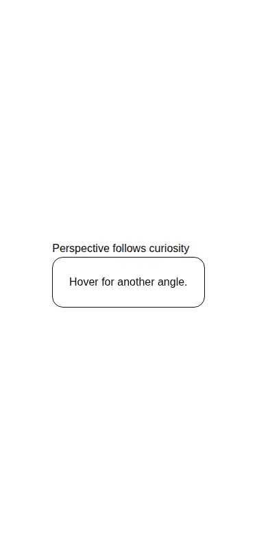
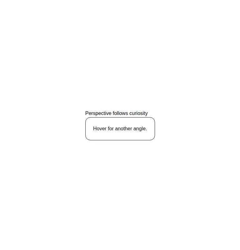
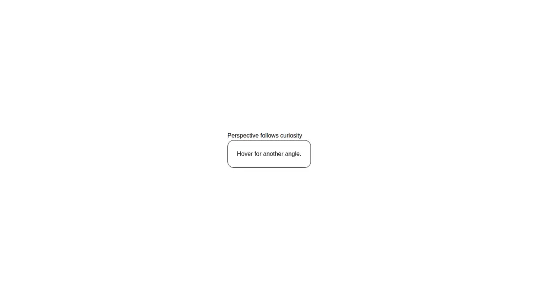
Measured
Every value below was written by the harness on the run that produced the frames above. None of it is derived from the prose.
| Build | OK |
|---|---|
| Mount | OK |
| Console errors | 0 |
| Uncaught page errors | 0 |
| Horizontal overflow | clean at 375, 768, 1440 |
| Axe critical | 0 |
| Axe serious | 0 |
| Axe moderate | 0 |
| Axe minor | 0 |
| Gzip marginal | 59.0 KB (124.4 KB build, 65.4 KB baseline) |
| Bare mode | OK |
| Provider required | NO |
| Demo used | written from the component source API |
Verdict
A focused, working tilt primitive with a clean wrapper API and no provider requirement. It is a sensible reuse when Motion is already present, but harder to justify as a new dependency for decoration alone. Plan to add touch and reduced-motion behavior if those matter to the product.
Use it if
- You want a pointer-reactive tilt around an existing card, image, or product preview.
- Your app already uses Motion and can absorb another client-side interaction.
- You need configurable rotation direction and spring behavior without building the pointer math yourself.
Skip it if
- The experience must communicate equally well on touch and keyboard input, where this mouse-driven effect has no equivalent interaction.
- You need reduced-motion handling built into the component rather than adding that policy yourself.
- Adding Motion solely for a decorative hover treatment is not worth the dependency cost.
- You need a polished card primitive with its own layout and visual styling rather than a behavior-only wrapper.
Install
| Declared dependencies | motion |
|---|---|
| Missing on install | none |
| Bare install | builds and mounts without the shadcn-style helpers |
| Provider | no provider required in the harness |
In a non-shadcn project, copy the component into the source tree, install Motion, and keep it behind a React client boundary. Supply all layout and visual classes yourself. Preserve the exported prop spelling when calling the reverse-direction option, or rename it consistently during adoption.
Source and credit
This page is a review, not a copy. The component source lives with its author and this site does not republish it. Read the license before you use anything.
Author repository
github.com/ibelick/motion-primitivesAlternatives
Other published entries for the hover-effect pattern, ordered by what they measured: mounts first, then clean axe scans, then bare-mode passes, then the smaller bundle.
- eldora-card-flip-hover3d
- Renders
- YES
- A11y
- 0
- Gzip
- 17.5KB
- Bare
- pass
- Prov
- NO
- uilayouts-btn-hover-left-flip3d
- Renders
- YES
- A11y
- 0
- Gzip
- 17.5KB
- Bare
- pass
- Prov
- NO
- uilayouts-btn-hover-down3d
- Renders
- YES
- A11y
- 0
- Gzip
- 17.6KB
- Bare
- pass
- Prov
- NO
- uilayouts-btn-hover-multiplegradient-glow
- Renders
- YES
- A11y
- 0
- Gzip
- 17.9KB
- Bare
- pass
- Prov
- NO
- magicui-cool-modespatial
- Renders
- YES
- A11y
- 0
- Gzip
- 21.8KB
- Bare
- pass
- Prov
- NO
- uilayouts-hovercard2gradient-glow
- Renders
- YES
- A11y
- 0
- Gzip
- 24.0KB
- Bare
- pass
- Prov
- NO