Measured entry
neobrutalism-switch
A client-side React toggle built on the Radix Switch primitive and distributed as a shadcn registry TSX file. Its neobrutalist appearance comes from Tailwind utility classes and project theme tokens, while its class merging relies on the local cn helper backed by clsx and tailwind-merge.
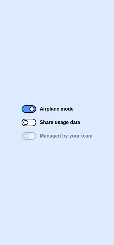
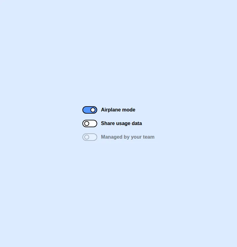
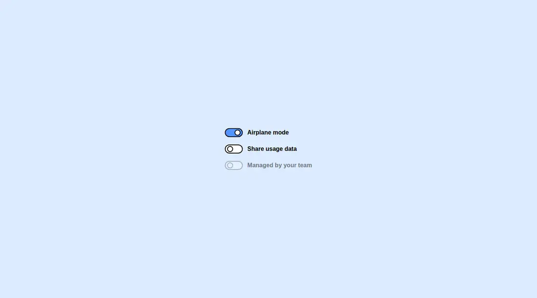
Measured
Every value below was written by the harness on the run that produced the frames above. None of it is derived from the prose.
| Build | OK |
|---|---|
| Mount | OK |
| Console errors | 0 |
| Uncaught page errors | 0 |
| Horizontal overflow | clean at 375, 768, 1440 |
| Axe critical | 0 |
| Axe serious | 1 |
| Axe moderate | 0 |
| Axe minor | 0 |
| Gzip marginal | 34.5 KB (100.0 KB build, 65.5 KB baseline) |
| Bare mode | OK |
| Provider required | NO |
| Demo used | written from the component source API |
Verdict
The component builds and mounts cleanly, stays contained across the tested layouts, and offers a sensible Radix foundation. Adopt it when the visual language fits, but review and adjust the theme colors before release because the tested presentation has a serious contrast issue.
Use it if
- Your interface already uses the matching neobrutalist Tailwind theme tokens.
- You want Radix-managed switch behavior with controlled, uncontrolled, and disabled states.
- You are comfortable supplying visible labels outside the switch component.
Skip it if
- Your project does not use Tailwind or cannot adopt the required custom color tokens.
- You need a component whose default theme has already cleared a strict contrast review.
- You want a self-contained field that renders its own label, help text, or validation message.
Install
| Declared dependencies | @radix-ui/react-switch, clsx, tailwind-merge |
|---|---|
| Missing on install | none |
| Bare install | builds and mounts without the shadcn-style helpers |
| Provider | no provider required in the harness |
In a non-shadcn project, add the Radix Switch package, Tailwind, clsx, and tailwind-merge. Provide the cn utility, configure the border, main, secondary-background, and ring theme tokens, and preserve client-component handling where your framework requires it.
Source and credit
This page is a review, not a copy. The component source lives with its author and this site does not republish it. Read the license before you use anything.
Author repository
github.com/ekmas/neobrutalism-componentsAlternatives
Other published entries for the switch pattern, ordered by what they measured: mounts first, then clean axe scans, then bare-mode passes, then the smaller bundle.
- neu-toggleneumorphism
- Renders
- YES
- A11y
- 0
- Gzip
- 17.8KB
- Bare
- pass
- Prov
- NO
- clay-toggleclaymorphism
- Renders
- YES
- A11y
- 0
- Gzip
- 18.2KB
- Bare
- pass
- Prov
- NO
- ruixen-scrub-datetimeunclassified
- Renders
- YES
- A11y
- 0
- Gzip
- 22.2KB
- Bare
- pass
- Prov
- NO
- shadcn-switchunclassified
- Renders
- YES
- A11y
- 0
- Gzip
- 34.4KB
- Bare
- pass
- Prov
- NO
- hextaui-switchminimal-flat
- Renders
- YES
- A11y
- 0
- Gzip
- 34.5KB
- Bare
- pass
- Prov
- NO
- hextaui-tabsminimal-flat
- Renders
- YES
- A11y
- 0
- Gzip
- 39.0KB
- Bare
- pass
- Prov
- NO