Measured entry
neu-avatar
avatarneumorphismfirst party
A single React avatar component with image and initials modes, three named sizes, and an optional online-style status dot. It ships as source styled entirely with Tailwind utility classes, including arbitrary neumorphic shadows and fixed colors, and has no declared package dependencies or provider requirement.
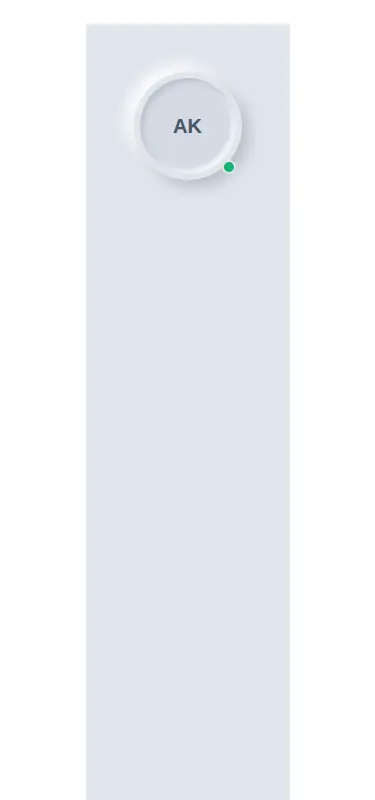
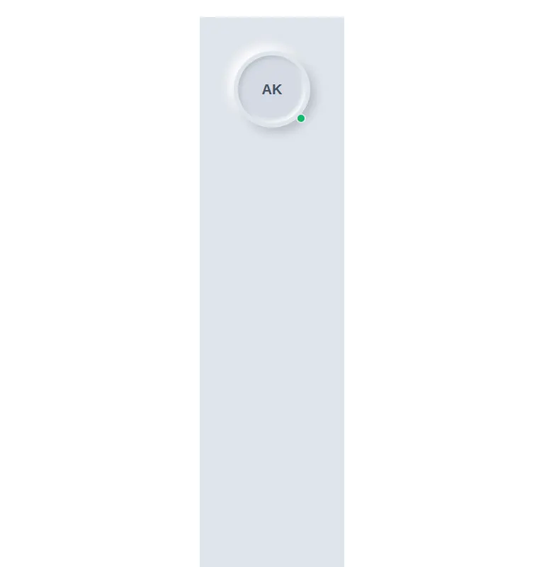
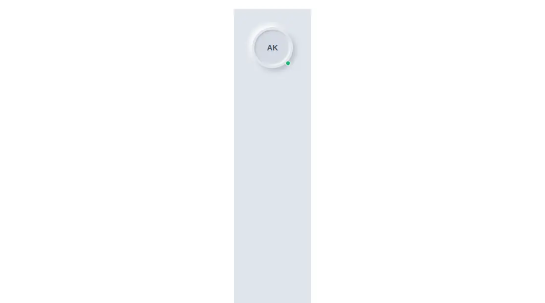
Measured
Every value below was written by the harness on the run that produced the frames above. None of it is derived from the prose.
| Build | OK |
|---|---|
| Mount | OK |
| Console errors | 0 |
| Uncaught page errors | 0 |
| Horizontal overflow | clean at 375, 768, 1440 |
| Axe critical | 0 |
| Axe serious | 1 |
| Axe moderate | 0 |
| Axe minor | 0 |
| Gzip marginal | 17.8 KB (83.2 KB build, 65.4 KB baseline) |
| Bare mode | OK |
| Provider required | NO |
| Demo used | written from the component source API |
Verdict
A focused, dependency-light avatar that builds, mounts, and fits its tested layouts, but it is not ready unchanged for accessibility-sensitive production use. Fix the invalid ARIA treatment on the initials or status element and replace the fixed palette with project tokens before adopting it broadly.
Use it if
- You need a compact avatar that can fall back from a photo to initials.
- Your interface already uses the same light neumorphic surface and can accept its fixed palette.
- You want an optional presence dot and are prepared to correct its accessibility markup.
Skip it if
- You need an accessible status announcement without modifying the component, because the current ARIA markup is invalid.
- Your design system requires theme tokens, dark mode, or flexible color variants instead of embedded colors.
- You need image loading states, error fallback behavior, or a semantic profile link built in.
Install
| Declared dependencies | none declared |
|---|---|
| Missing on install | none |
| Bare install | builds and mounts without the shadcn-style helpers |
| Provider | no provider required in the harness |
First-party component from the sir-originals set. Add the component to a React project and ensure Tailwind scans its file so the utility classes and arbitrary shadow styles are generated. No shadcn setup, provider, or extra package is required. Adjust the status markup to expose its label through a permitted semantic pattern.
Source and credit
This page is a review, not a copy. The component source lives with its author and this site does not republish it. Read the license before you use anything.
Author repository
mrkeyoor/sir-originalsAlternatives
Other published entries for the avatar pattern, ordered by what they measured: mounts first, then clean axe scans, then bare-mode passes, then the smaller bundle.
- hextaui-avatarminimal-flat
- Renders
- YES
- A11y
- 0
- Gzip
- 32.7KB
- Bare
- pass
- Prov
- NO
- neobrutalism-avatarbrutalism
- Renders
- YES
- A11y
- 0
- Gzip
- 32.7KB
- Bare
- pass
- Prov
- NO
- shadcn-avatarunclassified
- Renders
- YES
- A11y
- 0
- Gzip
- 33.0KB
- Bare
- pass
- Prov
- NO
- tripled-native-avatar-expand-shadcnuiminimal-flat
- Renders
- YES
- A11y
- 0
- Gzip
- 75.4KB
- Bare
- pass
- Prov
- NO
- tripled-native-avatar-with-name-shadcnuiminimal-flat
- Renders
- YES
- A11y
- 0
- Gzip
- 75.5KB
- Bare
- pass
- Prov
- NO
- magicui-avatar-circlesbento
- Renders
- YES
- A11y
- 0
- Gzip
- 26.0KB
- Bare
- fail
- Prov
- NO