Measured entry
neu-card
cardneumorphismfirst party
A presentational React article card with eyebrow, title, body, optional footer, and a className hook. It ships as one default-exported component, uses Tailwind utility classes with arbitrary color and shadow values, and needs no extra runtime package or provider.
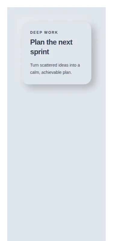
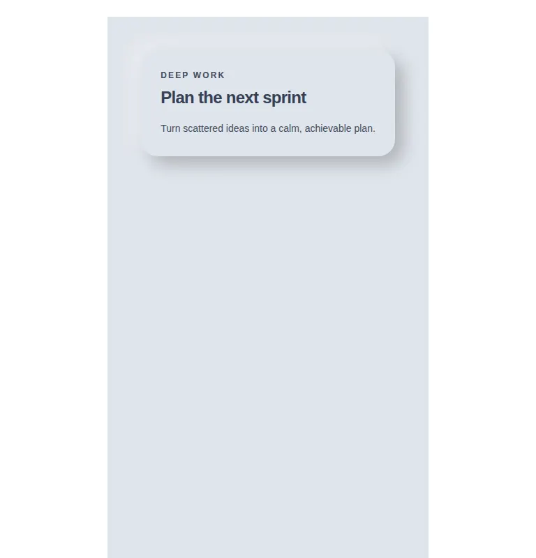
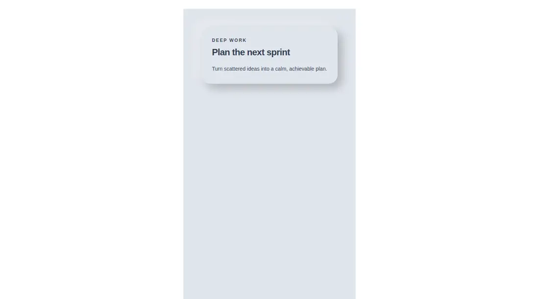
Measured
Every value below was written by the harness on the run that produced the frames above. None of it is derived from the prose.
| Build | OK |
|---|---|
| Mount | OK |
| Console errors | 0 |
| Uncaught page errors | 0 |
| Horizontal overflow | clean at 375, 768, 1440 |
| Axe critical | 0 |
| Axe serious | 1 |
| Axe moderate | 0 |
| Axe minor | 0 |
| Gzip marginal | 17.7 KB (83.1 KB build, 65.4 KB baseline) |
| Bare mode | OK |
| Provider required | NO |
| Demo used | written from the component source API |
Verdict
A focused, dependency-free card that builds and mounts on its own, with useful content slots and no provider setup. Use it as a visual starting point, but revise the muted text color before shipping where accessibility compliance matters.
Use it if
- You need a compact editorial or planning card with a soft neumorphic surface.
- Your React project already compiles Tailwind arbitrary-value utilities.
- You want flexible body and footer slots without adopting a component framework.
Skip it if
- Your interface must pass strict contrast checks without modifying the supplied palette.
- Your design system avoids neumorphic shadows or hard-coded colors.
- You need built-in interactions, loading states, or structured card actions.
Install
| Declared dependencies | none declared |
|---|---|
| Missing on install | none |
| Bare install | builds and mounts without the shadcn-style helpers |
| Provider | no provider required in the harness |
First-party component from the sir-originals set. Copy the component into a React project and add Tailwind CSS if it is not already present. Configure Tailwind to scan the component file and retain arbitrary color, spacing, tracking, radius, and shadow utilities. No shadcn primitives, provider, or third-party package is required.
Source and credit
This page is a review, not a copy. The component source lives with its author and this site does not republish it. Read the license before you use anything.
Author repository
mrkeyoor/sir-originalsAlternatives
Other published entries for the card pattern, ordered by what they measured: mounts first, then clean axe scans, then bare-mode passes, then the smaller bundle.
- tailark-veil-content-1minimal-flat
- Renders
- YES
- A11y
- 0
- Gzip
- 17.6KB
- Bare
- pass
- Prov
- NO
- tailark-veil-content-2minimal-flat
- Renders
- YES
- A11y
- 0
- Gzip
- 17.6KB
- Bare
- pass
- Prov
- NO
- tailark-mist-content-3minimal-flat
- Renders
- YES
- A11y
- 0
- Gzip
- 24.1KB
- Bare
- pass
- Prov
- NO
- neobrutalism-cardbrutalism
- Renders
- YES
- A11y
- 0
- Gzip
- 29.6KB
- Bare
- pass
- Prov
- NO
- neobrutalism-ncardbrutalism
- Renders
- YES
- A11y
- 0
- Gzip
- 29.6KB
- Bare
- pass
- Prov
- NO
- reui-icon-stackminimal-flat
- Renders
- YES
- A11y
- 0
- Gzip
- 30.1KB
- Bare
- pass
- Prov
- NO