Measured entry
reui-stepper
A client-side React compound component for interactive horizontal or vertical step flows. It ships as copied TypeScript from a shadcn registry and provides controlled or uncontrolled state, panels, keyboard navigation, loading states, and disabled states. It depends on radix-ui's Slot, Tailwind utility classes and theme tokens, plus a local cn helper.
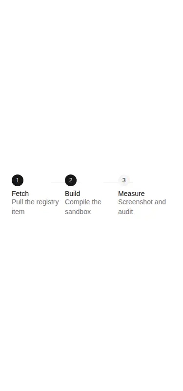
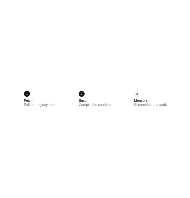
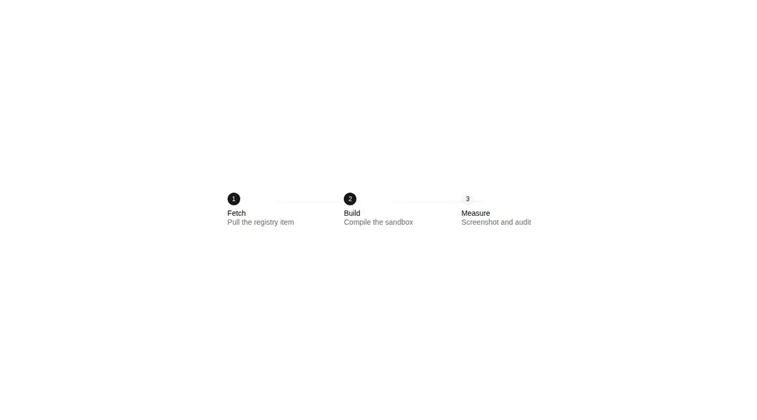
Measured
Every value below was written by the harness on the run that produced the frames above. None of it is derived from the prose.
| Build | OK |
|---|---|
| Mount | OK |
| Console errors | 0 |
| Uncaught page errors | 0 |
| Horizontal overflow | clean at 375, 768, 1440 |
| Axe critical | 3 |
| Axe serious | 0 |
| Axe moderate | 0 |
| Axe minor | 0 |
| Gzip marginal | 32.8 KB (98.3 KB build, 65.5 KB baseline) |
| Bare mode | OK |
| Provider required | NO |
| Demo used | written from the component source API |
Verdict
A solid pick for shadcn-based interactive step flows, with a useful compound API and deliberate keyboard behavior. It does not work as a bare drop-in and needs a shadcn-style setup; workflow validation still belongs to the caller.
Use it if
- You are building a multistage form or onboarding flow where users should move through tab-like steps.
- You need both horizontal and vertical layouts with replaceable indicators and separately rendered step content.
- Your app already follows shadcn conventions for Tailwind tokens, path aliases, and copied component source.
Skip it if
- You need the component itself to enforce validation or linear progression, since workflow rules remain the caller's responsibility.
- You only need a read-only progress display and do not want interactive tab behavior or local step state.
- Your design system does not use Tailwind utilities and you do not want to translate its token-based styling.
- The feature must remain server-only, since this component is explicitly a client module.
Install
| Declared dependencies | radix-ui, clsx, tailwind-merge |
|---|---|
| Missing on install | none |
| Bare install | builds and mounts without the shadcn-style helpers |
| Provider | no provider required in the harness |
In a non-shadcn project, add the radix-ui package, a cn class-merging helper at the expected alias, Tailwind processing, and matching theme tokens for primary, accent, muted, background, foreground, and ring colors. Configure the path alias or rewrite the import, then place the component in a client-capable React module.
Source and credit
This page is a review, not a copy. The component source lives with its author and this site does not republish it. Read the license before you use anything.
Author repository
github.com/keenthemes/reuiAlternatives
Other published entries for the progress pattern, ordered by what they measured: mounts first, then clean axe scans, then bare-mode passes, then the smaller bundle.
- neu-progressneumorphism
- Renders
- YES
- A11y
- 0
- Gzip
- 17.8KB
- Bare
- pass
- Prov
- NO
- clay-progressclaymorphism
- Renders
- YES
- A11y
- 0
- Gzip
- 18.0KB
- Bare
- pass
- Prov
- NO
- tripled-scroll-progress-tracker-shadcnuigradient-glow
- Renders
- YES
- A11y
- 0
- Gzip
- 64.3KB
- Bare
- pass
- Prov
- NO
- magicui-animated-circular-progress-barbento
- Renders
- YES
- A11y
- 0
- Gzip
- 26.3KB
- Bare
- fail
- Prov
- NO
- 8bitcn-timeline2skeuomorphism
- Renders
- YES
- A11y
- 0
- Gzip
- 26.7KB
- Bare
- fail
- Prov
- NO
- magicui-scroll-progressdark-futuristic
- Renders
- YES
- A11y
- 0
- Gzip
- 69.0KB
- Bare
- fail
- Prov
- NO