Measured entry
shadcn-carousel
carouselunclassifiedmotion on file
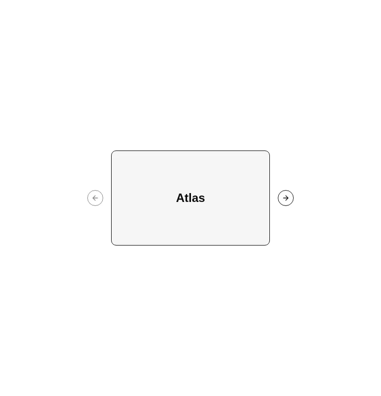
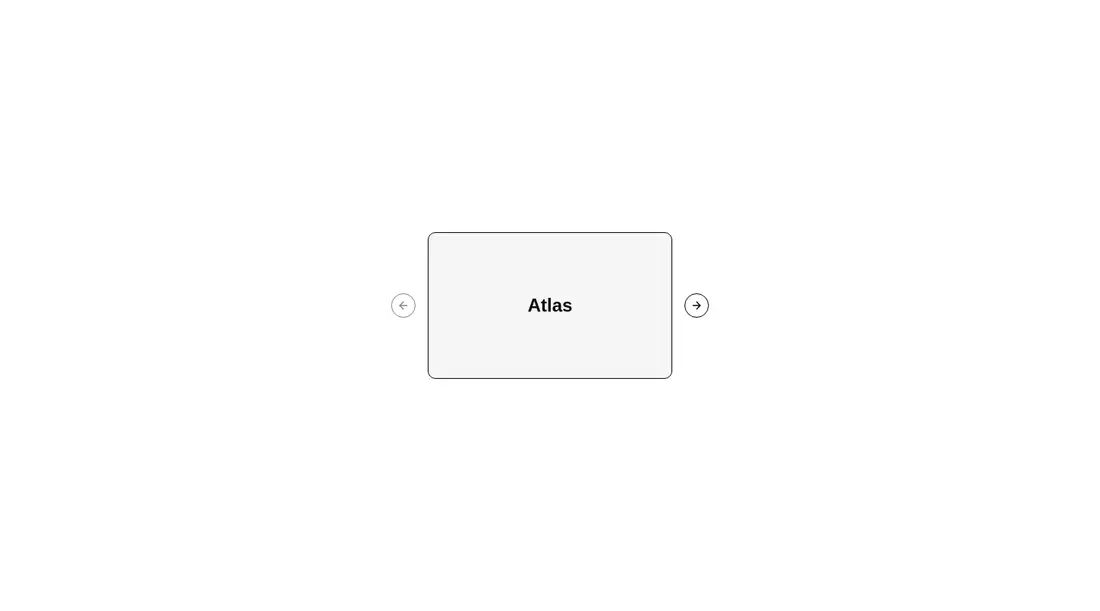
A client-side React carousel shipped as copy-in registry source rather than a packaged widget. It wraps Embla in a local context and provides content, slide, and previous/next controls. The source expects Tailwind utilities, a shared shadcn Button, the cn class helper, and Lucide icons.

Measured
Every value below was written by the harness on the run that produced the frames above. None of it is derived from the prose.
| Build | OK |
|---|---|
| Mount | OK |
| Console errors | 0 |
| Uncaught page errors | 0 |
| Horizontal overflow | flagged at 375 |
| Axe critical | 0 |
| Axe serious | 0 |
| Axe moderate | 0 |
| Axe minor | 0 |
| Gzip marginal | 40.7 KB (106.2 KB build, 65.5 KB baseline) |
| Bare mode | FAIL |
| Provider required | NO |
| Demo used | written from the component source API |
What the harness recorded
BARE BUILD
✗ Build failed in 1.73s
error during build:
[vite]: Rollup failed to resolve import "lucide-react" from "<sandbox>re-2c3796973c63/src/cut/components/ui/carousel.tsx".
Verdict
A sound choice for teams already comfortable with shadcn's copy-in model and Embla. It built and mounted cleanly, and the tested semantics raised no accessibility findings. The default external arrow placement needs responsive adjustment before use in narrow containers.
Use it if
- You already use shadcn conventions and want carousel markup that remains editable in your codebase.
- You need horizontal or vertical slides with keyboard and button navigation.
- You want direct access to the Embla API or its plugin ecosystem.
Skip it if
- Your narrow layouts cannot tolerate controls positioned outside the carousel frame, since the verified demo overflowed there.
- You want a dependency-light static scroller and do not need Embla behavior.
- You need pagination, autoplay, or richer slide announcements without adding and maintaining those features yourself.
Install
| Declared dependencies | embla-carousel-react, radix-ui, clsx, tailwind-merge |
|---|---|
| Missing on install | none |
| Bare install | fails once the shadcn-style helpers are removed, so it needs that setup |
| Provider | no provider required in the harness |
Install Embla and Lucide React, bring in a compatible Button component and cn helper, configure the import aliases, and ensure Tailwind recognizes the utility classes. Non-shadcn projects must also recreate the expected button variants and focus styles.
Source and credit
This page is a review, not a copy. The component source lives with its author and this site does not republish it. Read the license before you use anything.
Author repository
github.com/shadcn-ui/uiAlternatives
Other published entries for the carousel pattern, ordered by what they measured: mounts first, then clean axe scans, then bare-mode passes, then the smaller bundle.
- neobrutalism-marqueebrutalism
- Renders
- YES
- A11y
- 0
- Gzip
- 17.3KB
- Bare
- pass
- Prov
- NO
- kibo-deckminimal-flat
- Renders
- YES
- A11y
- 0
- Gzip
- 71.9KB
- Bare
- pass
- Prov
- NO
- ruixen-card-stack3d
- Renders
- YES
- A11y
- 0
- Gzip
- 84.0KB
- Bare
- pass
- Prov
- NO
- magicui-marqueeunclassified
- Renders
- YES
- A11y
- 0
- Gzip
- 11.9KB
- Bare
- fail
- Prov
- NO
- ruixen-auto-scrolling-client-carouselunclassified
- Renders
- YES
- A11y
- 0
- Gzip
- 27.2KB
- Bare
- fail
- Prov
- NO
- ruixen-coverflow-carousel3d
- Renders
- YES
- A11y
- 0
- Gzip
- 33.2KB
- Bare
- fail
- Prov
- NO