Measured entry
ruixen-client-carousel-showcase
carouselgradient-glowmotion on file
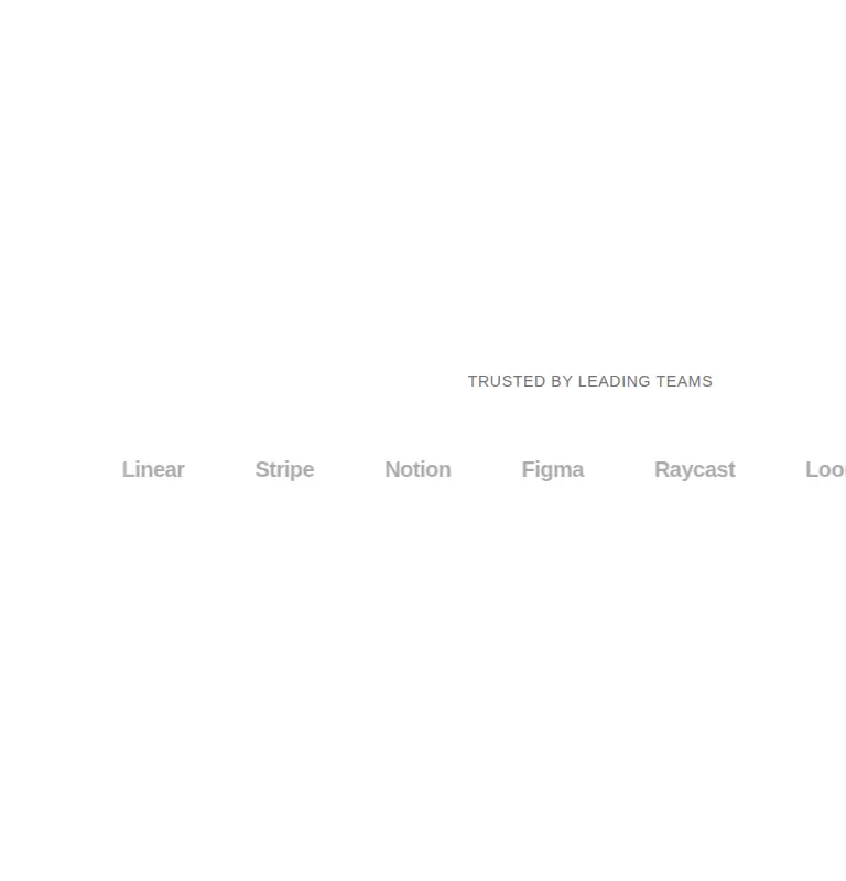
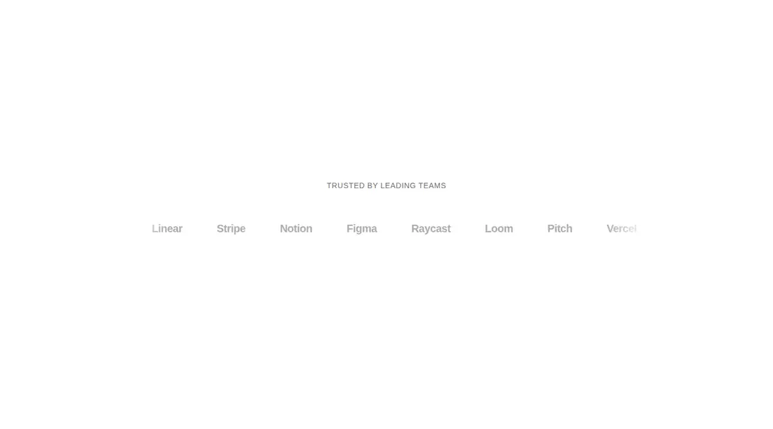
A React client component shipped as a shadcn registry TSX file. It renders an endlessly drifting, triplicated client-name or logo ribbon, pauses and lifts items around the pointer, and includes its own keyframes. It has no added package dependency, but expects React, Tailwind utility classes, theme color tokens, and the usual cn helper alias.

Measured
Every value below was written by the harness on the run that produced the frames above. None of it is derived from the prose.
| Build | OK |
|---|---|
| Mount | OK |
| Console errors | 0 |
| Uncaught page errors | 0 |
| Horizontal overflow | flagged at 375, 768 |
| Axe critical | 0 |
| Axe serious | 1 |
| Axe moderate | 0 |
| Axe minor | 0 |
| Gzip marginal | 27.4 KB (92.8 KB build, 65.4 KB baseline) |
| Bare mode | FAIL |
| Provider required | NO |
| Demo used | written from the component source API |
What the harness recorded
BARE BUILD
✗ Build failed in 33.02s
error during build:
[vite:load-fallback] Could not load <sandbox>/src/lib/utils (imported by src/cut/client-carousel-showcase.tsx): ENOENT: no such file or directory, open '<sandbox>/src/lib/utils'
Verdict
A polished marquee primitive for shadcn-based marketing pages, but it is not drop-in responsive or accessibility-ready. The bare mount fails, so it needs a shadcn-style setup. Adopt it only if you will fix narrow-layout overflow, improve faded-text contrast, and add reduced-motion handling.
Use it if
- You need a continuously moving client or partner strip for a wide marketing section.
- Your client data may mix linked logos, custom React nodes, and text fallbacks.
- Your site already uses shadcn conventions and you can tune motion and theme tokens.
Skip it if
- The strip must remain contained on phone and tablet layouts without additional responsive fixes.
- You need accessible contrast without revising the intentionally faded item styling.
- Your motion policy requires built-in reduced-motion behavior or keyboard-equivalent proximity effects.
- You want a user-controlled carousel with navigation, pagination, or discrete slides.
Install
| Declared dependencies | none declared |
|---|---|
| Missing on install | none |
| Bare install | fails once the shadcn-style helpers are removed, so it needs that setup |
| Provider | no provider required in the harness |
In a non-shadcn project, add React client-component support and Tailwind, provide foreground and muted-foreground theme tokens, then create a cn class-merging helper at the expected alias or replace that import with your local utility. Add reduced-motion styling and responsive containment before release.
Source and credit
This page is a review, not a copy. The component source lives with its author and this site does not republish it. Read the license before you use anything.
Author repository
github.com/ruixenui/ruixen.comAlternatives
Other published entries for the carousel pattern, ordered by what they measured: mounts first, then clean axe scans, then bare-mode passes, then the smaller bundle.
- neobrutalism-marqueebrutalism
- Renders
- YES
- A11y
- 0
- Gzip
- 17.3KB
- Bare
- pass
- Prov
- NO
- kibo-deckminimal-flat
- Renders
- YES
- A11y
- 0
- Gzip
- 71.9KB
- Bare
- pass
- Prov
- NO
- ruixen-card-stack3d
- Renders
- YES
- A11y
- 0
- Gzip
- 84.0KB
- Bare
- pass
- Prov
- NO
- magicui-marqueeunclassified
- Renders
- YES
- A11y
- 0
- Gzip
- 11.9KB
- Bare
- fail
- Prov
- NO
- ruixen-auto-scrolling-client-carouselunclassified
- Renders
- YES
- A11y
- 0
- Gzip
- 27.2KB
- Bare
- fail
- Prov
- NO
- ruixen-coverflow-carousel3d
- Renders
- YES
- A11y
- 0
- Gzip
- 33.2KB
- Bare
- fail
- Prov
- NO