Measured entry
ruixen-drag-and-drop-tabs
tabsunclassifiedmotion on file
A client-side React tab strip that lets pointer users reorder tabs, animates selection and content with Motion, and optionally plays generated tick sounds. It ships as a shadcn registry TypeScript file with inline theme CSS and depends on Motion, dnd-kit core and sortable, plus browser audio and resize APIs.
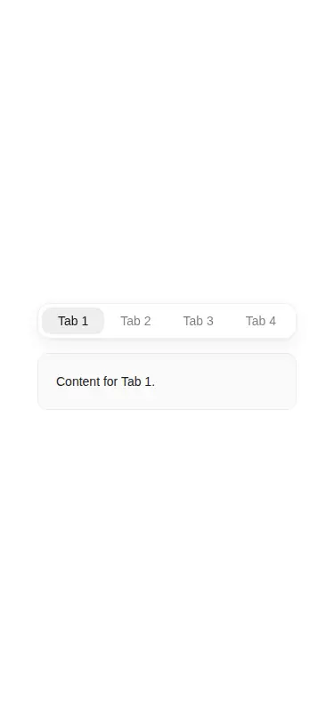
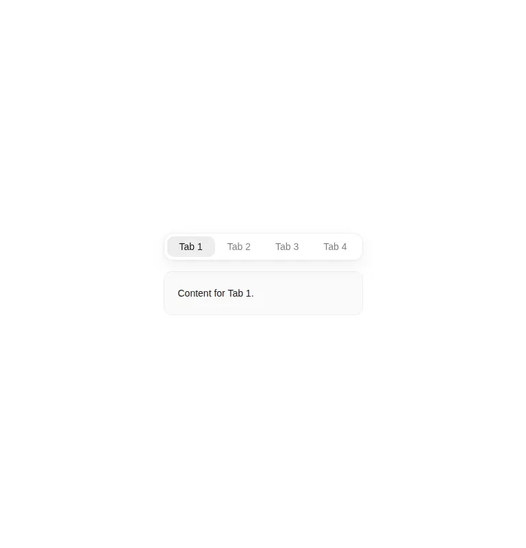
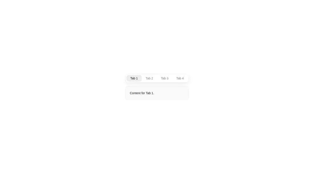
Measured
Every value below was written by the harness on the run that produced the frames above. None of it is derived from the prose.
| Build | OK |
|---|---|
| Mount | OK |
| Console errors | 0 |
| Uncaught page errors | 0 |
| Horizontal overflow | clean at 375, 768, 1440 |
| Axe critical | 0 |
| Axe serious | 1 |
| Axe moderate | 0 |
| Axe minor | 0 |
| Gzip marginal | 75.0 KB (140.4 KB build, 65.4 KB baseline) |
| Bare mode | OK |
| Provider required | NO |
| Demo used | written from the component source API |
Verdict
A polished choice for a small, pointer-first, locally managed tab set, and it builds and mounts without framework scaffolding. Before production use, fix the text contrast, add proper tab semantics and keyboard behavior, and expose reordered state if order matters beyond the component.
Use it if
- You need a compact tab strip whose order users can rearrange directly with a mouse or touch input.
- You want spring-based selection and reorder feedback without adding a separate stylesheet.
- Your tab order is local UI state and does not need to be saved or reported to a parent component.
Skip it if
- You require accessible tab semantics and keyboard reordering, because the implementation uses buttons with only a pointer drag sensor and does not expose a tablist relationship.
- Your accessibility bar requires the supplied colors to pass contrast checks without adjustment.
- You need to persist or synchronize reordered items, because there is no reorder callback or controlled order prop.
- You expect many or long tab labels, because the strip stays on one inline row and provides no wrapping or overflow treatment.
Install
| Declared dependencies | motion, @dnd-kit/core, @dnd-kit/sortable |
|---|---|
| Missing on install | none |
| Bare install | builds and mounts without the shadcn-style helpers |
| Provider | no provider required in the harness |
In a non-shadcn project, copy the client component into the source tree and install Motion plus dnd-kit core and sortable. Ensure the build supports React client components and TypeScript, and keep browser-only audio and resize APIs out of server execution. No provider or external stylesheet is required.
Source and credit
This page is a review, not a copy. The component source lives with its author and this site does not republish it. Read the license before you use anything.
Author repository
github.com/ruixenui/ruixen.comAlternatives
Other published entries for the tabs pattern, ordered by what they measured: mounts first, then clean axe scans, then bare-mode passes, then the smaller bundle.
- tripled-native-tabs-carbonminimal-flat
- Renders
- YES
- A11y
- 0
- Gzip
- 69.9KB
- Bare
- pass
- Prov
- NO
- shadcn-tabsunclassified
- Renders
- YES
- A11y
- 0
- Gzip
- 22.4KB
- Bare
- fail
- Prov
- NO
- neobrutalism-paginationbrutalism
- Renders
- YES
- A11y
- 0
- Gzip
- 28.0KB
- Bare
- fail
- Prov
- NO
- shadcn-paginationunclassified
- Renders
- YES
- A11y
- 0
- Gzip
- 28.1KB
- Bare
- fail
- Prov
- NO
- originui-comp-109minimal-flat
- Renders
- YES
- A11y
- 0
- Gzip
- 35.1KB
- Bare
- fail
- Prov
- NO
- originui-comp-110minimal-flat
- Renders
- YES
- A11y
- 0
- Gzip
- 35.1KB
- Bare
- fail
- Prov
- NO