Measured entry
tripled-native-tabs-carbon
tabsminimal-flatmotion on file
A client-side React tab switcher shipped as a shadcn registry component. It renders equal-width buttons, a spring-animated active pill, and animated content using Framer Motion. Styling relies on Tailwind utilities, shadcn color tokens, and a cn helper backed by clsx and tailwind-merge.
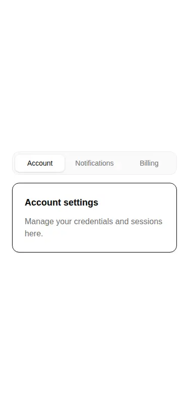
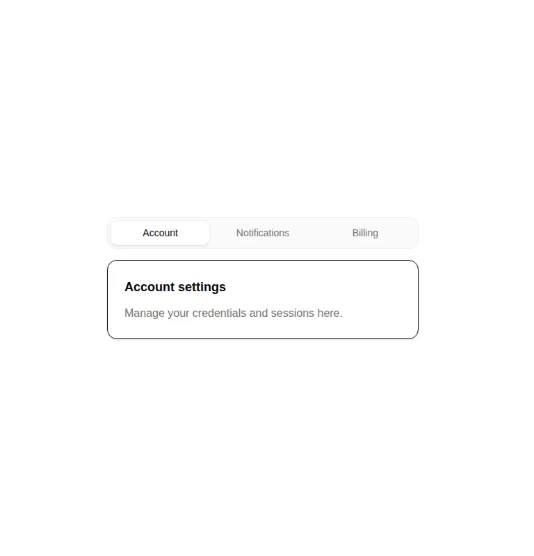
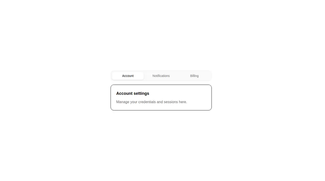
Measured
Every value below was written by the harness on the run that produced the frames above. None of it is derived from the prose.
| Build | OK |
|---|---|
| Mount | OK |
| Console errors | 0 |
| Uncaught page errors | 0 |
| Horizontal overflow | clean at 375, 768, 1440 |
| Axe critical | 0 |
| Axe serious | 0 |
| Axe moderate | 0 |
| Axe minor | 0 |
| Gzip marginal | 69.9 KB (135.4 KB build, 65.5 KB baseline) |
| Bare mode | OK |
| Provider required | NO |
| Demo used | written from the component source API |
Verdict
A polished, responsive switcher for low-stakes panels, and it installs and mounts without framework scaffolding. Still, it behaves like styled buttons rather than a complete accessible tabs primitive. Use it as a visual starting point, then add semantics, keyboard behavior, and a controlled API for production workflows.
Use it if
- You need a compact settings or account switcher with short labels and simple content panels.
- Your app already uses Framer Motion and Tailwind theme tokens, so the animation adds little integration work.
- You want an uncontrolled component whose initial selection can be set once and then managed internally.
Skip it if
- You need proper tablist semantics, selected-state announcements, or arrow-key navigation for assistive technology users.
- You need controlled selection, change callbacks, URL synchronization, or tabs driven by application state.
- You do not already ship Framer Motion and cannot justify that dependency for a small sliding indicator.
- You plan to render multiple instances without first making the shared animation identifier instance-safe.
Install
| Declared dependencies | framer-motion, react, clsx, tailwind-merge |
|---|---|
| Missing on install | none |
| Bare install | builds and mounts without the shadcn-style helpers |
| Provider | no provider required in the harness |
In a non-shadcn project, add React, Framer Motion, clsx, and tailwind-merge; configure Tailwind; define equivalents for the referenced theme colors and focus ring; provide the cn utility or replace it with your class-merging helper; and update the import alias if your project does not map it.
Source and credit
This page is a review, not a copy. The component source lives with its author and this site does not republish it. Read the license before you use anything.
Author repository
github.com/moumen-soliman/uitripledAlternatives
Other published entries for the tabs pattern, ordered by what they measured: mounts first, then clean axe scans, then bare-mode passes, then the smaller bundle.
- shadcn-tabsunclassified
- Renders
- YES
- A11y
- 0
- Gzip
- 22.4KB
- Bare
- fail
- Prov
- NO
- neobrutalism-paginationbrutalism
- Renders
- YES
- A11y
- 0
- Gzip
- 28.0KB
- Bare
- fail
- Prov
- NO
- shadcn-paginationunclassified
- Renders
- YES
- A11y
- 0
- Gzip
- 28.1KB
- Bare
- fail
- Prov
- NO
- originui-comp-109minimal-flat
- Renders
- YES
- A11y
- 0
- Gzip
- 35.1KB
- Bare
- fail
- Prov
- NO
- originui-comp-110minimal-flat
- Renders
- YES
- A11y
- 0
- Gzip
- 35.1KB
- Bare
- fail
- Prov
- NO
- shadcn-toggle-groupunclassified
- Renders
- YES
- A11y
- 0
- Gzip
- 35.4KB
- Bare
- fail
- Prov
- NO