Measured entry
ruixen-expandable-menu-navbar
navbarunclassifiedmotion on file
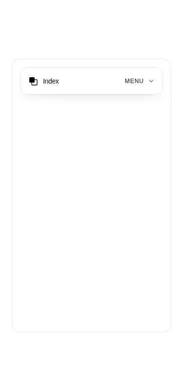
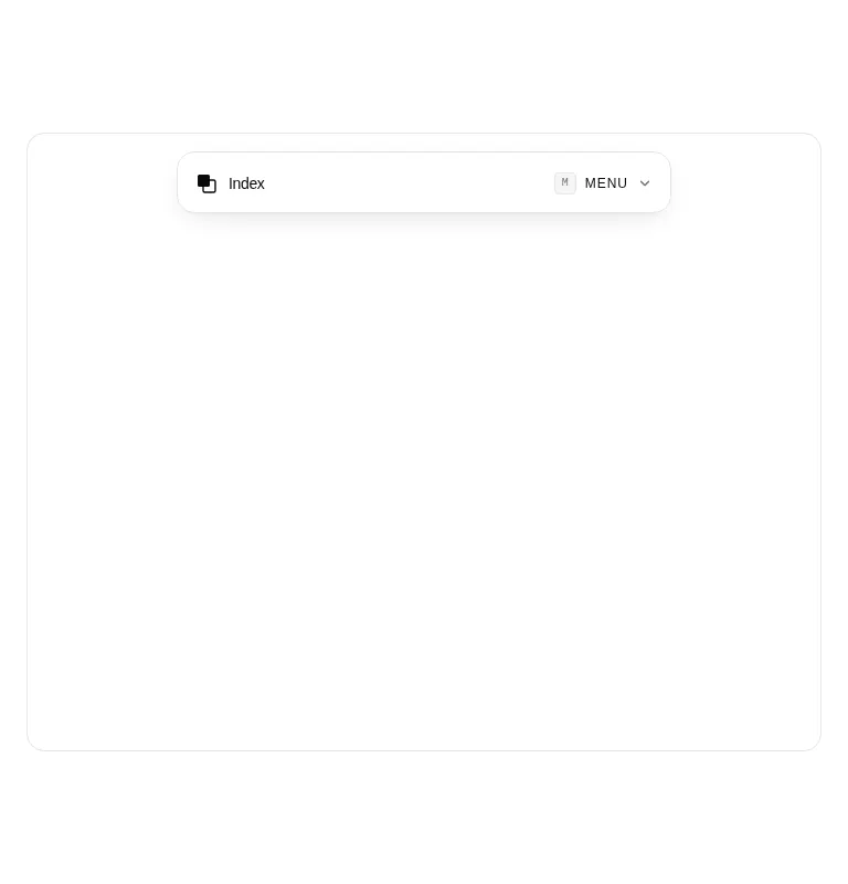
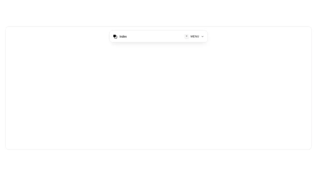
A client-side React navbar that expands a compact floating bar into grouped, animated links with metadata and a status footer. It ships as a shadcn registry component, uses native React elements and Tailwind theme utilities, and depends on Motion for the panel, scrim, chevron, and item transitions.
Measured
Every value below was written by the harness on the run that produced the frames above. None of it is derived from the prose.
| Build | OK |
|---|---|
| Mount | OK |
| Console errors | 0 |
| Uncaught page errors | 0 |
| Horizontal overflow | clean at 375, 768, 1440 |
| Axe critical | 0 |
| Axe serious | 0 |
| Axe moderate | 0 |
| Axe minor | 0 |
| Gzip marginal | 61.8 KB (127.2 KB build, 65.4 KB baseline) |
| Bare mode | OK |
| Provider required | NO |
| Demo used | written from the component source API |
Verdict
A polished, focused choice for editorial or portfolio navigation, with clean mounting and responsive behavior in the harness. Adopt it when the expanding panel suits the information architecture, but wire every destination and either implement or remove the displayed shortcut before shipping.
Use it if
- You want a compact portfolio or studio menu that can reveal several grouped link sections.
- Your app already uses Tailwind theme tokens and can accept Motion as a runtime dependency.
- You need configurable branding, navigation groups, status text, and version text in one self-contained component.
Skip it if
- You need a conventional desktop navigation row with primary links always visible.
- You need a working keyboard shortcut out of the box, since the shortcut prop only renders a label.
- You cannot spend the added client bundle cost of Motion for a single navigation interaction.
- You need production-ready destinations without editing data, since the supplied items fall back to placeholder anchors.
Install
| Declared dependencies | motion |
|---|---|
| Missing on install | none |
| Bare install | builds and mounts without the shadcn-style helpers |
| Provider | no provider required in the harness |
In a non-shadcn project, add Motion, enable client-side React rendering, and provide Tailwind utilities plus the background, foreground, border, card, muted, and accent theme tokens used by the classes. No shadcn runtime component is imported.
Source and credit
This page is a review, not a copy. The component source lives with its author and this site does not republish it. Read the license before you use anything.
Author repository
github.com/ruixenui/ruixen.comAlternatives
Other published entries for the navbar pattern, ordered by what they measured: mounts first, then clean axe scans, then bare-mode passes, then the smaller bundle.
- hyperui-headers-4editorial
- Renders
- YES
- A11y
- 0
- Gzip
- 19.1KB
- Bare
- pass
- Prov
- NO
- kibo-dialog-stackminimal-flat
- Renders
- YES
- A11y
- 0
- Gzip
- 33.4KB
- Bare
- pass
- Prov
- NO
- ruixen-floating-navbarunclassified
- Renders
- YES
- A11y
- 0
- Gzip
- 59.9KB
- Bare
- pass
- Prov
- NO
- ruixen-hover-gradient-navbargradient-glow
- Renders
- YES
- A11y
- 0
- Gzip
- 60.9KB
- Bare
- pass
- Prov
- NO
- hextaui-cardminimal-flat
- Renders
- YES
- A11y
- 0
- Gzip
- 26.7KB
- Bare
- fail
- Prov
- NO
- hextaui-breadcrumbminimal-flat
- Renders
- YES
- A11y
- 0
- Gzip
- 31.7KB
- Bare
- fail
- Prov
- NO