Measured entry
ruixen-floating-navbar
navbarunclassifiedmotion on file
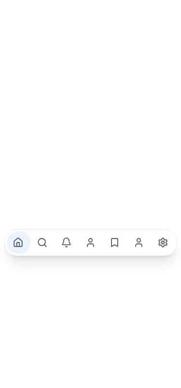
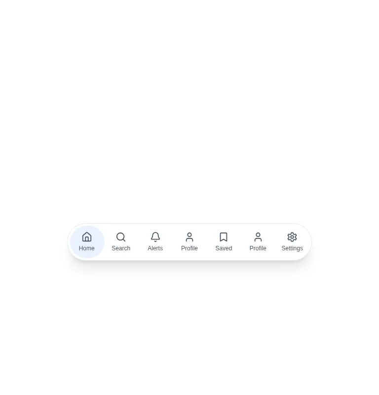
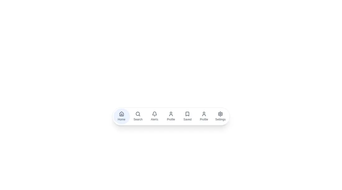
A client-side React bottom navigation bar with icon buttons and a spring-animated active indicator. It ships as a shadcn registry TSX file but uses no shadcn primitives or providers. Styling comes from Tailwind utility classes, while Motion handles the indicator and Lucide supplies the icons.
Measured
Every value below was written by the harness on the run that produced the frames above. None of it is derived from the prose.
| Build | OK |
|---|---|
| Mount | OK |
| Console errors | 0 |
| Uncaught page errors | 0 |
| Horizontal overflow | clean at 375, 768, 1440 |
| Axe critical | 0 |
| Axe serious | 0 |
| Axe moderate | 0 |
| Axe minor | 0 |
| Gzip marginal | 59.9 KB (125.3 KB build, 65.4 KB baseline) |
| Bare mode | OK |
| Provider required | NO |
| Demo used | written from the component source API |
Verdict
A sound visual starting point that builds, mounts, and adapts cleanly across the tested layouts. Use it as source to customize, not as finished navigation: routing is absent, one sample destination is duplicated, and its fixed placement needs product-specific tuning.
Use it if
- You want a floating, mobile-oriented action bar with a clearly animated active state.
- Your React app already uses Tailwind and can accommodate Motion and Lucide dependencies.
- You are prepared to replace the sample items and connect each button to real navigation or actions.
Skip it if
- You need working routes, links, or application callbacks out of the box; the source only changes local selection state.
- You need semantic link navigation for destinations rather than a row of buttons.
- You have a strict client bundle budget or do not want an animation runtime for one navbar.
- You need drop-in page placement without revisiting fixed positioning and the component's unusually large bottom spacing.
Install
| Declared dependencies | motion, lucide-react |
|---|---|
| Missing on install | none |
| Bare install | builds and mounts without the shadcn-style helpers |
| Provider | no provider required in the harness |
In a non-shadcn React project, copy the client component, install Motion and Lucide React, and make sure Tailwind processes the file. No shadcn primitives or provider setup are required. Replace the sample items, wire buttons to your router or handlers, and tune the fixed placement for your layout.
Source and credit
This page is a review, not a copy. The component source lives with its author and this site does not republish it. Read the license before you use anything.
Author repository
github.com/ruixenui/ruixen.comAlternatives
Other published entries for the navbar pattern, ordered by what they measured: mounts first, then clean axe scans, then bare-mode passes, then the smaller bundle.
- hyperui-headers-4editorial
- Renders
- YES
- A11y
- 0
- Gzip
- 19.1KB
- Bare
- pass
- Prov
- NO
- kibo-dialog-stackminimal-flat
- Renders
- YES
- A11y
- 0
- Gzip
- 33.4KB
- Bare
- pass
- Prov
- NO
- ruixen-hover-gradient-navbargradient-glow
- Renders
- YES
- A11y
- 0
- Gzip
- 60.9KB
- Bare
- pass
- Prov
- NO
- ruixen-expandable-menu-navbarunclassified
- Renders
- YES
- A11y
- 0
- Gzip
- 61.8KB
- Bare
- pass
- Prov
- NO
- hextaui-cardminimal-flat
- Renders
- YES
- A11y
- 0
- Gzip
- 26.7KB
- Bare
- fail
- Prov
- NO
- hextaui-breadcrumbminimal-flat
- Renders
- YES
- A11y
- 0
- Gzip
- 31.7KB
- Bare
- fail
- Prov
- NO