Measured entry
ruixen-hover-gradient-navbar
navbargradient-glowmotion on file
A client-side React bottom navbar distributed as a shadcn registry component. It uses Tailwind utility classes for its fixed, responsive shell, Motion for flip and glow interactions, and Lucide React for icons. Its menu labels, links, colors, and gradients are defined directly in the component.

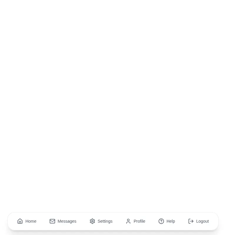
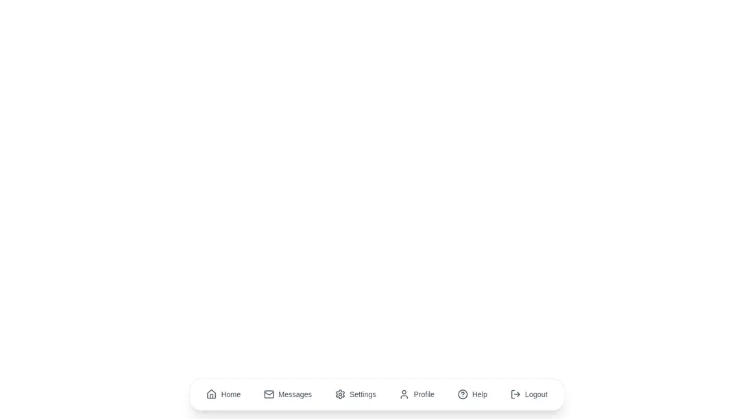
Measured
Every value below was written by the harness on the run that produced the frames above. None of it is derived from the prose.
| Build | OK |
|---|---|
| Mount | OK |
| Console errors | 0 |
| Uncaught page errors | 0 |
| Horizontal overflow | clean at 375, 768, 1440 |
| Axe critical | 0 |
| Axe serious | 0 |
| Axe moderate | 0 |
| Axe minor | 0 |
| Gzip marginal | 60.9 KB (126.3 KB build, 65.4 KB baseline) |
| Bare mode | OK |
| Provider required | NO |
| Demo used | written from the component source API |
Verdict
A polished app-style dock that builds and mounts cleanly, but it is better treated as a visual starting point than a finished navigation system. Replace the placeholder links and review the duplicated animated anchors, focus behavior, and whole-nav hover response before shipping.
Use it if
- You want a fixed bottom navigation for an app-like interface.
- Your project already uses Tailwind and can accept Motion-driven hover effects.
- You are comfortable replacing a small hard-coded menu with your own routes and labels.
Skip it if
- You need a conventional top navbar, nested menus, or a mobile drawer.
- You need navigation generated from props or routing configuration without refactoring the component.
- You want to minimize animation dependency overhead for a small navigation element.
- You require restrained keyboard behavior without auditing the overlapping front and back links.
Install
| Declared dependencies | motion, lucide-react |
|---|---|
| Missing on install | none |
| Bare install | builds and mounts without the shadcn-style helpers |
| Provider | no provider required in the harness |
In a non-shadcn React project, add Motion and Lucide React, configure Tailwind with dark-mode support, place the component in a client-rendered boundary, and replace the placeholder anchors with your router links. No provider is required.
Source and credit
This page is a review, not a copy. The component source lives with its author and this site does not republish it. Read the license before you use anything.
Author repository
github.com/ruixenui/ruixen.comAlternatives
Other published entries for the navbar pattern, ordered by what they measured: mounts first, then clean axe scans, then bare-mode passes, then the smaller bundle.
- hyperui-headers-4editorial
- Renders
- YES
- A11y
- 0
- Gzip
- 19.1KB
- Bare
- pass
- Prov
- NO
- kibo-dialog-stackminimal-flat
- Renders
- YES
- A11y
- 0
- Gzip
- 33.4KB
- Bare
- pass
- Prov
- NO
- ruixen-floating-navbarunclassified
- Renders
- YES
- A11y
- 0
- Gzip
- 59.9KB
- Bare
- pass
- Prov
- NO
- ruixen-expandable-menu-navbarunclassified
- Renders
- YES
- A11y
- 0
- Gzip
- 61.8KB
- Bare
- pass
- Prov
- NO
- hextaui-cardminimal-flat
- Renders
- YES
- A11y
- 0
- Gzip
- 26.7KB
- Bare
- fail
- Prov
- NO
- hextaui-breadcrumbminimal-flat
- Renders
- YES
- A11y
- 0
- Gzip
- 31.7KB
- Bare
- fail
- Prov
- NO