Measured entry
ruixen-glass-form
switchliquid-glassmotion on file
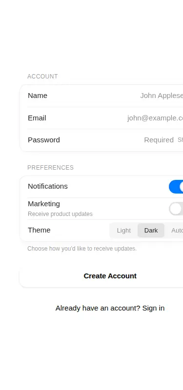
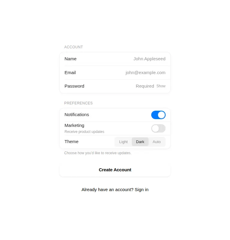
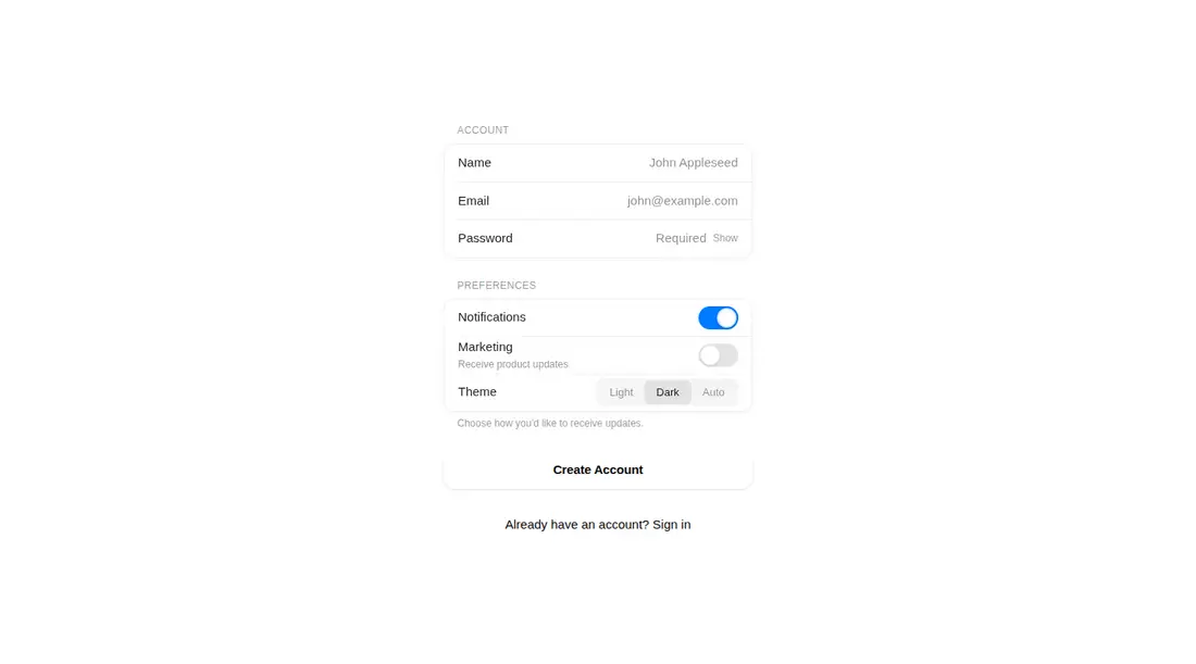
A client-side React form kit shipped as a shadcn registry component, with grouped fields, switches, segmented controls, and buttons. It embeds its glass CSS, uses Motion for entrance and control animation, reads primary theme variables, and can create Web Audio ticks for interactions.
Measured
Every value below was written by the harness on the run that produced the frames above. None of it is derived from the prose.
| Build | OK |
|---|---|
| Mount | OK |
| Console errors | 0 |
| Uncaught page errors | 0 |
| Horizontal overflow | flagged at 375 |
| Axe critical | 0 |
| Axe serious | 1 |
| Axe moderate | 0 |
| Axe minor | 0 |
| Gzip marginal | 63.4 KB (128.9 KB build, 65.5 KB baseline) |
| Bare mode | OK |
| Provider required | NO |
| Demo used | written from the component source API |
Verdict
A cohesive, ready-to-mount form treatment with useful composable parts, but not a drop-in production choice. Narrow-screen overflow and insufficient text contrast need correction, and the default interaction sound deserves an explicit product decision.
Use it if
- You want an account or preferences form with a consistent liquid-glass treatment.
- Your product already uses Motion and can supply compatible primary theme variables.
- You can test and tune the layout for narrow mobile screens before release.
Skip it if
- Your form must fit narrow screens without component-level responsive changes.
- You need a component that already clears color-contrast checks without theme tuning.
- You want native form controls with no animation or interaction sounds.
- You cannot justify adding Motion for a single form treatment.
Install
| Declared dependencies | motion |
|---|---|
| Missing on install | none |
| Bare install | builds and mounts without the shadcn-style helpers |
| Provider | no provider required in the harness |
In a non-shadcn React project, copy the client component into your source tree, install Motion, and define compatible primary and primary-foreground CSS variables. Ensure client rendering is enabled where required. No context provider is needed; disable sound through the form prop if audio feedback is unwanted.
Source and credit
This page is a review, not a copy. The component source lives with its author and this site does not republish it. Read the license before you use anything.
Author repository
github.com/ruixenui/ruixen.comAlternatives
Other published entries for the switch pattern, ordered by what they measured: mounts first, then clean axe scans, then bare-mode passes, then the smaller bundle.
- neu-toggleneumorphism
- Renders
- YES
- A11y
- 0
- Gzip
- 17.8KB
- Bare
- pass
- Prov
- NO
- clay-toggleclaymorphism
- Renders
- YES
- A11y
- 0
- Gzip
- 18.2KB
- Bare
- pass
- Prov
- NO
- ruixen-scrub-datetimeunclassified
- Renders
- YES
- A11y
- 0
- Gzip
- 22.2KB
- Bare
- pass
- Prov
- NO
- shadcn-switchunclassified
- Renders
- YES
- A11y
- 0
- Gzip
- 34.4KB
- Bare
- pass
- Prov
- NO
- hextaui-switchminimal-flat
- Renders
- YES
- A11y
- 0
- Gzip
- 34.5KB
- Bare
- pass
- Prov
- NO
- hextaui-tabsminimal-flat
- Renders
- YES
- A11y
- 0
- Gzip
- 39.0KB
- Bare
- pass
- Prov
- NO