Measured entry
ruixen-notification-inbox-popover
alertglassmorphismmotion on file
A client-side React notification inbox delivered as a single shadcn registry TSX file. It uses motion/react for entry, layout, and read-state animation, inline scoped styles for the glass treatment, browser audio for optional click feedback, and callbacks or local state for marking items read.
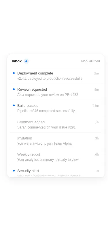
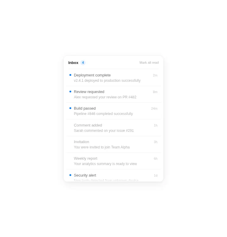
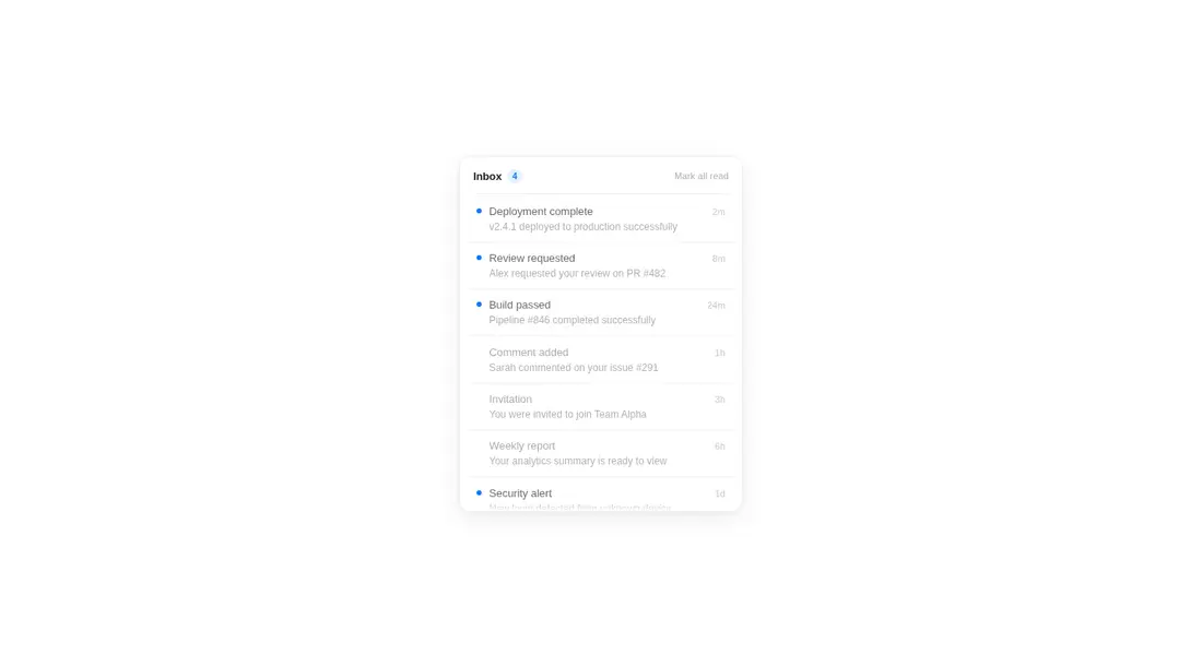
Measured
Every value below was written by the harness on the run that produced the frames above. None of it is derived from the prose.
| Build | OK |
|---|---|
| Mount | OK |
| Console errors | 0 |
| Uncaught page errors | 0 |
| Horizontal overflow | clean at 375, 768, 1440 |
| Axe critical | 0 |
| Axe serious | 2 |
| Axe moderate | 0 |
| Axe minor | 0 |
| Gzip marginal | 62.1 KB (127.5 KB build, 65.4 KB baseline) |
| Bare mode | OK |
| Provider required | NO |
| Demo used | written from the component source API |
Verdict
A polished, functional inbox shell that builds and mounts on its own, with useful controlled-state hooks. Treat it as a strong visual starting point, not a drop-in production alert center, until contrast, focusability, and keyboard activation are corrected.
Use it if
- You need a compact notification inbox with individual and bulk read actions.
- Your interface benefits from pointer-driven row emphasis and animated state changes.
- You want a self-contained client component that accepts external notification data and callbacks.
Skip it if
- You need production-ready keyboard access without modifying the scrollable list and clickable rows.
- Your accessibility baseline cannot accept the current low-contrast secondary text and controls.
- You want to avoid an animation dependency, direct DOM styling, or browser audio behavior.
- Your primary interaction is touch or keyboard, where the pointer-proximity effect adds little value.
Install
| Declared dependencies | motion |
|---|---|
| Missing on install | none |
| Bare install | builds and mounts without the shadcn-style helpers |
| Provider | no provider required in the harness |
In a non-shadcn project, copy the TSX component into the app, install Motion, and render it from a React client boundary. No provider is required. Ensure the build supports TypeScript and JSX, then add keyboard semantics and contrast fixes before release.
Source and credit
This page is a review, not a copy. The component source lives with its author and this site does not republish it. Read the license before you use anything.
Author repository
github.com/ruixenui/ruixen.comAlternatives
Other published entries for the alert pattern, ordered by what they measured: mounts first, then clean axe scans, then bare-mode passes, then the smaller bundle.
- 8bitcn-toastskeuomorphism
- Renders
- YES
- A11y
- 0
- Gzip
- 30.8KB
- Bare
- pass
- Prov
- NO
- neobrutalism-sonnerbrutalism
- Renders
- YES
- A11y
- 0
- Gzip
- 31.6KB
- Bare
- pass
- Prov
- NO
- shadcn-alertunclassified
- Renders
- YES
- A11y
- 0
- Gzip
- 12.5KB
- Bare
- fail
- Prov
- NO
- reui-alertminimal-flat
- Renders
- YES
- A11y
- 0
- Gzip
- 29.9KB
- Bare
- fail
- Prov
- NO
- neobrutalism-alertbrutalism
- Renders
- YES
- A11y
- 0
- Gzip
- 30.0KB
- Bare
- fail
- Prov
- NO
- shadcn-sonnerunclassified
- Renders
- YES
- A11y
- 0
- Gzip
- 31.9KB
- Bare
- fail
- Prov
- NO