Measured entry
ruixen-notifications-carousel
A client-side React notification carousel distributed as a shadcn registry component. It uses Motion for spring animation, embeds its own light and dark styling, accepts notification data and selection or dismissal callbacks, and can play optional browser-generated sound feedback.
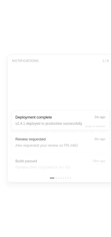
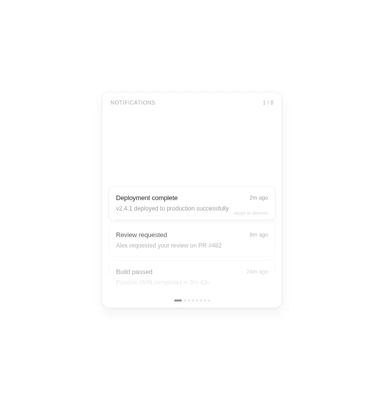
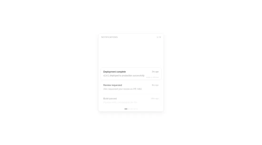
Measured
Every value below was written by the harness on the run that produced the frames above. None of it is derived from the prose.
| Build | OK |
|---|---|
| Mount | OK |
| Console errors | 0 |
| Uncaught page errors | 0 |
| Horizontal overflow | flagged at 375 |
| Axe critical | 1 |
| Axe serious | 1 |
| Axe moderate | 0 |
| Axe minor | 0 |
| Gzip marginal | 64.7 KB (130.1 KB build, 65.4 KB baseline) |
| Bare mode | OK |
| Provider required | NO |
| Demo used | written from the component source API |
Verdict
A polished interaction concept that builds and mounts cleanly, but it is not ready to drop into an accessible mobile product. Use it when the drum-like browsing behavior matters, and budget time to make the width responsive, label the dot controls, and revise the muted text colors.
Use it if
- You need a compact, tactile notification browser with wheel, keyboard, pointer, and swipe interactions.
- You want a self-contained visual treatment that does not depend on a utility CSS framework.
- Your product can benefit from controlled selection and dismissal callbacks or simple internal demo data.
Skip it if
- Your interface must fit narrow mobile screens without modifying the component's fixed-width layout.
- You need production-ready accessibility without first labeling the navigation controls and strengthening text contrast.
- You prefer a conventional notification list whose full contents remain visible and easy to scan.
- You cannot justify adding Motion for a single animated notification surface.
Install
| Declared dependencies | motion |
|---|---|
| Missing on install | none |
| Bare install | builds and mounts without the shadcn-style helpers |
| Provider | no provider required in the harness |
In a non-shadcn React project, add the Motion package, copy the client component into your source tree, and render it in a browser-capable client boundary. Supply your own notification items and callbacks as needed. No provider or utility CSS setup is required because the component injects its own styles.
Source and credit
This page is a review, not a copy. The component source lives with its author and this site does not republish it. Read the license before you use anything.
Author repository
github.com/ruixenui/ruixen.comAlternatives
Other published entries for the alert pattern, ordered by what they measured: mounts first, then clean axe scans, then bare-mode passes, then the smaller bundle.
- 8bitcn-toastskeuomorphism
- Renders
- YES
- A11y
- 0
- Gzip
- 30.8KB
- Bare
- pass
- Prov
- NO
- neobrutalism-sonnerbrutalism
- Renders
- YES
- A11y
- 0
- Gzip
- 31.6KB
- Bare
- pass
- Prov
- NO
- shadcn-alertunclassified
- Renders
- YES
- A11y
- 0
- Gzip
- 12.5KB
- Bare
- fail
- Prov
- NO
- reui-alertminimal-flat
- Renders
- YES
- A11y
- 0
- Gzip
- 29.9KB
- Bare
- fail
- Prov
- NO
- neobrutalism-alertbrutalism
- Renders
- YES
- A11y
- 0
- Gzip
- 30.0KB
- Bare
- fail
- Prov
- NO
- shadcn-sonnerunclassified
- Renders
- YES
- A11y
- 0
- Gzip
- 31.9KB
- Bare
- fail
- Prov
- NO