Measured entry
shadcn-aspect-ratio
A tiny client-side React wrapper around Radix UI's AspectRatio root. It ships as source code copied into your project, adds a data slot for styling hooks, forwards the primitive's props, and depends only on the radix-ui package rather than a provider or wider component system.
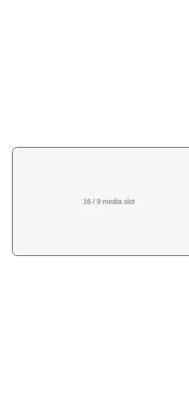
Measured
Every value below was written by the harness on the run that produced the frames above. None of it is derived from the prose.
| Build | OK |
|---|---|
| Mount | OK |
| Console errors | 0 |
| Uncaught page errors | 0 |
| Horizontal overflow | flagged at 375 |
| Axe critical | 0 |
| Axe serious | 1 |
| Axe moderate | 0 |
| Axe minor | 0 |
| Gzip marginal | 21.8 KB (87.5 KB build, 65.7 KB baseline) |
| Bare mode | OK |
| Provider required | NO |
| Demo used | written from the component source API |
Verdict
A dependable but very thin layout primitive that builds and mounts cleanly without a provider. Adopt it when a shared React abstraction is useful; otherwise native CSS is simpler. The demo exposes narrow-screen overflow and a text contrast issue, both owned by surrounding styles rather than the wrapper.
Use it if
- You need media, embeds, or placeholders to preserve a chosen shape as their container resizes.
- You want a local, easily modified wrapper with Radix behavior and no provider setup.
- Your project already accepts client components and the radix-ui package.
Skip it if
- Native CSS aspect-ratio on an existing element already covers the layout without another dependency.
- You need a complete image component with loading, cropping, fallback, or optimization behavior.
- Your content must fit very narrow screens without adjusting the surrounding fixed-width layout.
- You cannot review and correct theme token contrast in the consuming content.
Install
| Declared dependencies | radix-ui |
|---|---|
| Missing on install | none |
| Bare install | builds and mounts without the shadcn-style helpers |
| Provider | no provider required in the harness |
Install radix-ui, copy the client component into your source tree, and ensure your React and TypeScript setup supports client modules and React component prop types. Tailwind and shadcn utilities are not required by the wrapper itself; add your own container, overflow, and theme styles.
Source and credit
This page is a review, not a copy. The component source lives with its author and this site does not republish it. Read the license before you use anything.
Author repository
github.com/shadcn-ui/uiAlternatives
Other published entries for the image pattern, ordered by what they measured: mounts first, then clean axe scans, then bare-mode passes, then the smaller bundle.
- magicui-androidskeuomorphism
- Renders
- YES
- A11y
- 0
- Gzip
- 17.8KB
- Bare
- pass
- Prov
- NO
- magicui-iphoneskeuomorphism
- Renders
- YES
- A11y
- 0
- Gzip
- 18.5KB
- Bare
- pass
- Prov
- NO
- magicui-safariskeuomorphism
- Renders
- YES
- A11y
- 0
- Gzip
- 20.8KB
- Bare
- pass
- Prov
- NO
- kibo-image-zoomminimal-flat
- Renders
- YES
- A11y
- 0
- Gzip
- 36.6KB
- Bare
- pass
- Prov
- NO
- ruixen-scroll-tilted-gridunclassified
- Renders
- YES
- A11y
- 0
- Gzip
- 60.5KB
- Bare
- pass
- Prov
- NO
- magicui-lens3d
- Renders
- YES
- A11y
- 0
- Gzip
- 63.5KB
- Bare
- pass
- Prov
- NO