Measured entry
shadcn-block-sidebar-05
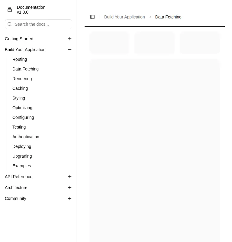
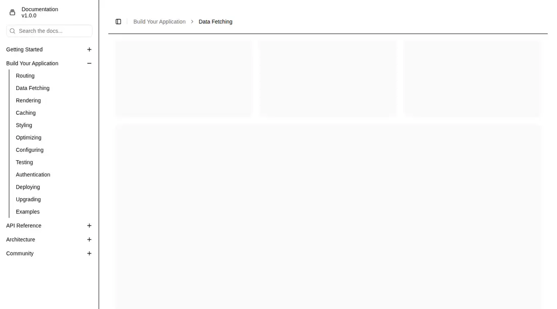
A documentation-oriented app shell with a collapsible sidebar, nested navigation, search field, breadcrumb header, content placeholders, and a compact rail. It ships as a shadcn registry block split across a page and React components, and depends on shadcn sidebar, breadcrumb, separator, label, and collapsible primitives plus Radix UI, class-variance-authority, and Lucide icons.

Measured
Every value below was written by the harness on the run that produced the frames above. None of it is derived from the prose.
| Build | OK |
|---|---|
| Mount | OK |
| Console errors | 0 |
| Uncaught page errors | 0 |
| Horizontal overflow | clean at 375, 768, 1440 |
| Axe critical | 0 |
| Axe serious | 2 |
| Axe moderate | 2 |
| Axe minor | 0 |
| Gzip marginal | 60.1 KB (125.5 KB build, 65.4 KB baseline) |
| Bare mode | FAIL |
| Provider required | NO |
| Demo used | none |
What the harness recorded
BARE BUILD
✗ Build failed in 24.17s
error during build:
[vite:load-fallback] Could not load <sandbox>/src/lib/utils (imported by src/components/ui/breadcrumb.tsx): ENOENT: no such file or directory, open '<sandbox>/src/lib/utils'
Verdict
A practical starting shell for documentation-heavy products already committed to shadcn, with useful collapse and hierarchy patterns. It needs a shadcn-style setup, and the navigation markup should be repaired before production because the current collapsible structure breaks list semantics.
Use it if
- You are building documentation or a settings area with grouped, nested navigation.
- Your app already uses shadcn conventions, Tailwind theme tokens, and the at-sign path alias.
- You want a responsive app shell whose sidebar can collapse while preserving a breadcrumb-led content area.
Skip it if
- You need production-ready accessibility without correcting the detected list semantics and landmark conflicts.
- Your project is not prepared to adopt shadcn primitives, theme tokens, and source-copy ownership.
- You need routing, search behavior, or navigation state to work without replacing the placeholder links and sample data.
- You want a small standalone menu rather than a full page shell with several UI dependencies.
Install
| Declared dependencies | radix-ui, class-variance-authority, lucide-react |
|---|---|
| Missing on install | none |
| Bare install | fails once the shadcn-style helpers are removed, so it needs that setup |
| Provider | no provider required in the harness |
For a non-shadcn project, add the sidebar, breadcrumb, separator, label, and collapsible source primitives with their transitive UI pieces; install Radix UI, class-variance-authority, and Lucide React; provide the cn utility at the expected lib path, configure the at-sign alias, and define the Tailwind and global CSS theme tokens used by the sidebar. Replace the sample links and data with your router and search logic.
Source and credit
This page is a review, not a copy. The component source lives with its author and this site does not republish it. Read the license before you use anything.
Author repository
github.com/shadcn-ui/uiAlternatives
Other published entries for the sidebar pattern, ordered by what they measured: mounts first, then clean axe scans, then bare-mode passes, then the smaller bundle.
- magicui-file-treebento
- Renders
- YES
- A11y
- 0
- Gzip
- 45.4KB
- Bare
- fail
- Prov
- NO
- shadcn-block-sidebar-13minimal-flat
- Renders
- YES
- A11y
- 0
- Gzip
- 59.4KB
- Bare
- fail
- Prov
- NO
- tripled-animated-sidebar-shadcnuiminimal-flat
- Renders
- YES
- A11y
- 1
- Gzip
- 64.4KB
- Bare
- pass
- Prov
- NO
- shadcn-block-sidebar-14minimal-flat
- Renders
- YES
- A11y
- 2
- Gzip
- 58.4KB
- Bare
- fail
- Prov
- NO
- shadcn-block-sidebar-04minimal-flat
- Renders
- YES
- A11y
- 2
- Gzip
- 58.6KB
- Bare
- fail
- Prov
- NO
- shadcn-block-sidebar-03minimal-flat
- Renders
- YES
- A11y
- 2
- Gzip
- 58.7KB
- Bare
- fail
- Prov
- NO