Measured entry
shadcn-block-sidebar-11
A shadcn registry block for a dashboard shell with a collapsible file tree, change badges, breadcrumbs, and responsive sidebar controls. It ships as React source plus sidebar, breadcrumb, separator, and collapsible registry primitives, and relies on Radix UI, class-variance-authority, Lucide icons, Tailwind styling, and the usual shadcn utility conventions.
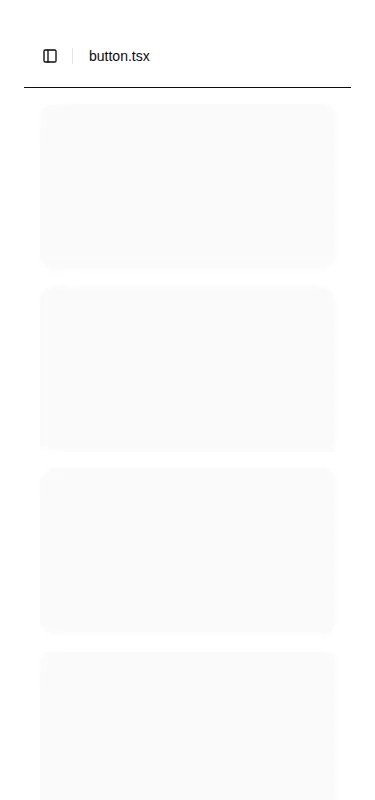
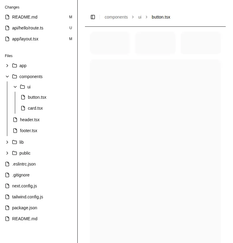
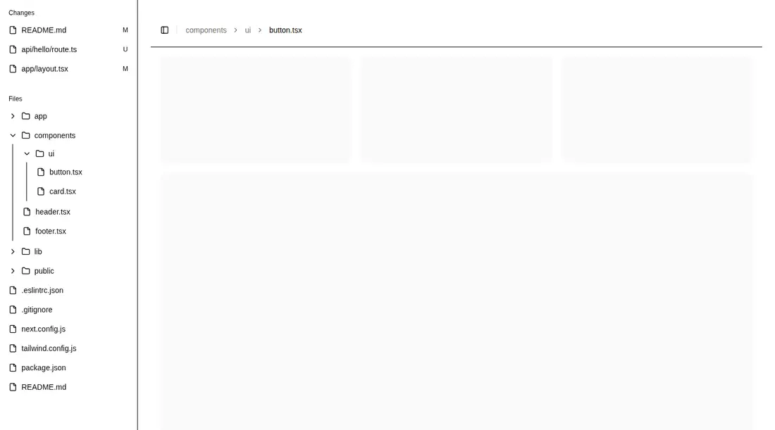
Measured
Every value below was written by the harness on the run that produced the frames above. None of it is derived from the prose.
| Build | OK |
|---|---|
| Mount | OK |
| Console errors | 0 |
| Uncaught page errors | 0 |
| Horizontal overflow | clean at 375, 768, 1440 |
| Axe critical | 0 |
| Axe serious | 1 |
| Axe moderate | 2 |
| Axe minor | 0 |
| Gzip marginal | 59.5 KB (124.9 KB build, 65.4 KB baseline) |
| Bare mode | FAIL |
| Provider required | NO |
| Demo used | none |
What the harness recorded
BARE BUILD
✗ Build failed in 21.75s
error during build:
[vite:load-fallback] Could not load <sandbox>/src/lib/utils (imported by src/components/ui/separator.tsx): ENOENT: no such file or directory, open '<sandbox>/src/lib/utils'
Verdict
A useful starting point for developer tools and content browsers, with responsive behavior intact, but it is not drop-in outside its ecosystem. It needs a shadcn-style setup, and the tree list semantics plus main-landmark structure should be corrected before production use.
Use it if
- You need an IDE-like navigation panel for nested files, documents, or project assets.
- Your app already uses shadcn primitives and can adopt its sidebar provider and styling conventions.
- You want a responsive dashboard shell with a collapsible rail and breadcrumb header ready to customize.
Skip it if
- Your project is not prepared to carry the shadcn sidebar primitives, utility alias, and Tailwind theme conventions.
- You need accessible list markup without source changes, since the rendered tree currently places menu buttons directly under lists.
- Your page already defines its main landmark and cannot adjust the block's nested or duplicate landmark structure.
- You only need a simple navigation list and do not want the added dependency and styling footprint of a full dashboard shell.
Install
| Declared dependencies | radix-ui, class-variance-authority, lucide-react |
|---|---|
| Missing on install | none |
| Bare install | fails once the shadcn-style helpers are removed, so it needs that setup |
| Provider | no provider required in the harness |
In a non-shadcn project, add the sidebar, breadcrumb, separator, and collapsible component source; configure the at-sign path alias and the shared class-name utility; install Radix UI, class-variance-authority, and Lucide React; then port the required Tailwind tokens, sidebar variables, responsive styles, and global theme rules. Review the host layout so it supplies only one top-level main landmark.
Source and credit
This page is a review, not a copy. The component source lives with its author and this site does not republish it. Read the license before you use anything.
Author repository
github.com/shadcn-ui/uiAlternatives
Other published entries for the sidebar pattern, ordered by what they measured: mounts first, then clean axe scans, then bare-mode passes, then the smaller bundle.
- magicui-file-treebento
- Renders
- YES
- A11y
- 0
- Gzip
- 45.4KB
- Bare
- fail
- Prov
- NO
- shadcn-block-sidebar-13minimal-flat
- Renders
- YES
- A11y
- 0
- Gzip
- 59.4KB
- Bare
- fail
- Prov
- NO
- tripled-animated-sidebar-shadcnuiminimal-flat
- Renders
- YES
- A11y
- 1
- Gzip
- 64.4KB
- Bare
- pass
- Prov
- NO
- shadcn-block-sidebar-14minimal-flat
- Renders
- YES
- A11y
- 2
- Gzip
- 58.4KB
- Bare
- fail
- Prov
- NO
- shadcn-block-sidebar-04minimal-flat
- Renders
- YES
- A11y
- 2
- Gzip
- 58.6KB
- Bare
- fail
- Prov
- NO
- shadcn-block-sidebar-03minimal-flat
- Renders
- YES
- A11y
- 2
- Gzip
- 58.7KB
- Bare
- fail
- Prov
- NO