Measured entry
shadcn-toggle
A client-side React pressed-state button copied into your app as source, wrapping the Radix UI Toggle primitive. Its visual variants use class-variance-authority, Tailwind utility classes, and a local cn helper backed by clsx and tailwind-merge.

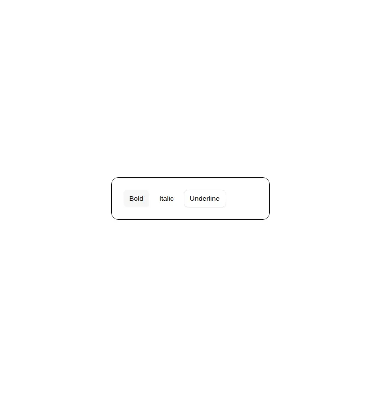
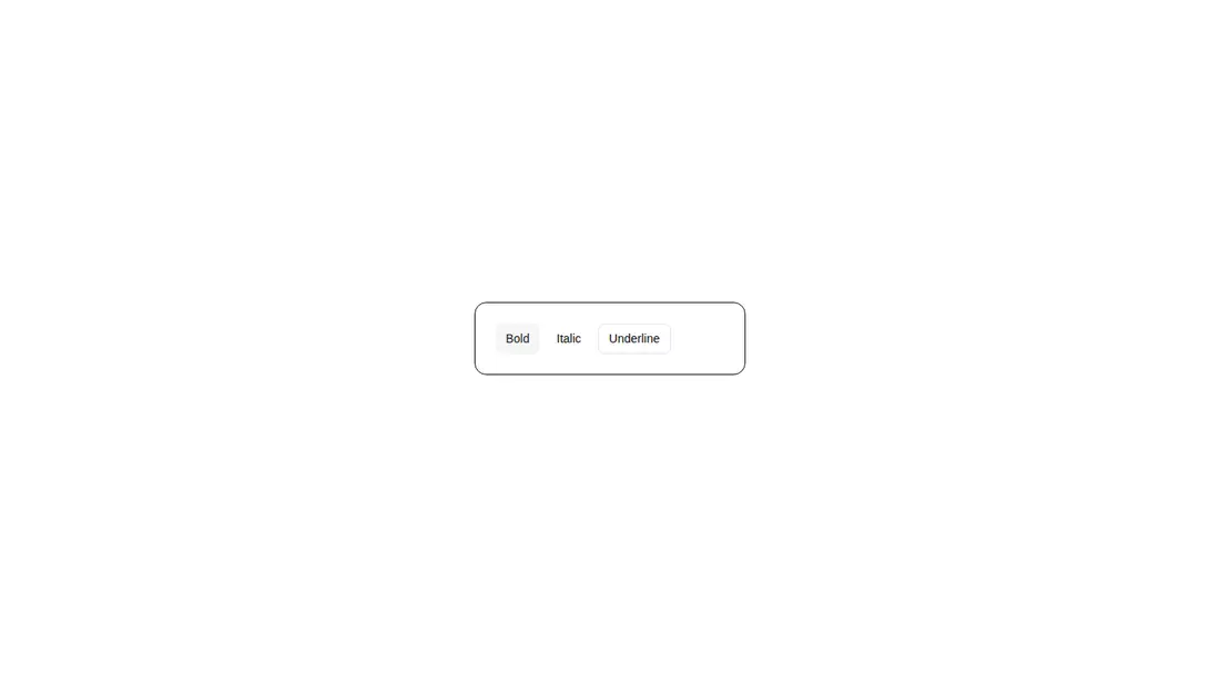
Measured
Every value below was written by the harness on the run that produced the frames above. None of it is derived from the prose.
| Build | OK |
|---|---|
| Mount | OK |
| Console errors | 0 |
| Uncaught page errors | 0 |
| Horizontal overflow | clean at 375, 768, 1440 |
| Axe critical | 0 |
| Axe serious | 0 |
| Axe moderate | 0 |
| Axe minor | 0 |
| Gzip marginal | 32.8 KB (98.3 KB build, 65.5 KB baseline) |
| Bare mode | FAIL |
| Provider required | NO |
| Demo used | written from the component source API |
What the harness recorded
BARE BUILD
✗ Build failed in 896ms
error during build:
[vite]: Rollup failed to resolve import "class-variance-authority" from "<sandbox>re-2ba5c3265590/src/cut/components/ui/toggle.tsx".
Verdict
A dependable choice for compact, independently toggled actions. It built and mounted cleanly, stayed responsive, and produced no detected accessibility violations. The main tradeoff is adopting its Tailwind token conventions and Radix dependency for a small control.
Use it if
- You need an independently pressed toolbar action such as bold, mute, or pin.
- Your app already uses Tailwind and shadcn-style theme tokens.
- You want Radix-managed keyboard, focus, disabled, and controlled-state behavior while retaining local source ownership.
Skip it if
- You need a mutually exclusive or coordinated set of controls, where Toggle Group is the better primitive.
- You need a form setting presented as an on-off switch rather than a pressed button.
- Your project does not use Tailwind and you do not want to translate its theme-token classes.
- You want a dependency-free button and can implement pressed-state behavior yourself.
Install
| Declared dependencies | radix-ui, clsx, tailwind-merge |
|---|---|
| Missing on install | none |
| Bare install | fails once the shadcn-style helpers are removed, so it needs that setup |
| Provider | no provider required in the harness |
In a non-shadcn project, add Radix UI, class-variance-authority, clsx, and tailwind-merge; provide the cn class-merging helper; and define or replace the Tailwind theme-token utilities used for muted, accent, input, ring, and destructive states. Keep it in a client-rendered React boundary.
Source and credit
This page is a review, not a copy. The component source lives with its author and this site does not republish it. Read the license before you use anything.
Author repository
github.com/shadcn-ui/uiAlternatives
Other published entries for the switch pattern, ordered by what they measured: mounts first, then clean axe scans, then bare-mode passes, then the smaller bundle.
- neu-toggleneumorphism
- Renders
- YES
- A11y
- 0
- Gzip
- 17.8KB
- Bare
- pass
- Prov
- NO
- clay-toggleclaymorphism
- Renders
- YES
- A11y
- 0
- Gzip
- 18.2KB
- Bare
- pass
- Prov
- NO
- ruixen-scrub-datetimeunclassified
- Renders
- YES
- A11y
- 0
- Gzip
- 22.2KB
- Bare
- pass
- Prov
- NO
- shadcn-switchunclassified
- Renders
- YES
- A11y
- 0
- Gzip
- 34.4KB
- Bare
- pass
- Prov
- NO
- hextaui-switchminimal-flat
- Renders
- YES
- A11y
- 0
- Gzip
- 34.5KB
- Bare
- pass
- Prov
- NO
- hextaui-tabsminimal-flat
- Renders
- YES
- A11y
- 0
- Gzip
- 39.0KB
- Bare
- pass
- Prov
- NO