Measured entry
tailark-dusk-content-3
A dark Tailark content section with a headline, framed product screenshot, supporting copy, and icon-led feature blurbs. It ships as a TSX registry block and relies on Next.js Image, Lucide icons, Tailwind utilities and theme tokens, plus a site-provided mail screenshot asset.


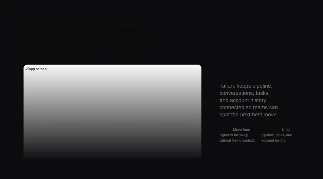
Measured
Every value below was written by the harness on the run that produced the frames above. None of it is derived from the prose.
| Build | OK |
|---|---|
| Mount | OK |
| Console errors | 1 |
| Uncaught page errors | 0 |
| Horizontal overflow | flagged at 375, 768 |
| Axe critical | 0 |
| Axe serious | 1 |
| Axe moderate | 0 |
| Axe minor | 0 |
| Gzip marginal | 26.1 KB (91.5 KB build, 65.4 KB baseline) |
| Bare mode | FAIL |
| Provider required | NO |
| Demo used | written from the component source API |
What the harness recorded
CONSOLE
Failed to load resource: the server responded with a status of 404 (Not Found)
BARE BUILD
✗ Build failed in 491ms
error during build:
[vite]: Rollup failed to resolve import "lucide-react" from "<sandbox>re-5b0c5607fb71/src/cut/components/content-3.tsx".
Verdict
A solid desktop composition, but not ready to ship unchanged. It builds and mounts without a provider, yet the referenced screenshot is missing, narrow layouts overflow, and muted copy fails contrast checks. Use it as a styled starting point after fixing those issues.
Use it if
- You need a wide editorial product section that pairs a large interface preview with concise supporting copy.
- Your app already uses Next.js, Tailwind theme tokens, and Lucide icons.
- You are prepared to supply the referenced product screenshot and tune the section for your own content.
Skip it if
- You need dependable narrow-screen behavior without revising the intentional image offset that currently causes horizontal overflow.
- You require accessible color contrast without adjusting the muted text and theme colors.
- You want a framework-neutral component and do not want to replace Next.js Image or translate Tailwind-specific masking utilities.
- You need a complete drop-in block with its product image included.
Install
| Declared dependencies | none declared |
|---|---|
| Missing on install | none |
| Bare install | fails once the shadcn-style helpers are removed, so it needs that setup |
| Provider | no provider required in the harness |
In a non-shadcn project, add Lucide React, configure Tailwind with the foreground, background, and muted color tokens used here, and ensure the masking and aspect utilities are supported. Provide the mail screenshot at the expected public path. Outside Next.js, replace the Image component with your framework's image element.
Source and credit
This page is a review, not a copy. The component source lives with its author and this site does not republish it. Read the license before you use anything.
Author repository
github.com/tailark/blocksAlternatives
Other published entries for the card pattern, ordered by what they measured: mounts first, then clean axe scans, then bare-mode passes, then the smaller bundle.
- tailark-veil-content-1minimal-flat
- Renders
- YES
- A11y
- 0
- Gzip
- 17.6KB
- Bare
- pass
- Prov
- NO
- tailark-veil-content-2minimal-flat
- Renders
- YES
- A11y
- 0
- Gzip
- 17.6KB
- Bare
- pass
- Prov
- NO
- tailark-mist-content-3minimal-flat
- Renders
- YES
- A11y
- 0
- Gzip
- 24.1KB
- Bare
- pass
- Prov
- NO
- neobrutalism-cardbrutalism
- Renders
- YES
- A11y
- 0
- Gzip
- 29.6KB
- Bare
- pass
- Prov
- NO
- neobrutalism-ncardbrutalism
- Renders
- YES
- A11y
- 0
- Gzip
- 29.6KB
- Bare
- pass
- Prov
- NO
- reui-icon-stackminimal-flat
- Renders
- YES
- A11y
- 0
- Gzip
- 30.1KB
- Bare
- pass
- Prov
- NO