Measured entry
tailark-dusk-content-4
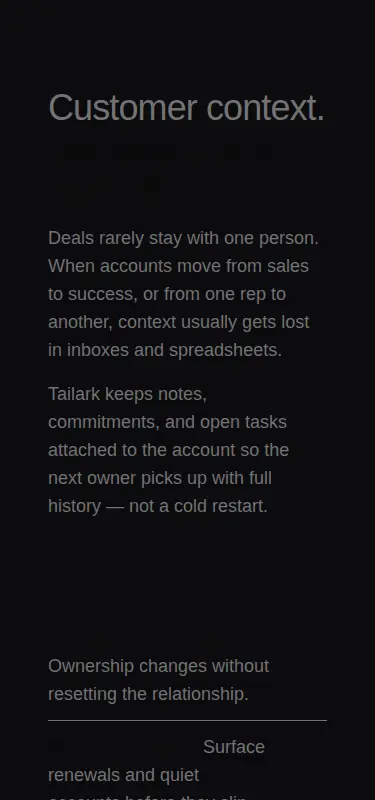
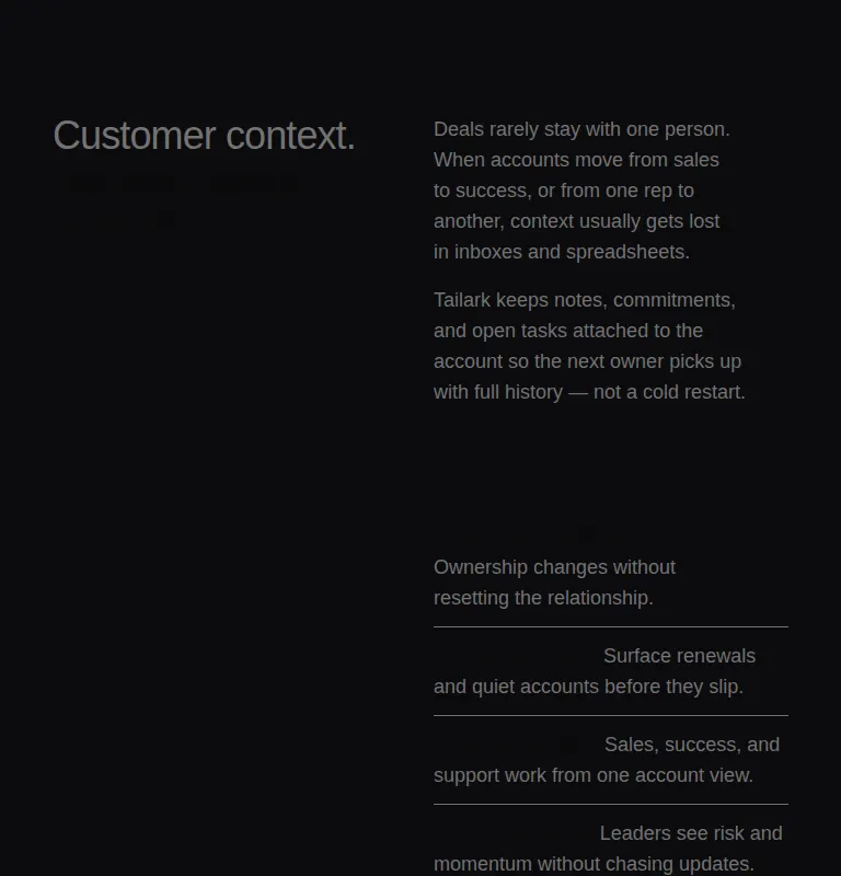
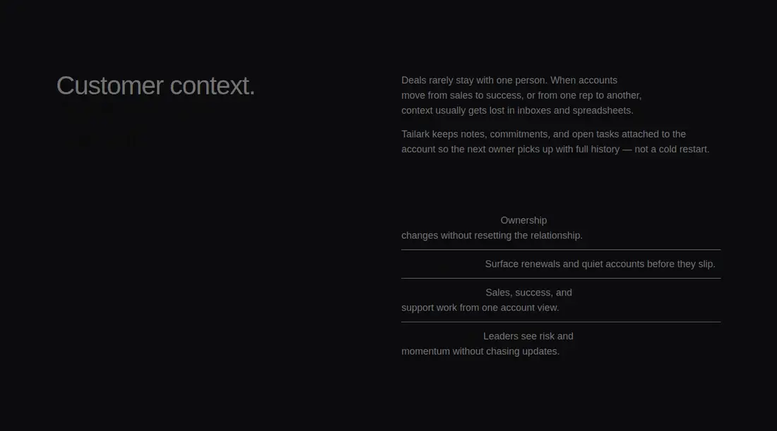
A static, dark content section with a split headline, explanatory copy, and an icon-led feature list. It ships as a single React TSX block through a shadcn registry and relies on Tailwind utilities, shadcn theme tokens, and Lucide icons.
Measured
Every value below was written by the harness on the run that produced the frames above. None of it is derived from the prose.
| Build | OK |
|---|---|
| Mount | OK |
| Console errors | 0 |
| Uncaught page errors | 0 |
| Horizontal overflow | clean at 375, 768, 1440 |
| Axe critical | 0 |
| Axe serious | 1 |
| Axe moderate | 0 |
| Axe minor | 0 |
| Gzip marginal | 19.1 KB (84.5 KB build, 65.4 KB baseline) |
| Bare mode | FAIL |
| Provider required | NO |
| Demo used | written from the component source API |
What the harness recorded
BARE BUILD
✗ Build failed in 532ms
error during build:
[vite]: Rollup failed to resolve import "lucide-react" from "<sandbox>re-0309aa4e1d5b/src/cut/components/content-4.tsx".
Verdict
A clean, adaptable content block that builds and mounts without extra providers and holds its layout across tested screens. Do not ship it unchanged: key headline and feature-label text fail contrast on the dark surface, so the foreground and muted colors need correction.
Use it if
- You need a dark editorial section that pairs a positioning statement with supporting product benefits.
- Your page already uses Tailwind and shadcn-compatible color tokens.
- You want a responsive, non-interactive block that can be adapted with replacement copy and icons.
Skip it if
- You need accessible colors without revising the supplied theme or text classes.
- You need interactive cards, links, or calls to action rather than a static feature list.
- Your design system does not use Tailwind utilities or shadcn-style semantic color tokens.
Install
| Declared dependencies | none declared |
|---|---|
| Missing on install | none |
| Bare install | fails once the shadcn-style helpers are removed, so it needs that setup |
| Provider | no provider required in the harness |
In a non-shadcn project, add React, Tailwind processing, Lucide React, and semantic foreground, muted-foreground, and border theme tokens. Recreate the responsive grid and spacing utilities if you use another styling system, then adjust the dark-theme colors to meet contrast requirements.
Source and credit
This page is a review, not a copy. The component source lives with its author and this site does not republish it. Read the license before you use anything.
Author repository
github.com/tailark/blocksAlternatives
Other published entries for the card pattern, ordered by what they measured: mounts first, then clean axe scans, then bare-mode passes, then the smaller bundle.
- tailark-veil-content-1minimal-flat
- Renders
- YES
- A11y
- 0
- Gzip
- 17.6KB
- Bare
- pass
- Prov
- NO
- tailark-veil-content-2minimal-flat
- Renders
- YES
- A11y
- 0
- Gzip
- 17.6KB
- Bare
- pass
- Prov
- NO
- tailark-mist-content-3minimal-flat
- Renders
- YES
- A11y
- 0
- Gzip
- 24.1KB
- Bare
- pass
- Prov
- NO
- neobrutalism-cardbrutalism
- Renders
- YES
- A11y
- 0
- Gzip
- 29.6KB
- Bare
- pass
- Prov
- NO
- neobrutalism-ncardbrutalism
- Renders
- YES
- A11y
- 0
- Gzip
- 29.6KB
- Bare
- pass
- Prov
- NO
- reui-icon-stackminimal-flat
- Renders
- YES
- A11y
- 0
- Gzip
- 30.1KB
- Bare
- pass
- Prov
- NO