Measured entry
tripled-course-content-page-shadcnui
progressminimal-flatmotion on file
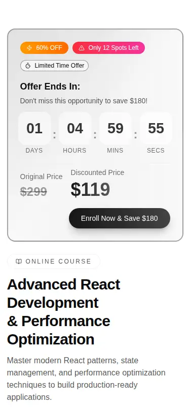
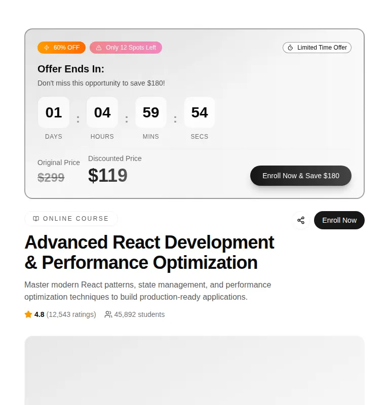
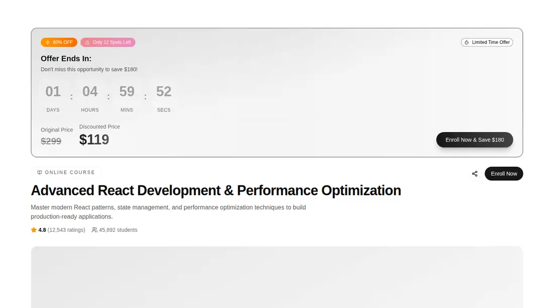
A client-side course sales and content page shipped as a shadcn registry TSX component. It combines a promotional countdown, mock video player, course metadata, curriculum, and instructor profile, using React, Framer Motion, Lucide icons, Tailwind theme tokens, and shadcn Button and Badge primitives backed by Radix.
Measured
Every value below was written by the harness on the run that produced the frames above. None of it is derived from the prose.
| Build | OK |
|---|---|
| Mount | OK |
| Console errors | 0 |
| Uncaught page errors | 0 |
| Horizontal overflow | flagged at 375 |
| Axe critical | 0 |
| Axe serious | 1 |
| Axe moderate | 3 |
| Axe minor | 0 |
| Gzip marginal | 77.5 KB (142.9 KB build, 65.4 KB baseline) |
| Bare mode | FAIL |
| Provider required | NO |
| Demo used | written from the component source API |
What the harness recorded
BARE BUILD
✗ Build failed in 2m 23s
error during build:
[vite:load-fallback] Could not load <sandbox>/src/lib/utils (imported by src/components/ui/button.tsx): ENOENT: no such file or directory, open '<sandbox>/src/lib/utils'
Verdict
A polished-looking starting shell for a course storefront, but it is demo content rather than finished product behavior. It needs a shadcn-style setup, and teams should fix the narrow-screen overflow, contrast, heading structure, and nested main landmark before shipping.
Use it if
- You need a ready-made course detail page with curriculum, instructor, enrollment, and promotion sections.
- Your app already uses shadcn conventions and can replace the hard-coded course data and placeholder video behavior.
- Motion-heavy presentation and a sales-oriented countdown fit the learning product you are building.
Skip it if
- You need a compact progress indicator rather than a complete course landing page.
- Mobile horizontal overflow must be absent without layout remediation.
- You cannot budget time to fix low-contrast text, heading order, and conflicting main landmarks.
- You want working playback, enrollment, sharing, or curriculum expansion out of the box; these controls are mostly presentation stubs.
- You are avoiding animation and icon dependencies for a lean course surface.
Install
| Declared dependencies | framer-motion, react, radix-ui |
|---|---|
| Missing on install | none |
| Bare install | fails once the shadcn-style helpers are removed, so it needs that setup |
| Provider | no provider required in the harness |
In a non-shadcn project, add compatible Button and Badge primitives, the path alias and class-name utility expected at @/lib/utils, Tailwind processing with shadcn color tokens, and the React, Framer Motion, Lucide, and Radix dependencies. Then connect real course data, video, enrollment, sharing, and curriculum state.
Source and credit
This page is a review, not a copy. The component source lives with its author and this site does not republish it. Read the license before you use anything.
Author repository
github.com/moumen-soliman/uitripledAlternatives
Other published entries for the progress pattern, ordered by what they measured: mounts first, then clean axe scans, then bare-mode passes, then the smaller bundle.
- neu-progressneumorphism
- Renders
- YES
- A11y
- 0
- Gzip
- 17.8KB
- Bare
- pass
- Prov
- NO
- clay-progressclaymorphism
- Renders
- YES
- A11y
- 0
- Gzip
- 18.0KB
- Bare
- pass
- Prov
- NO
- tripled-scroll-progress-tracker-shadcnuigradient-glow
- Renders
- YES
- A11y
- 0
- Gzip
- 64.3KB
- Bare
- pass
- Prov
- NO
- magicui-animated-circular-progress-barbento
- Renders
- YES
- A11y
- 0
- Gzip
- 26.3KB
- Bare
- fail
- Prov
- NO
- 8bitcn-timeline2skeuomorphism
- Renders
- YES
- A11y
- 0
- Gzip
- 26.7KB
- Bare
- fail
- Prov
- NO
- magicui-scroll-progressdark-futuristic
- Renders
- YES
- A11y
- 0
- Gzip
- 69.0KB
- Bare
- fail
- Prov
- NO