Measured entry
tripled-credit-card-shadcnui
hover-effect3dmotion on file
A client-side React credit card display that tilts with pointer movement and flips on click to reveal the security code. It ships as a shadcn registry component and uses Framer Motion, Lucide React, Tailwind utility classes, and shadcn-style theme tokens. It also honors reduced-motion preferences.
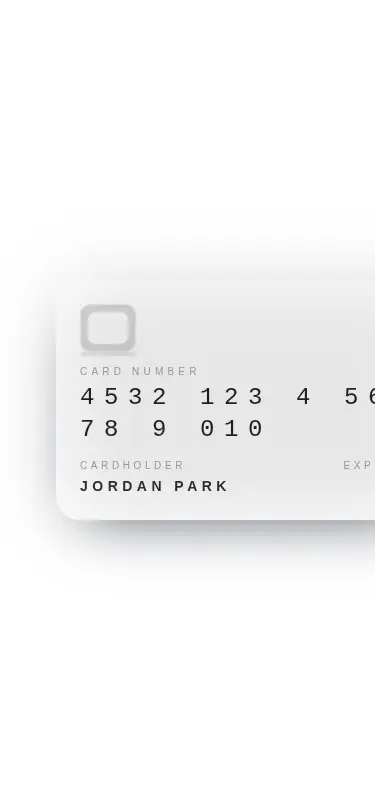
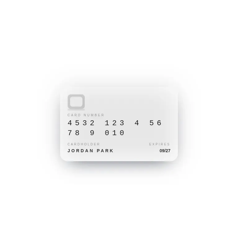
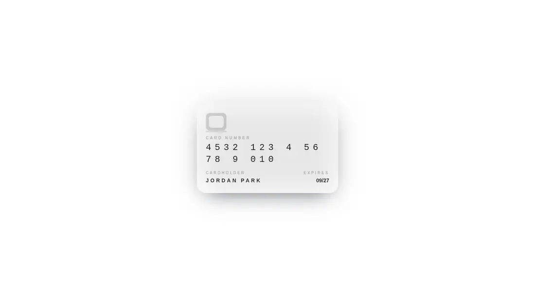
Measured
Every value below was written by the harness on the run that produced the frames above. None of it is derived from the prose.
| Build | OK |
|---|---|
| Mount | OK |
| Console errors | 0 |
| Uncaught page errors | 0 |
| Horizontal overflow | flagged at 375 |
| Axe critical | 0 |
| Axe serious | 1 |
| Axe moderate | 0 |
| Axe minor | 0 |
| Gzip marginal | 61.0 KB (126.4 KB build, 65.4 KB baseline) |
| Bare mode | FAIL |
| Provider required | NO |
| Demo used | written from the component source API |
What the harness recorded
BARE BUILD
✗ Build failed in 833ms
error during build:
[vite]: Rollup failed to resolve import "lucide-react" from "<sandbox>re-b31514a26e31/src/cut/components/uitripled/credit-card-shadcnui.tsx".
Verdict
A polished desktop-oriented preview with a convincing flip and sensible reduced-motion behavior. Use it as a visual starting point, but fix narrow-screen sizing, muted-text contrast, and keyboard interaction before shipping it in a payment flow.
Use it if
- You need a decorative card preview for a checkout, wallet, or payment-method screen.
- Your interface already uses Tailwind theme tokens and can accommodate Framer Motion.
- A pointer-driven tilt and click-to-flip interaction fits the product tone.
Skip it if
- The card must fit narrow mobile layouts without responsive changes.
- You need production-ready contrast without revising the muted text colors.
- The flip control must be keyboard accessible and expose button semantics out of the box.
- You want to avoid adding an animation library for a single decorative element.
Install
| Declared dependencies | framer-motion, react |
|---|---|
| Missing on install | none |
| Bare install | fails once the shadcn-style helpers are removed, so it needs that setup |
| Provider | no provider required in the harness |
Add React, Framer Motion, and Lucide React, then configure Tailwind with shadcn-style foreground, background, primary, accent, muted, and border theme tokens. Ensure the custom perspective utility is available, or replace it with equivalent CSS.
Source and credit
This page is a review, not a copy. The component source lives with its author and this site does not republish it. Read the license before you use anything.
Author repository
github.com/moumen-soliman/uitripledAlternatives
Other published entries for the hover-effect pattern, ordered by what they measured: mounts first, then clean axe scans, then bare-mode passes, then the smaller bundle.
- eldora-card-flip-hover3d
- Renders
- YES
- A11y
- 0
- Gzip
- 17.5KB
- Bare
- pass
- Prov
- NO
- uilayouts-btn-hover-left-flip3d
- Renders
- YES
- A11y
- 0
- Gzip
- 17.5KB
- Bare
- pass
- Prov
- NO
- uilayouts-btn-hover-down3d
- Renders
- YES
- A11y
- 0
- Gzip
- 17.6KB
- Bare
- pass
- Prov
- NO
- uilayouts-btn-hover-multiplegradient-glow
- Renders
- YES
- A11y
- 0
- Gzip
- 17.9KB
- Bare
- pass
- Prov
- NO
- magicui-cool-modespatial
- Renders
- YES
- A11y
- 0
- Gzip
- 21.8KB
- Bare
- pass
- Prov
- NO
- uilayouts-hovercard2gradient-glow
- Renders
- YES
- A11y
- 0
- Gzip
- 24.0KB
- Bare
- pass
- Prov
- NO