Measured entry
tripled-draggable-list-shadcnui
cardminimal-flatmotion on file
A client-side React list that reorders a small set of cards with Framer Motion spring dragging and a Lucide grip icon. It ships as a shadcn registry component, keeps its demo items in local React state, and relies on utility classes plus card and foreground theme variables.
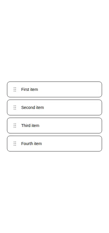
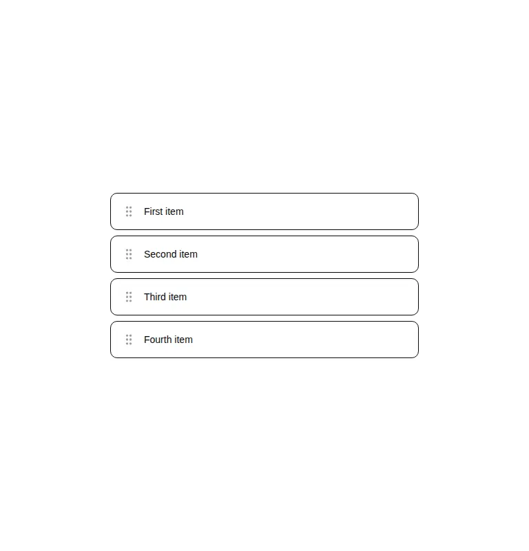
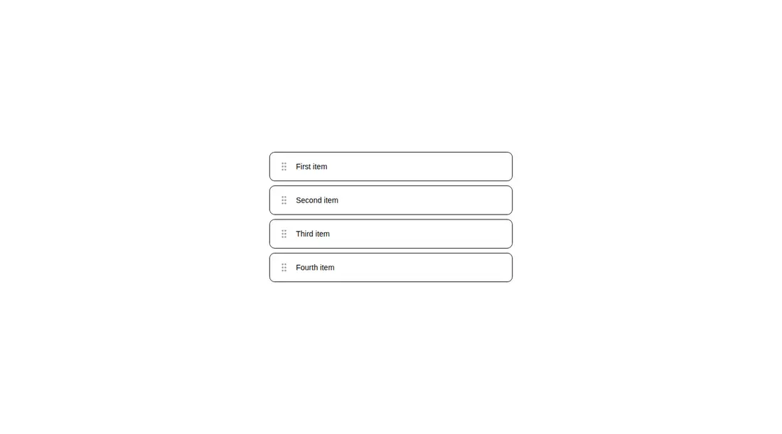
Measured
Every value below was written by the harness on the run that produced the frames above. None of it is derived from the prose.
| Build | OK |
|---|---|
| Mount | OK |
| Console errors | 0 |
| Uncaught page errors | 0 |
| Horizontal overflow | clean at 375, 768, 1440 |
| Axe critical | 0 |
| Axe serious | 0 |
| Axe moderate | 0 |
| Axe minor | 0 |
| Gzip marginal | 63.9 KB (129.3 KB build, 65.4 KB baseline) |
| Bare mode | FAIL |
| Provider required | NO |
| Demo used | written from the component source API |
What the harness recorded
BARE BUILD
✗ Build failed in 1.07s
error during build:
[vite]: Rollup failed to resolve import "lucide-react" from "<sandbox>re-4d56f5e0987a/src/cut/components/uitripled/draggable-list-shadcnui.tsx".
Verdict
A clean starting point for a simple draggable list, and it builds and mounts without special provider wiring. Treat it as interaction scaffolding: real use needs external data handling, persistence, and an accessible keyboard alternative.
Use it if
- You need a compact pointer-driven reorder interaction for a short list.
- Your app already uses Framer Motion and can adapt the local item state to real data.
- You want a minimal card treatment that can inherit existing theme variables.
Skip it if
- Keyboard-based reordering is a requirement, since the component provides no keyboard controls or reorder buttons.
- You need a drop-in data component with item props, persistence, or a change callback; this version hardcodes its items and owns the state.
- Adding Framer Motion for a small list interaction is not worth the dependency cost in your app.
Install
| Declared dependencies | framer-motion, react, radix-ui |
|---|---|
| Missing on install | none |
| Bare install | fails once the shadcn-style helpers are removed, so it needs that setup |
| Provider | no provider required in the harness |
In a non-shadcn project, add React, Framer Motion, and Lucide React, then provide equivalent utility-class styling or rewrite the classes as local CSS. Define the card background and foreground theme variables, and place the component behind a client boundary when using server-rendered React. The registry's button dependency is not used by this source.
Source and credit
This page is a review, not a copy. The component source lives with its author and this site does not republish it. Read the license before you use anything.
Author repository
github.com/moumen-soliman/uitripledAlternatives
Other published entries for the card pattern, ordered by what they measured: mounts first, then clean axe scans, then bare-mode passes, then the smaller bundle.
- tailark-veil-content-1minimal-flat
- Renders
- YES
- A11y
- 0
- Gzip
- 17.6KB
- Bare
- pass
- Prov
- NO
- tailark-veil-content-2minimal-flat
- Renders
- YES
- A11y
- 0
- Gzip
- 17.6KB
- Bare
- pass
- Prov
- NO
- tailark-mist-content-3minimal-flat
- Renders
- YES
- A11y
- 0
- Gzip
- 24.1KB
- Bare
- pass
- Prov
- NO
- neobrutalism-cardbrutalism
- Renders
- YES
- A11y
- 0
- Gzip
- 29.6KB
- Bare
- pass
- Prov
- NO
- neobrutalism-ncardbrutalism
- Renders
- YES
- A11y
- 0
- Gzip
- 29.6KB
- Bare
- pass
- Prov
- NO
- reui-icon-stackminimal-flat
- Renders
- YES
- A11y
- 0
- Gzip
- 30.1KB
- Bare
- pass
- Prov
- NO