Measured entry
tripled-stacked-card-carousel-shadcnui
carouselminimal-flatmotion on file
A client-side React card stack distributed as a shadcn registry item. It accepts a card array and uses Framer Motion for entrance and hover transforms, with Tailwind-style theme classes for layout, color, borders, and type. The registry also declares shadcn card and button dependencies, although the component does not import them.
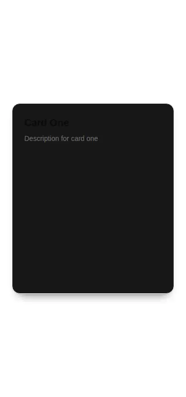
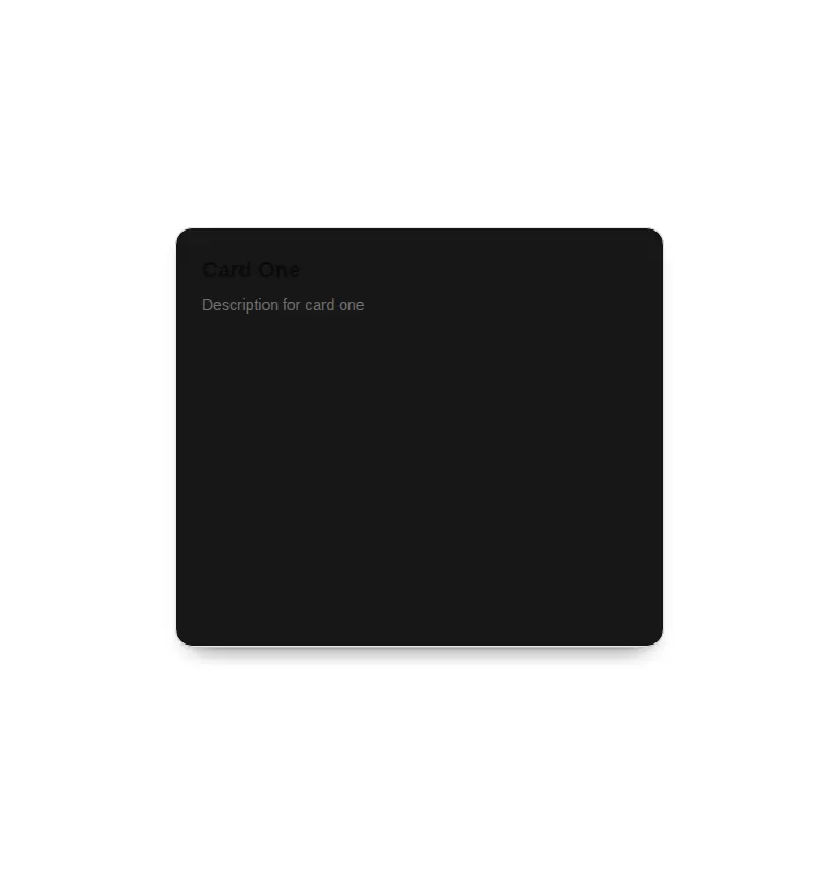
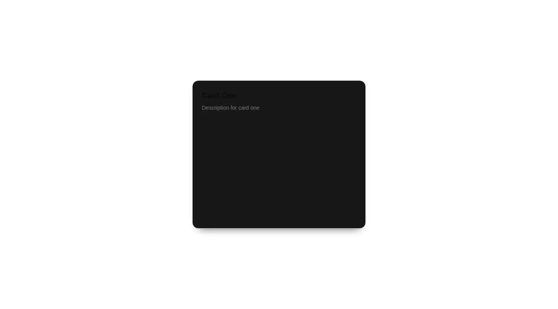
Measured
Every value below was written by the harness on the run that produced the frames above. None of it is derived from the prose.
| Build | OK |
|---|---|
| Mount | OK |
| Console errors | 0 |
| Uncaught page errors | 0 |
| Horizontal overflow | clean at 375, 768, 1440 |
| Axe critical | 0 |
| Axe serious | 1 |
| Axe moderate | 0 |
| Axe minor | 0 |
| Gzip marginal | 61.1 KB (126.5 KB build, 65.4 KB baseline) |
| Bare mode | OK |
| Provider required | NO |
| Demo used | written from the component source API |
Verdict
A tidy motion primitive for decorative card previews, but the carousel label overstates it. It mounts without special providers and stays contained across the tested layouts, yet its hover-only interaction and contrast failure make it a starting point, not a production-ready content navigator.
Use it if
- You need a compact hover-driven card stack for short promotional or feature copy.
- Your project already uses React, Framer Motion, and compatible utility theme tokens.
- You are prepared to tune the supplied foreground and background colors for accessible contrast.
Skip it if
- You need carousel controls, swipe gestures, autoplay, pagination, or keyboard navigation.
- Important content must remain discoverable on touch devices where hover does not reveal the stack.
- You need an accessible default without revising its low-contrast text and card color combination.
- Your cards vary substantially in height or require normal document flow rather than absolute stacking.
Install
| Declared dependencies | framer-motion, react, radix-ui |
|---|---|
| Missing on install | none |
| Bare install | builds and mounts without the shadcn-style helpers |
| Provider | no provider required in the harness |
In a non-shadcn project, add React and Framer Motion, then provide Tailwind or replace the utility classes with local CSS. Define equivalents for the card, primary, border, and muted foreground theme tokens. The declared shadcn card and button registry items are not referenced by this source.
Source and credit
This page is a review, not a copy. The component source lives with its author and this site does not republish it. Read the license before you use anything.
Author repository
github.com/moumen-soliman/uitripledAlternatives
Other published entries for the carousel pattern, ordered by what they measured: mounts first, then clean axe scans, then bare-mode passes, then the smaller bundle.
- neobrutalism-marqueebrutalism
- Renders
- YES
- A11y
- 0
- Gzip
- 17.3KB
- Bare
- pass
- Prov
- NO
- kibo-deckminimal-flat
- Renders
- YES
- A11y
- 0
- Gzip
- 71.9KB
- Bare
- pass
- Prov
- NO
- ruixen-card-stack3d
- Renders
- YES
- A11y
- 0
- Gzip
- 84.0KB
- Bare
- pass
- Prov
- NO
- magicui-marqueeunclassified
- Renders
- YES
- A11y
- 0
- Gzip
- 11.9KB
- Bare
- fail
- Prov
- NO
- ruixen-auto-scrolling-client-carouselunclassified
- Renders
- YES
- A11y
- 0
- Gzip
- 27.2KB
- Bare
- fail
- Prov
- NO
- ruixen-coverflow-carousel3d
- Renders
- YES
- A11y
- 0
- Gzip
- 33.2KB
- Bare
- fail
- Prov
- NO