Measured entry
uilayouts-hovercard4
hover-effectdark-futuristicmotion on file
A static editorial card distributed as a shadcn registry TSX file. It pairs a remote Unsplash image with fixed article copy and a hover transition on the image and arrow icon. The source relies on React, Tailwind utility classes, Next.js Image, and Lucide icons; Motion is declared by the registry but not imported.
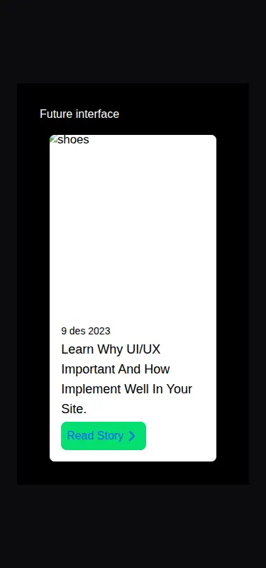

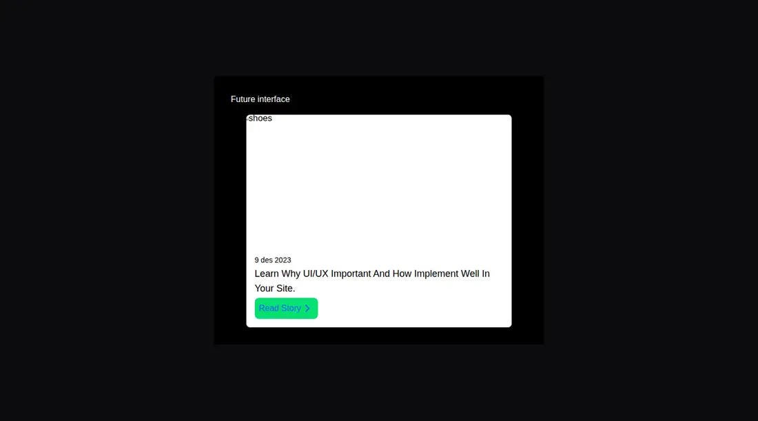
Measured
Every value below was written by the harness on the run that produced the frames above. None of it is derived from the prose.
| Build | OK |
|---|---|
| Mount | OK |
| Console errors | 1 |
| Uncaught page errors | 0 |
| Horizontal overflow | clean at 375, 768, 1440 |
| Axe critical | 0 |
| Axe serious | 1 |
| Axe moderate | 0 |
| Axe minor | 0 |
| Gzip marginal | 24.8 KB (90.2 KB build, 65.4 KB baseline) |
| Bare mode | FAIL |
| Provider required | NO |
| Demo used | written from the component source API |
What the harness recorded
CONSOLE
Failed to load resource: the server responded with a status of 404 (Not Found)
BARE BUILD
✗ Build failed in 915ms
error during build:
[vite]: Rollup failed to resolve import "lucide-react" from "<sandbox>re-f0bc004c51cf/src/cut/registry/components/card/hover-card4.tsx".
Verdict
A usable starting point for a Next.js editorial card, but it is closer to a fixed example than a reusable component. Adopt it only if you will parameterize the content, correct the color contrast, and verify the remote image request.
Use it if
- You need a compact image-led story card for a Next.js and Tailwind interface.
- You are comfortable replacing fixed copy, link destination, and image in the component source.
- Your design can accommodate an interaction whose visual flourish is triggered by pointer hover.
Skip it if
- You need a reusable card driven by props, since the supplied component ignores external title and child content.
- Your project does not use Next.js and you do not want to replace its image component.
- You require accessible colors without adjustment, since the tested styling has a contrast issue.
- You want a self-contained asset with no remote image host or related configuration.
Install
| Declared dependencies | motion |
|---|---|
| Missing on install | none |
| Bare install | fails once the shadcn-style helpers are removed, so it needs that setup |
| Provider | no provider required in the harness |
In a non-shadcn project, copy the component file, enable Tailwind utilities, add Lucide React and the declared Motion package, and provide React. Use Next.js Image with the Unsplash host allowed in image configuration, or replace it with your framework's image element. Motion can be omitted unless you add Motion-based behavior.
Source and credit
This page is a review, not a copy. The component source lives with its author and this site does not republish it. Read the license before you use anything.
Author repository
github.com/ui-layouts/uilayoutsAlternatives
Other published entries for the hover-effect pattern, ordered by what they measured: mounts first, then clean axe scans, then bare-mode passes, then the smaller bundle.
- eldora-card-flip-hover3d
- Renders
- YES
- A11y
- 0
- Gzip
- 17.5KB
- Bare
- pass
- Prov
- NO
- uilayouts-btn-hover-left-flip3d
- Renders
- YES
- A11y
- 0
- Gzip
- 17.5KB
- Bare
- pass
- Prov
- NO
- uilayouts-btn-hover-down3d
- Renders
- YES
- A11y
- 0
- Gzip
- 17.6KB
- Bare
- pass
- Prov
- NO
- uilayouts-btn-hover-multiplegradient-glow
- Renders
- YES
- A11y
- 0
- Gzip
- 17.9KB
- Bare
- pass
- Prov
- NO
- magicui-cool-modespatial
- Renders
- YES
- A11y
- 0
- Gzip
- 21.8KB
- Bare
- pass
- Prov
- NO
- uilayouts-hovercard2gradient-glow
- Renders
- YES
- A11y
- 0
- Gzip
- 24.0KB
- Bare
- pass
- Prov
- NO