Measured entry
hyperui-headers-2
A responsive marketing header shipped as static HyperUI HTML built from Tailwind utility classes. It includes an inline logo, desktop navigation, login and registration links, and a compact mobile menu button. It has no package dependencies or built-in menu behavior, so interaction and routing remain application work.

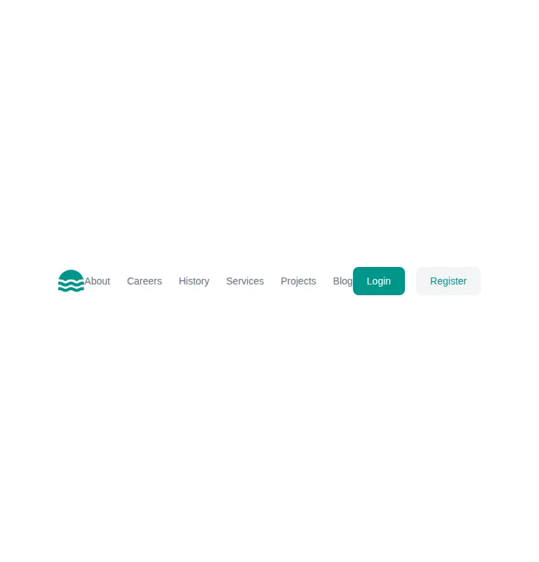
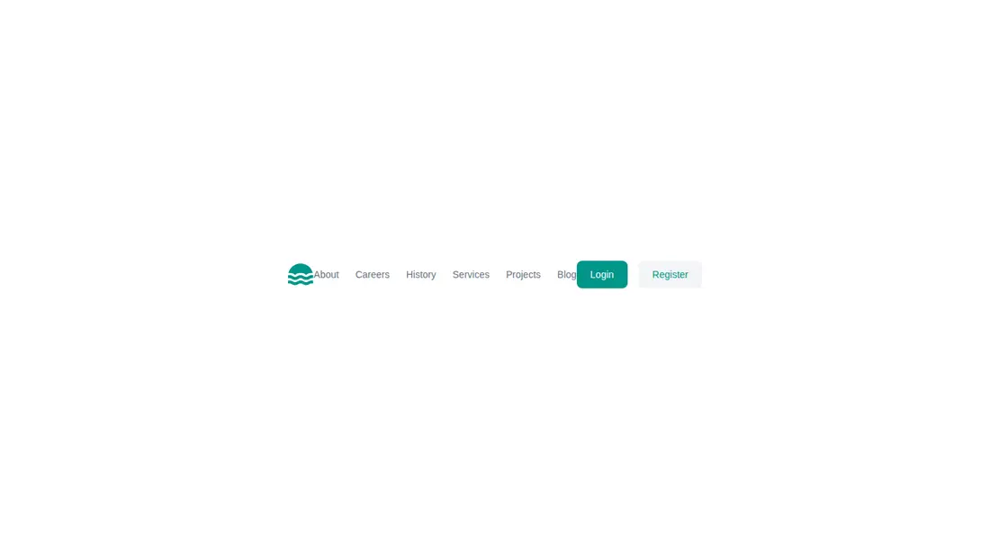
Measured
Every value below was written by the harness on the run that produced the frames above. None of it is derived from the prose.
| Build | OK |
|---|---|
| Mount | OK |
| Console errors | 0 |
| Uncaught page errors | 0 |
| Horizontal overflow | clean at 375, 768, 1440 |
| Axe critical | 0 |
| Axe serious | 1 |
| Axe moderate | 0 |
| Axe minor | 0 |
| Gzip marginal | 18.7 KB (84.1 KB build, 65.4 KB baseline) |
| Bare mode | OK |
| Provider required | NO |
| Demo used | written from the component source API |
Verdict
A clean, portable shell that builds, mounts, and stays contained across the tested layouts. Use it as a styling starting point, not a finished navigation system: the mobile trigger has no menu logic, all destinations are placeholders, and the muted link colors need a contrast pass.
Use it if
- You need a compact marketing-site header with separate desktop and mobile layouts.
- Your project already uses Tailwind and can replace placeholder links with real routes.
- You want a simple logo, navigation, and account-action shell to customize.
Skip it if
- You need a mobile drawer or dropdown that works without adding interaction logic.
- You require an accessibility-ready color palette without revising the muted navigation text.
- Your project does not use Tailwind and you do not want to translate utility classes into your styling system.
Install
| Declared dependencies | none declared |
|---|---|
| Missing on install | none |
| Bare install | builds and mounts without the shadcn-style helpers |
| Provider | no provider required in the harness |
Add Tailwind CSS and ensure its scanner includes the component markup. Copy the inline SVGs, replace placeholder links, wire the mobile button to an accessible menu, and adjust the muted text palette to meet contrast requirements. No shadcn primitives or extra packages are required.
Source and credit
This page is a review, not a copy. The component source lives with its author and this site does not republish it. Read the license before you use anything.
Author repository
github.com/markmead/hyperuiAlternatives
Other published entries for the navbar pattern, ordered by what they measured: mounts first, then clean axe scans, then bare-mode passes, then the smaller bundle.
- hyperui-headers-4editorial
- Renders
- YES
- A11y
- 0
- Gzip
- 19.1KB
- Bare
- pass
- Prov
- NO
- kibo-dialog-stackminimal-flat
- Renders
- YES
- A11y
- 0
- Gzip
- 33.4KB
- Bare
- pass
- Prov
- NO
- ruixen-floating-navbarunclassified
- Renders
- YES
- A11y
- 0
- Gzip
- 59.9KB
- Bare
- pass
- Prov
- NO
- ruixen-hover-gradient-navbargradient-glow
- Renders
- YES
- A11y
- 0
- Gzip
- 60.9KB
- Bare
- pass
- Prov
- NO
- ruixen-expandable-menu-navbarunclassified
- Renders
- YES
- A11y
- 0
- Gzip
- 61.8KB
- Bare
- pass
- Prov
- NO
- hextaui-cardminimal-flat
- Renders
- YES
- A11y
- 0
- Gzip
- 26.7KB
- Bare
- fail
- Prov
- NO