Measured entry
kokonut-carousel-cards
navbardark-futuristicmotion on file
A client-side React carousel that renders two horizontally scrollable rows of experience cards with images, ratings, badges, favorite controls, and arrow navigation. It ships as a shadcn registry component for Next.js and imports Next Image and Link, Lucide icons, plus local shadcn Card, Badge, and Button primitives backed by Radix and the project utility layer.
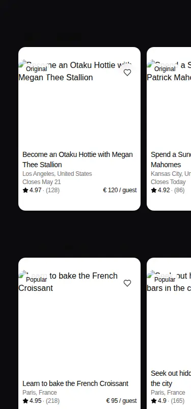
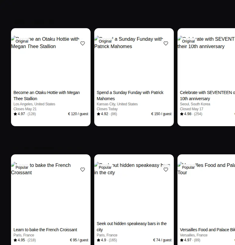
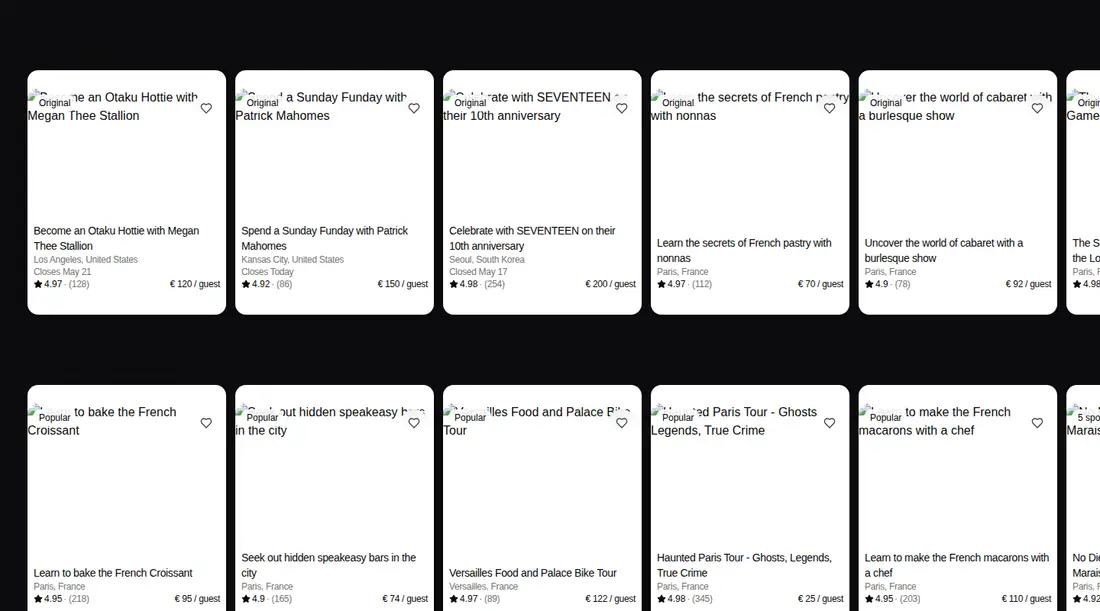
Measured
Every value below was written by the harness on the run that produced the frames above. None of it is derived from the prose.
| Build | OK |
|---|---|
| Mount | OK |
| Console errors | 40 |
| Uncaught page errors | 0 |
| Horizontal overflow | flagged at 375, 768, 1440 |
| Axe critical | 0 |
| Axe serious | 0 |
| Axe moderate | 0 |
| Axe minor | 0 |
| Gzip marginal | 53.7 KB (119.1 KB build, 65.4 KB baseline) |
| Bare mode | FAIL |
| Provider required | NO |
| Demo used | written from the component source API |
What the harness recorded
CONSOLE
Failed to load resource: the server responded with a status of 404 (Not Found)
CONSOLE
Failed to load resource: the server responded with a status of 404 (Not Found)
CONSOLE
Failed to load resource: the server responded with a status of 404 (Not Found)
Verdict
A usable marketplace carousel for an existing Next.js and shadcn codebase, with sensible card structure and accessible control labels. It needs a shadcn-style setup, overflows in the tested layouts, and its demo image requests fail, so expect integration work before shipping.
Use it if
- You need a marketplace or travel discovery rail with rich cards and horizontal browsing.
- Your Next.js app already has shadcn primitives, Tailwind tokens, and the standard import alias.
- You are prepared to replace the bundled experience data and placeholder links with real records and routes.
Skip it if
- Your layout must avoid horizontal overflow at every tested viewport without component-level adjustment.
- You need a framework-neutral React component without Next Image or Next Link dependencies.
- You cannot host, allow, or replace the remote imagery, since the demo produced repeated missing-resource errors.
- You want a compact navigation bar rather than a full content carousel.
Install
| Declared dependencies | lucide-react, radix-ui |
|---|---|
| Missing on install | none |
| Bare install | fails once the shadcn-style helpers are removed, so it needs that setup |
| Provider | no provider required in the harness |
In a non-shadcn project, add Tailwind styling and theme tokens, configure the standard import alias and utility helper, and supply compatible Card, Badge, and Button primitives with Radix support. Install Lucide React, configure Next Image for the chosen remote hosts, and keep Next Link or replace both Next-specific imports with local equivalents.
Source and credit
This page is a review, not a copy. The component source lives with its author and this site does not republish it. Read the license before you use anything.
Author repository
github.com/kokonut-labs/kokonutuiAlternatives
Other published entries for the navbar pattern, ordered by what they measured: mounts first, then clean axe scans, then bare-mode passes, then the smaller bundle.
- hyperui-headers-4editorial
- Renders
- YES
- A11y
- 0
- Gzip
- 19.1KB
- Bare
- pass
- Prov
- NO
- kibo-dialog-stackminimal-flat
- Renders
- YES
- A11y
- 0
- Gzip
- 33.4KB
- Bare
- pass
- Prov
- NO
- ruixen-floating-navbarunclassified
- Renders
- YES
- A11y
- 0
- Gzip
- 59.9KB
- Bare
- pass
- Prov
- NO
- ruixen-hover-gradient-navbargradient-glow
- Renders
- YES
- A11y
- 0
- Gzip
- 60.9KB
- Bare
- pass
- Prov
- NO
- ruixen-expandable-menu-navbarunclassified
- Renders
- YES
- A11y
- 0
- Gzip
- 61.8KB
- Bare
- pass
- Prov
- NO
- hextaui-cardminimal-flat
- Renders
- YES
- A11y
- 0
- Gzip
- 26.7KB
- Bare
- fail
- Prov
- NO