Measured entry
magicui-rainbow-button
buttongradient-glowmotion on file
A React call-to-action button with an animated rainbow border and glow, plus default and outline variants, size options, and optional child composition. It ships as a shadcn registry item built from Tailwind utilities, theme CSS, class-variance-authority, Radix Slot, and a local class-merging helper.


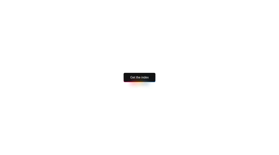
Measured
Every value below was written by the harness on the run that produced the frames above. None of it is derived from the prose.
| Build | OK |
|---|---|
| Mount | OK |
| Console errors | 0 |
| Uncaught page errors | 0 |
| Horizontal overflow | clean at 375, 768, 1440 |
| Axe critical | 0 |
| Axe serious | 0 |
| Axe moderate | 0 |
| Axe minor | 0 |
| Gzip marginal | 32.0 KB (97.5 KB build, 65.5 KB baseline) |
| Bare mode | FAIL |
| Provider required | NO |
| Demo used | written from the component source API |
What the harness recorded
BARE BUILD
✗ Build failed in 701ms
error during build:
[vite]: Rollup failed to resolve import "@radix-ui/react-slot" from "<sandbox>re-9c1bfacd85a6/src/cut/rainbow-button.tsx".
Verdict
A specialized promotional button for teams already invested in the shadcn ecosystem. The packaged build mounts, but the blank captures weaken visual confidence and the supplied colors need contrast work. It needs a shadcn-style setup and is not a drop-in choice for a bare React project.
Use it if
- You need a visually prominent call to action on a dark or themed landing page.
- Your app already uses shadcn conventions and can absorb the supplied theme variables and animation.
- You want variant and size props while retaining native button attributes and ref forwarding.
Skip it if
- You need a component that renders reliably in an unconfigured React and Tailwind project.
- Your accessibility bar requires the supplied color pairing to pass contrast checks without adjustment.
- You need confidence from the visual capture, since the verified viewport screenshots were blank.
- Your interface avoids continuously animated or attention-heavy controls.
Install
| Declared dependencies | clsx, tailwind-merge |
|---|---|
| Missing on install | none |
| Bare install | fails once the shadcn-style helpers are removed, so it needs that setup |
| Provider | no provider required in the harness |
In a non-shadcn project, add Radix Slot and class-variance-authority, provide the local class-merging helper with clsx and tailwind-merge, and configure Tailwind to recognize the component utilities. Copy the rainbow color variables, keyframes, animation mapping, and referenced semantic color tokens into your theme.
Source and credit
This page is a review, not a copy. The component source lives with its author and this site does not republish it. Read the license before you use anything.
Author repository
github.com/magicuidesign/magicuiAlternatives
Other published entries for the button pattern, ordered by what they measured: mounts first, then clean axe scans, then bare-mode passes, then the smaller bundle.
- neu-buttonneumorphism
- Renders
- YES
- A11y
- 0
- Gzip
- 17.8KB
- Bare
- pass
- Prov
- NO
- clay-buttonclaymorphism
- Renders
- YES
- A11y
- 0
- Gzip
- 18.2KB
- Bare
- pass
- Prov
- NO
- tripled-animated-radio-shadcnuiminimal-flat
- Renders
- YES
- A11y
- 0
- Gzip
- 58.2KB
- Bare
- pass
- Prov
- NO
- ruixen-glow-link-buttonliquid-glass
- Renders
- YES
- A11y
- 0
- Gzip
- 58.9KB
- Bare
- pass
- Prov
- NO
- tripled-mood-gradient-button-shadcnuigradient-glow
- Renders
- YES
- A11y
- 0
- Gzip
- 59.2KB
- Bare
- pass
- Prov
- NO
- ruixen-glass-ai-cardliquid-glass
- Renders
- YES
- A11y
- 0
- Gzip
- 59.5KB
- Bare
- pass
- Prov
- NO